The network for creativity
Join 1.25M professional creatives like you
Connect with clients, get discovered, and run your business 100% commission-free
Creatives on Contra have earned over $150M and we are just getting started
Back to feedPost
After loved ones pass away,
Some people live in your phone.
In a voicemail you haven't deleted.
In the way they texted - always with a typo, always with love.
I built something for them.
✦ Heirloom ✦
A place where you keep the people you carry with you.
Not an app. Not a memorial. Just somewhere quiet to put what you still have of them.
You add their name.
You bring what you have - a photo, a voice note, a screenshot.
Heirloom does the rest.
Their words come back to you.
A different memory every time you open it.
Private. Yours. Always there.
Grief doesn’t ask for much.
Just somewhere to put it
where they still feel close.


Hey Sahana, make sure to include links to your project to be considered. Great work!

One of the best designs have seen so far todayyy,, keep it up

Thank you @Boluwatife Delight I appreciate it

The voicemail detail hit hard. The idea that grief doesn't need a monument, just somewhere to revisit a specific person's way of texting, that's a very human insight to design around.
I’m really glad that landed with you. It’s those tiny, specific details that stay, not the big memories, but the way someone was. That’s what I wanted to design for.

This is one of the more unique approaches I've seen in the challenge so far. 👏
Thank you, that really means a lot.
I was actually a bit skeptical before starting this, it felt tricky to translate something as delicate as grief into design without making it heavy or sad. I spent a lot of time thinking about how it could feel gentle instead, something that...
You are welcome 😊

The line about the typo is what got me — that's such a specific, true detail, and it's doing more emotional work than most apps manage in a whole feature list. The 'not a memorial, just somewhere quiet' framing is the right instinct too; grief tech usually overshoots into ceremony when restraint is what people actually need
The network for creativity
Join 1.25M professional creatives like you
Connect with clients, get discovered, and run your business 100% commission-free
Creatives on Contra have earned over $150M and we are just getting started







Related posts

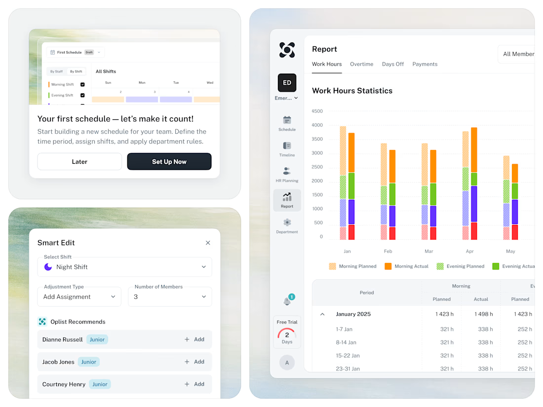
🚀 From Excel chaos to a clear SaaS workflow for staff scheduling.




A founder ask me for a feedback on there product, so i started reviewing the healthcare app, and something felt off.
The website felt warm and welcoming. You could tell there were real people behind the brand.
But once you opened the app to sign up, that feeling was gone.
And honestly, for something as personal as healthcare, that matters. People need to feel comfortable before they trust you with their health.
So I worked on the onboarding screen to bring that feeling back.
Nothing complicated. I added a human touch through imagery and kept the screen simple, while making the app feel more connected to the website.
Sometimes, it's not about adding more to a screen. It's about making what's already there feel right.
Which would make you more comfortable signing up:
Before or After?
4 voted
14%
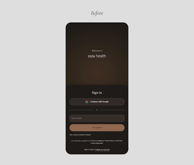
25 voted
86%
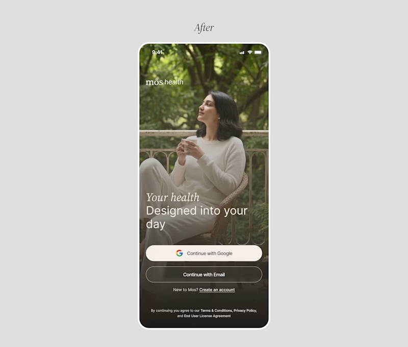
29 votes
Closed

Good catch on the disconnect between the website and signup flow. Carrying that human warmth into onboarding feels especially relevant for healthcare. Have you had a chance to test the redesign with new users?


Hear the sound 🎧
An experimental exploration of bringing AI conversations to life through motion. ✨
Tool stack: Figma × Claude × After Effects


Really impressive