The network for creativity
Join 1.25M professional creatives like you
Connect with clients, get discovered, and run your business 100% commission-free
Creatives on Contra have earned over $150M and we are just getting started
Back to feedPost
Taste Test

Another day another taste test 👀
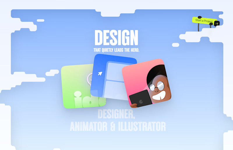
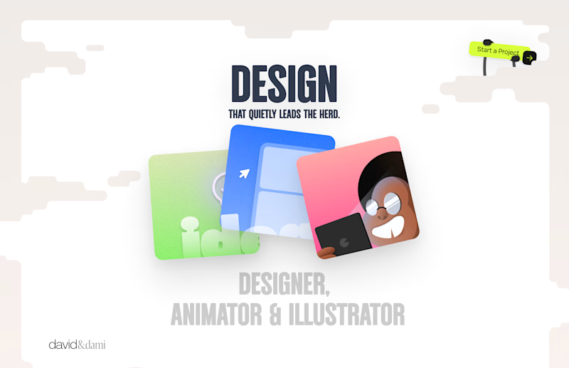
We are experimenting with a new layout for our next Framer template, it includes tiles of content all laid out on a free-roam canvas.
Here’s a first look 👇
What do you think? Which of these would you like to see in a template?
A. A canvas with content hidden in tiles where you hover and find it on the canvas,
OR
B. A low opacity layout that gives glimpses of what each tile contains.
Let us know! 👀 🚀

2 voted
67%
1 voted
33%
3 votes
Closed

Perfect

The low-opacity approach feels like the better balance here—it preserves discoverability while still rewarding exploration, and should make the canvas feel alive before hover.

I’d go with the low-opacity tiles, gives enough context without hiding the content.

hidden tiles.
The network for creativity
Join 1.25M professional creatives like you
Connect with clients, get discovered, and run your business 100% commission-free
Creatives on Contra have earned over $150M and we are just getting started





Related posts

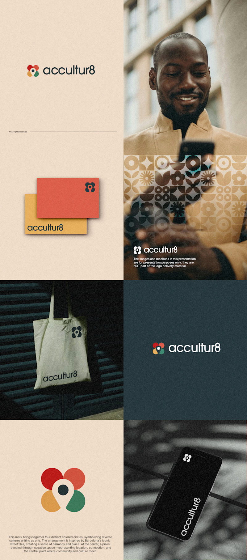
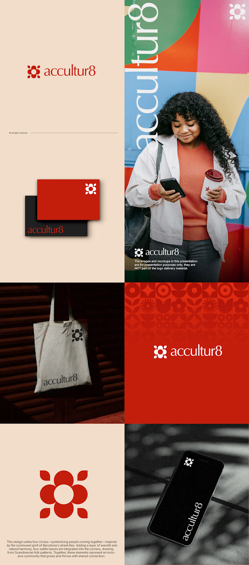
The client really liked Barcelona typical floor tiles, so I presented these logo options. Which one you liked the most?
4 voted
13%
26 voted
87%
30 votes
Closed

Love option 2, which one do you like most ?


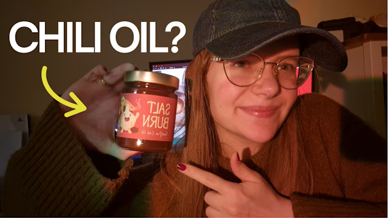
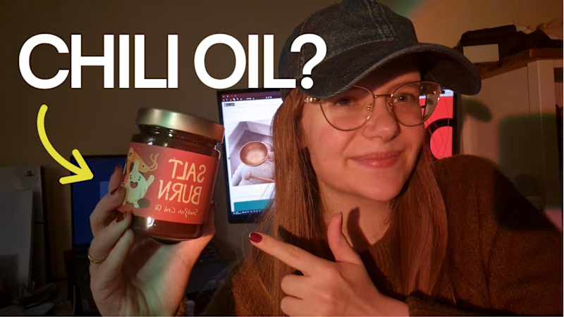
Posting my new YouTube video this week... which thumbnail would you click on?
29 voted
63%
17 voted
37%
46 votes
Closed

Should I go for left or right? Focusing on updating and finishing up my portfolio... and then I came across this crossroads. Another alternative is to make them switchable themes through a toggle, but I still need to decide which should be the default.

27 voted
75%
9 voted
25%
36 votes
Closed

Left is better because the text is readable, the overall blue background is not flashing to the eyes as compared to the right one.
For the top right button " Start a project ", you can add some animation so that it stands out and encourage users to click on it.