The network for creativity
Join 1.25M professional creatives like you
Connect with clients, get discovered, and run your business 100% commission-free
Creatives on Contra have earned over $150M and we are just getting started
Back to feedPost
Taste Test

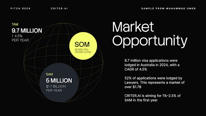
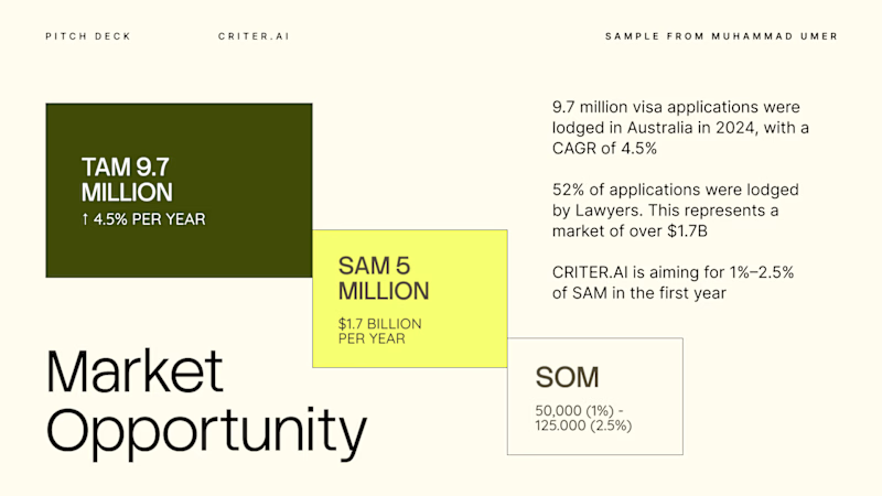
Criter.AI: Market Opportunity Slide, Two Visual Approaches
Turning a TAM/SAM/SOM breakdown into something an investor can absorb in five seconds, tested two directions.
Direction 1, Dark globe visual: nested circles on a wireframe globe, built for a spatial, big-picture read.
Direction 2, Light block grid: overlapping rectangles sized and colored by scale, built for a fast, numbers-first read.
Both carry the same figures: a $9.7M applicant market growing 4.5% yearly, a $1.7B addressable segment through lawyers, and a 1–2.5% year-one target.
Scope: pitch deck data slide design and visual direction
Tools: [Figma / PowerPoint / etc.]
Available for pitch decks and data-driven presentation design. Open to new projects.
2 voted
67%
1 voted
33%
3 votes
Closed
The network for creativity
Join 1.25M professional creatives like you
Connect with clients, get discovered, and run your business 100% commission-free
Creatives on Contra have earned over $150M and we are just getting started


Related posts

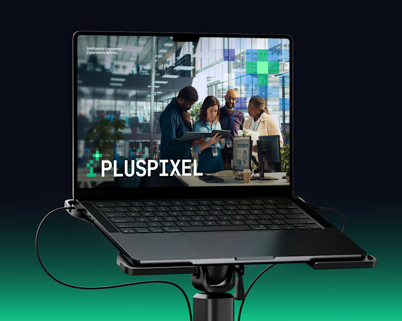
Same content, two different settings.
One designed to be seen on a big conference screen, the other experienced through a compact device. It's interesting how the same visuals can feel different depending on where they show up.
Which setting do you think brings the content to life better?
4 voted
57%

3 voted
43%
7 votes
Closed

Big screen 🔥

two brands, one tiny taste test.
would you rather look through an Oriel or answer a Calling?
winner gets the full brand. reply with your pick.
35 voted
85%
6 voted
15%
41 votes
Closed

The biggest misconception about branding is thinking it's just a logo. What actually saves founders time and money later is a compact system a focused 2–3 color palette and clear sub-brand rules so every new deck, social post, or product launch looks cohesive without starting from scratch.

Exploring a few different hero directions for Frame 18.
Which one would you go with, A or B, and why?
Would love to hear your thoughts before I finalize the design!
#webdesign #uiux #framer #websitedesign #designfeedback
9 voted
50%
9 voted
50%
18 votes
Closed

A for me. The portrait grid shows the range of work right away, though B has the stronger first impression.