The network for creativity
Join 1.25M professional creatives like you
Connect with clients, get discovered, and run your business 100% commission-free
Creatives on Contra have earned over $150M and we are just getting started
Back to feedPost

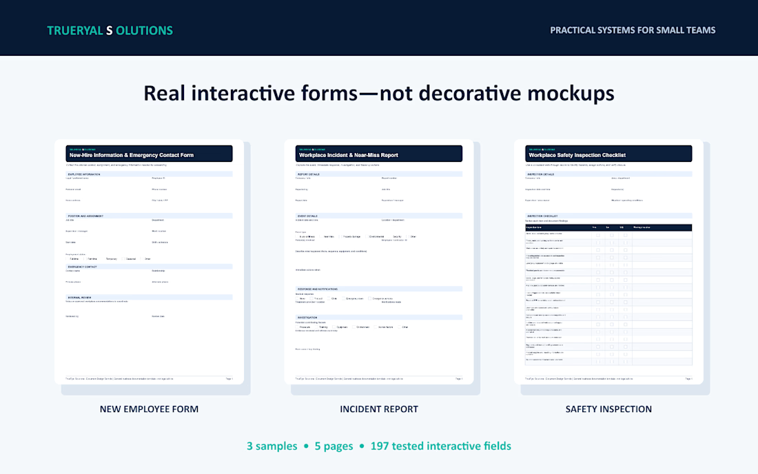
Smart Form Field Design — Clear field types, logical sections, and professional branding make information easier to collect and review.

The network for creativity
Join 1.25M professional creatives like you
Connect with clients, get discovered, and run your business 100% commission-free
Creatives on Contra have earned over $150M and we are just getting started




Related posts

Criter.AI: Pitch Deck Cover, Two Design Directions
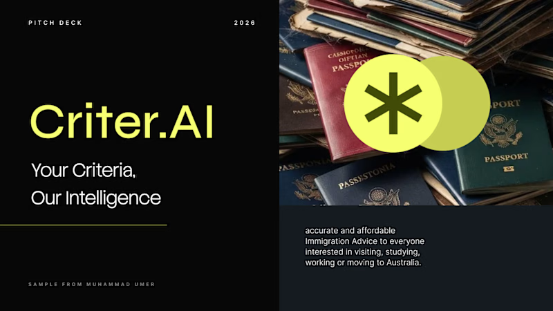
For an AI immigration advice platform serving Australia, I explored two cover directions to test how tone changes perception.
Direction 1, Olive gradient: warm, human and trustworthy, with a rounded image card and gold accents.
Direction 2, Dark and neon: high contrast, modern and investor-ready, with a bold split layout.
Both keep the brand mark, the tagline "Your Criteria, Our Intelligence" and the hero imagery, so the difference is purely in the design language.
Scope: pitch deck cover design and visual direction
Tools: Figma, PowerPoint, etc.
Available for pitch decks, presentations and brand design. Open to new projects.
Contra tags: , Presentation Design, Graphic Design, Branding, Startup Design
3 voted
50%

3 voted
50%
6 votes
Closed


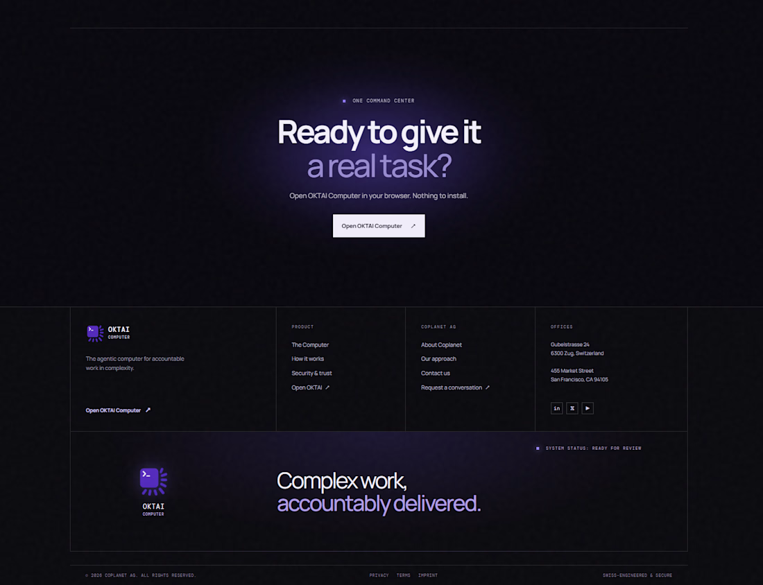


ready to give it a real task is huge. that purple glow is fun

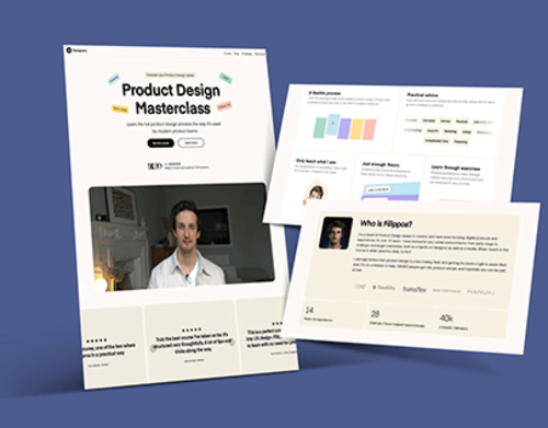
A high end, conversion focused website designed for a Product Design Masterclass, with an emphasis on clarity, credibility, and a refined visual experience.
The website was structured to communicate the value of the masterclass immediately while creating a clear path from discovery to registration. The visual system combines strong typography, intentional spacing, structured content sections, and editorial style layouts to give the experience a polished and professional feel.