The network for creativity
Join 1.25M professional creatives like you
Connect with clients, get discovered, and run your business 100% commission-free
Creatives on Contra have earned over $150M and we are just getting started
Back to feedPost

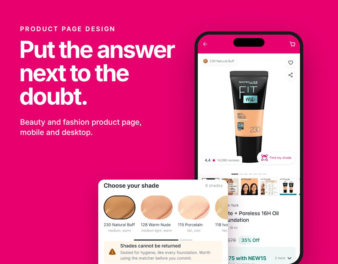
I audited six Indian beauty and fashion stores on mobile and desktop. Every one of them had built the right tools, then hidden them.
Shade finders, size guides, return rules, reviews. They were all there, just far away from the moment the buyer had the doubt.
So the fix wasn't a new feature. It was moving each answer next to the doubt it solves.
1. The shade matcher sits on the product photo
2. The real price is worked out before Buy
3. "Shades cannot be returned" appears right before Buy, not after
4. Reviews are filtered to your own shade
One rule for every product page: put the answer next to the doubt.
What do you check on a product page before you buy?
The network for creativity
Join 1.25M professional creatives like you
Connect with clients, get discovered, and run your business 100% commission-free
Creatives on Contra have earned over $150M and we are just getting started


Related posts

How AiSalesQ knows which quiz made the sale
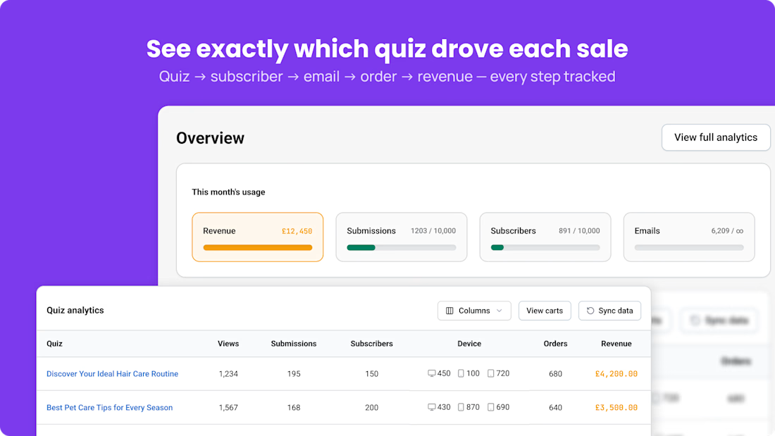
Most Shopify quiz apps stop at "someone finished the quiz". Merchants want to know if it paid.
In AiSalesQ, one orders/paid webhook does four jobs:
1) Matches the order to the shopper's quiz result
2) Closes the open cart
3) Redeems the discount
4) Stops the follow-up email sequence, so a buyer never gets a "you forgot something" email
The result is the table in the screenshot: views, submissions, subscribers, orders and revenue, per quiz. Every step is tracked, so the merchant sees which quiz is worth keeping.
If you run quizzes or pop-ups on your store, what do you track today: completions, or sales?
#Shopify #ShopifyApps #ShopifyDeveloper #Ecommerce #ProductQuiz #EmailMarketing #BuildInPublic



A beautiful ecommerce website doesn't always mean a high-converting website.
After years of working with Shopify stores, one thing i've learned is that some of the biggest conversion barriers are surprisingly simple.
A product page can look stunning but still leave customers wondering:
Why should I trust this brand?
What makes this product worth buying?
Can I find the information I need without searching for it?
Is the mobile shopping experience genuinely easy?
Sometimes improving clarity, navigation, and purchase confidence matters more than another complete redesign.
Good design attracts attention. Great ecommerce design helps customers make confident decisions.
What's one small website change you've seen make a meaningful difference to the user experience?
#Shopify #WebDesign #UXDesign #Ecommerce #CRO

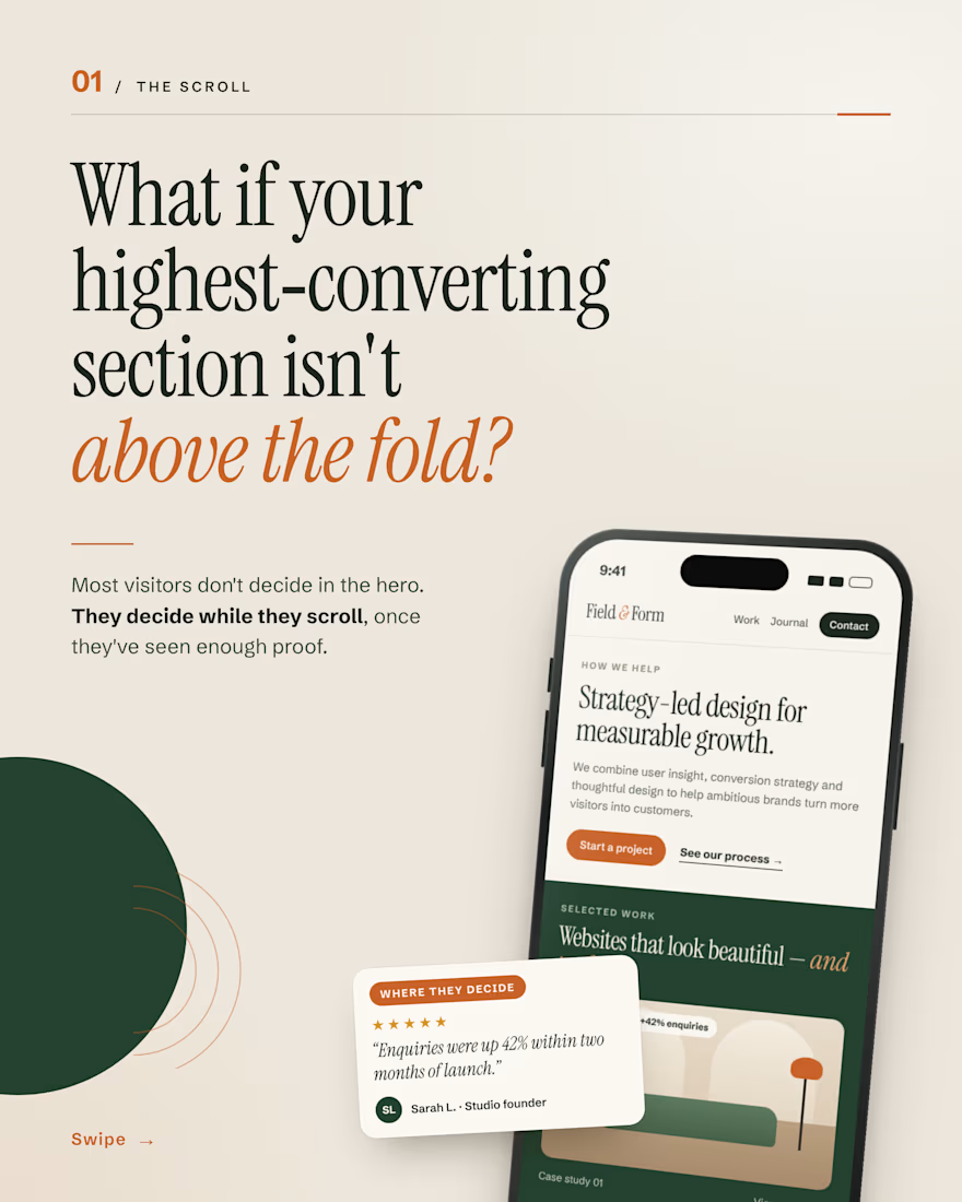
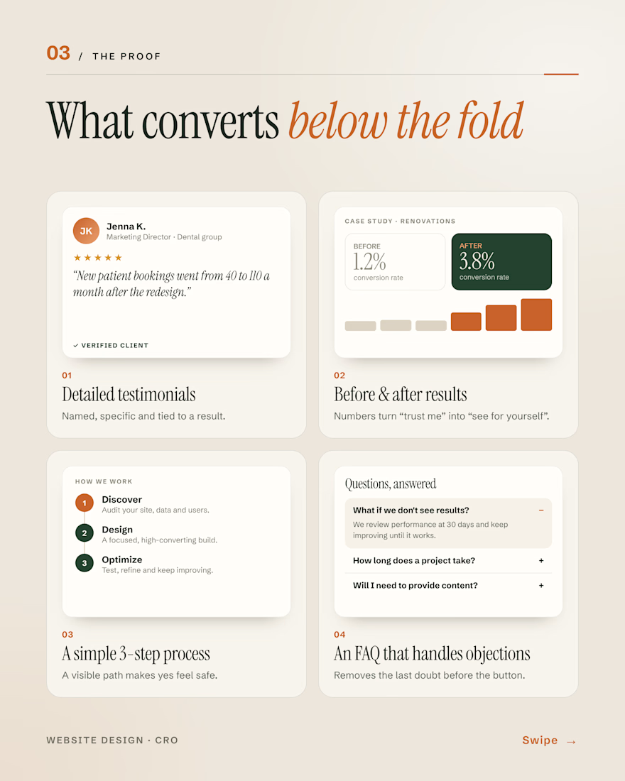
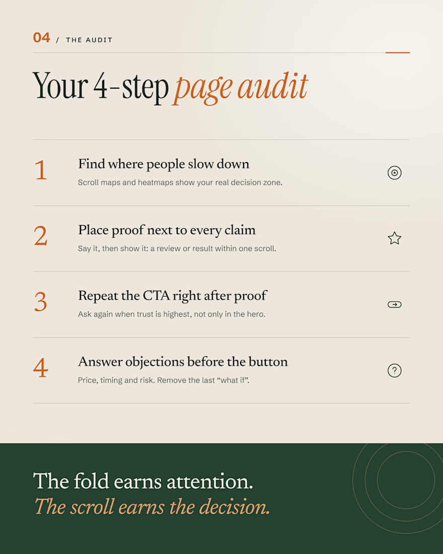
Your hero gets the first look. But most visitors don’t decide there.
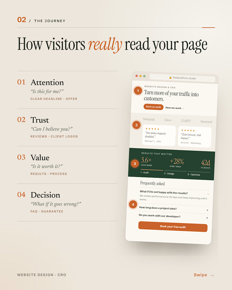
They scroll and question you: Is this for me? Can I trust you? Is it worth it? What if it goes wrong?
The sections that answer those (reviews, real results, a clear process, an honest FAQ) are often the ones doing the selling.
The fold earns attention. The scroll earns the decision.
#WebDesign #CRO #ConversionRateOptimization #LandingPages #UXDesign

Agree that the FAQ is where a lot of doubt gets settled. When you build these sections, do you put reviews before the process or after it?