The network for creativity
Join 1.25M professional creatives like you
Connect with clients, get discovered, and run your business 100% commission-free
Creatives on Contra have earned over $150M and we are just getting started
Back to feedPost
Taste Test
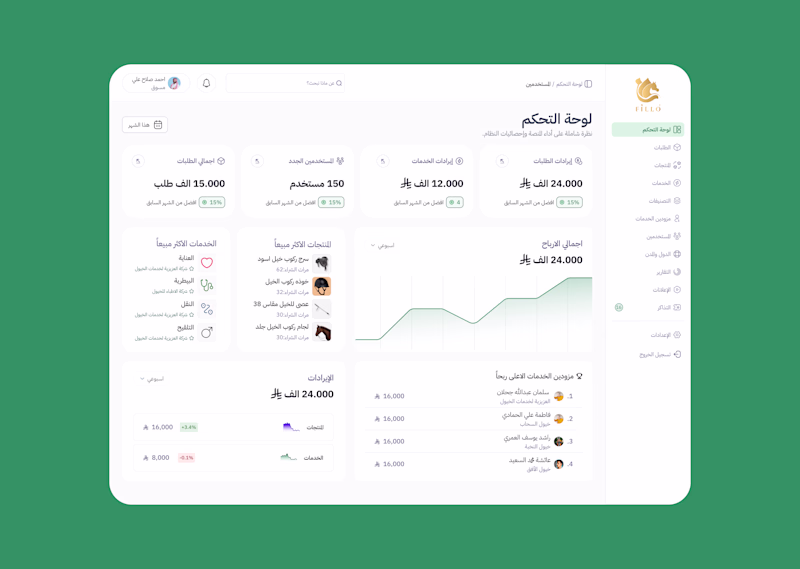
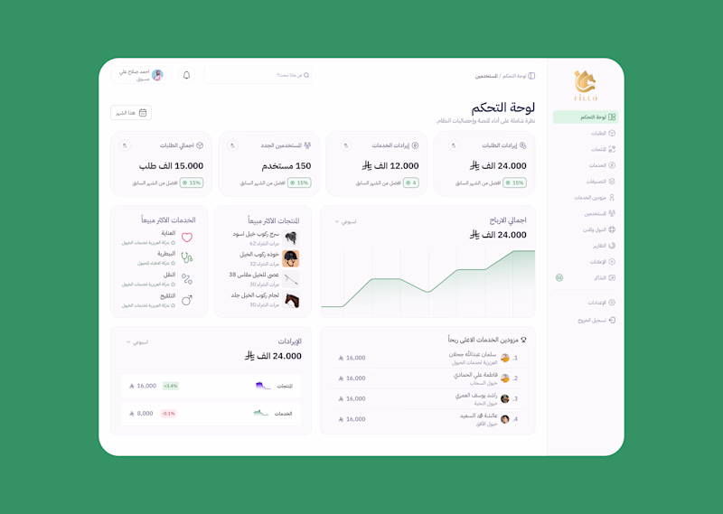
Which feels better to you? — Fillo Dashboard (Version A vs B) I'm designing a dashboard for Fillo — an Arabic equestrian services platform.
I kept going back and forth between two directions for the card style, so I'm letting you decide.
Version A — more depth, stronger card shadows, feels structured Version B — flatter, cleaner, more breathing room
Both carry the same green brand identity and Arabic RTL layout, but they feel completely different to use.
Drop a comment: A or B — and tell me why. I'm actively choosing between these before handoff.
2 voted
100%
0 voted
0%
2 votes
Closed
B all the way
The network for creativity
Join 1.25M professional creatives like you
Connect with clients, get discovered, and run your business 100% commission-free
Creatives on Contra have earned over $150M and we are just getting started
Related posts
Every screen I design starts flat – structure first, style second.
When a designer shows a case, which do you actually want to see?
Same screen, two stages.
3 voted
21%
11 voted
79%
14 votes
Closed
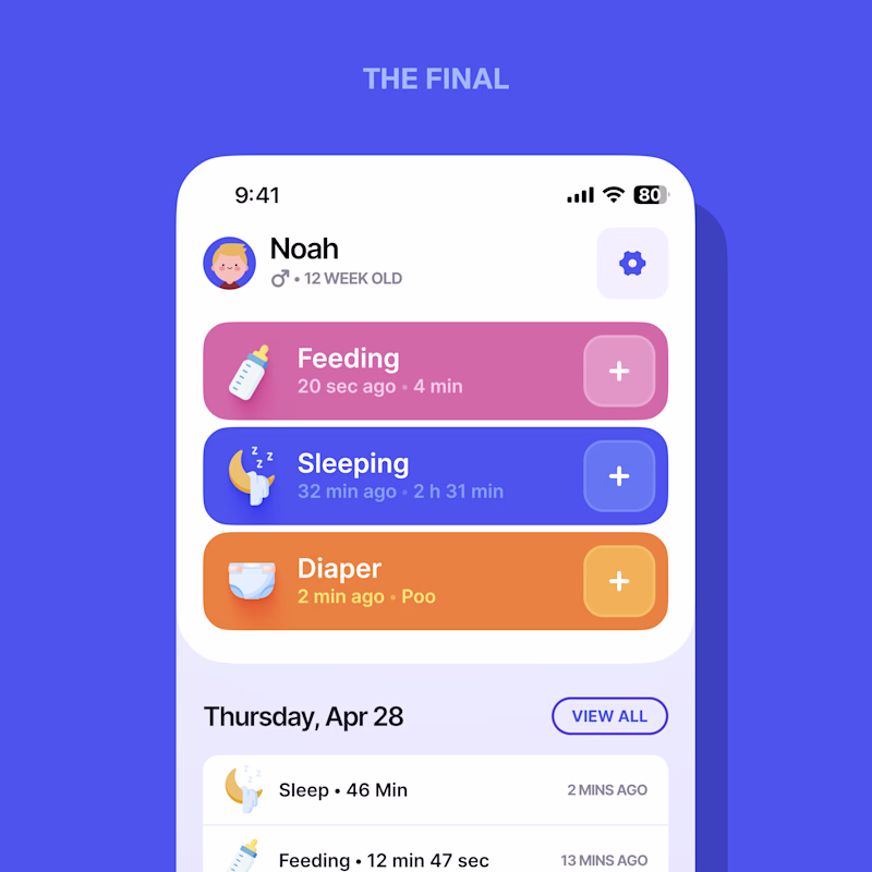
Love it. The final
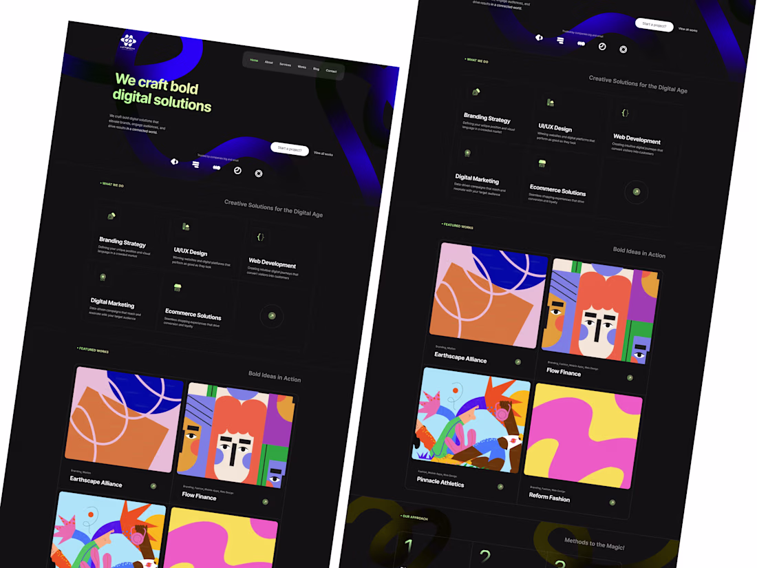
🚀 Creative Digital Agency Website – Modern UI/UX Concept
A strong online presence starts with a great first impression. This website concept is designed for creative agencies, startups, and digital businesses looking to showcase their services with a modern, premium look.
Featuring a bold dark theme, vibrant gradients, clean typography, and a structured layout, the design focuses on both aesthetics and usability. Every section is strategically crafted to guide visitors—from the hero section and services to portfolio, testimonials, and clear call-to-actions—creating a seamless and conversion-focused user experience.
✨ Highlights:
• Modern Dark UI
• Creative Hero Section
• Service Showcase
• Portfolio & Case Studies
• Client Testimonials
• Conversion-Focused CTA
• Responsive Layout
• Clean Visual Hierarchy
• Pixel-Perfect Design
Designed in Figma with scalability, usability, and business goals in mind.
Those illustration lift brand and website character! Your work never fail to impress me @Gopi UI/UX + AI 🤩🤩🤩
The core UI theme of Brainrot is clean and minimal, but users can unlock extra themes with streaks, to change the entire look of the home screen!
We launched with 5 themes, with more to come over the next few months!
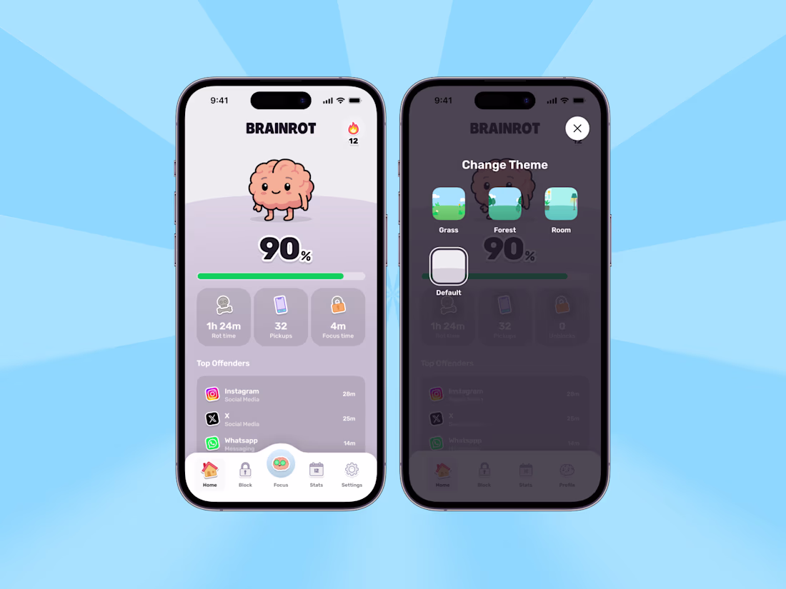
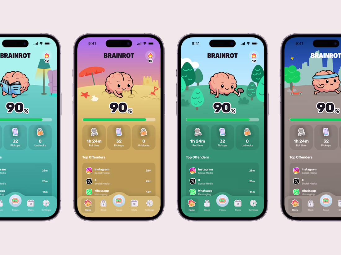
That autumn theme is my favorite of the four — the warm palette actually makes the mascot feel more alive than the default purple. Are the streak-unlocked themes generated per season or is that just the launch set?
Trending
Claude
Claude has entered the design space. How are you using Claude Design?
Contra University
Learn from expert creatives how to earn more using next-gen AI tools.
creativeaiflow
Creative AI workflows are evolving. What tools do you use, and what are their strengths and weaknesses?
freelancerlife
Freelancer life is wins, pivots, and everything in between. What’s yours right now?