The network for creativity
Join 1.25M professional creatives like you
Connect with clients, get discovered, and run your business 100% commission-free
Creatives on Contra have earned over $150M and we are just getting started
Back to feedPost

A website redesign isn't about making things look prettier.
It's about making it easier for visitors to understand what you do, trust you, and take action.
Here's an example from a recent redesign concept I created for a mental health practice.
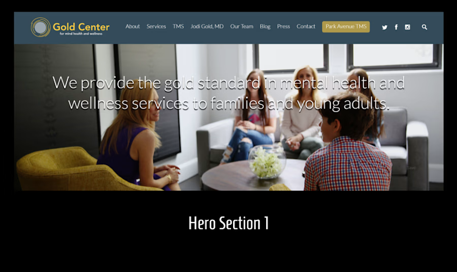
Original Hero (Left):
"We provide the gold standard in mental health and wellness services to families and young adults."
While it's a good statement, it doesn't immediately answer the questions most first-time visitors have:
• Who do you help?
• What problem do you solve?
• What should I do next?
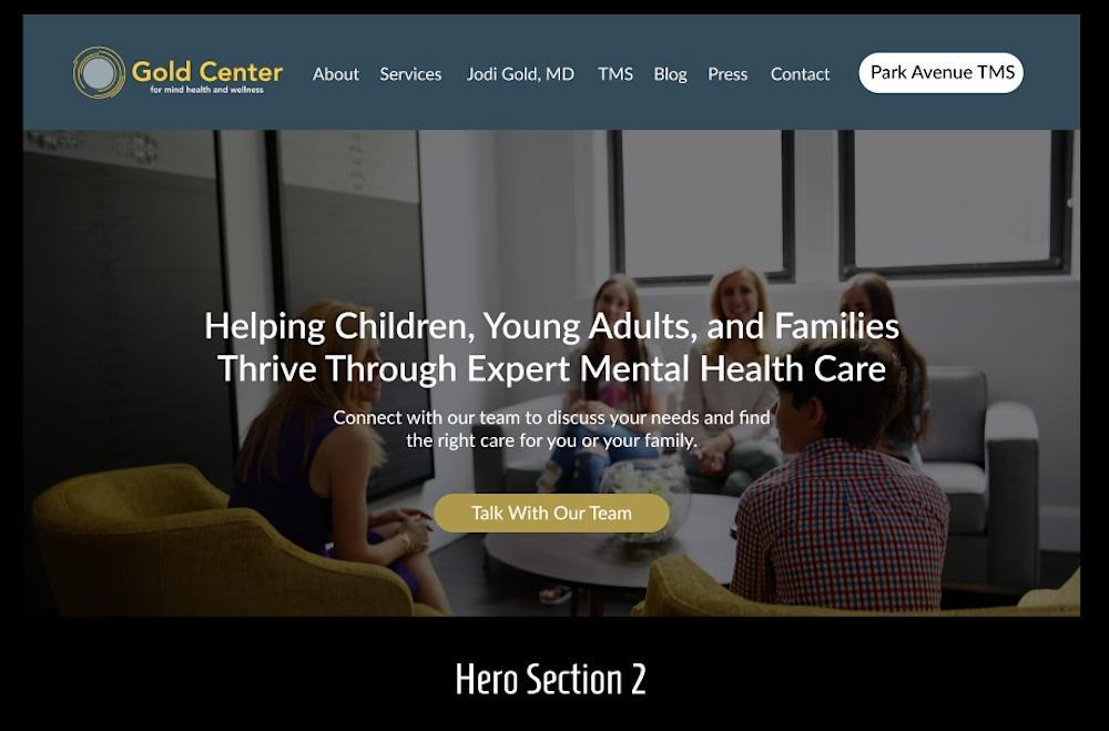
Redesigned Hero (Right):
"Helping Children, Young Adults, and Families Thrive Through Expert Mental Health Care."
A few strategic changes made a big difference:
✓ The headline is clearer and speaks directly to the audience.
✓ The supporting text reassures visitors and explains the next step.
✓ A prominent "Talk With Our Team" button gives visitors an obvious action to take instead of leaving them wondering what comes next.
✓ The darker image overlay improves readability and keeps the focus on the message.
The goal wasn't to redesign for aesthetics.
It was to reduce confusion, build trust faster, and increase the likelihood that visitors reach out for help.
That's what conversion-focused design is all about.
What do you think? Which hero communicates the service better, the original or the redesign?


The network for creativity
Join 1.25M professional creatives like you
Connect with clients, get discovered, and run your business 100% commission-free
Creatives on Contra have earned over $150M and we are just getting started





Related posts

A few things we’ve been working on this month.
Different industries, different problems, but the same goal: making complex products feel simple, clear, and trustworthy.
Fintech → Investment Banking → Geospatial AI
More projects are still in progress.
Full case studies coming soon.






This is the kind of work I enjoy seeing — simple, focused, and actually thought through.

Same prompt. Two builders.
One site made with Lovable, one with Google AI Studio. A Flemish still-life snack brand, gilt frames, GSAP scroll, the works.
Which one is better?
33 voted
67%

16 voted
33%

49 votes
Closed


Does an AI brand still need to look like an AI brand?
Lupr helps small and growing businesses adopt AI without the complexity, so the identity needed to do the same.
We built a clean, approachable system around movement, connection and continuous improvement, without leaning on the usual futuristic tech clichés.
The idea was simple: make AI feel like useful business infrastructure, not something you need to be an expert to understand.
As AI becomes part of everyday business, do you think brands still need to visibly signal “AI”?
Full case study below 👇


Great design it feels alive 🎉🎉❤️❤️


