The network for creativity
Join 1.25M professional creatives like you
Connect with clients, get discovered, and run your business 100% commission-free
Creatives on Contra have earned over $150M and we are just getting started
Back to feedPost

Even minimalism needs a strong structure.
Reducing the number of elements enhances the brand's formality and helps lower the CES (customer effort score).

The network for creativity
Join 1.25M professional creatives like you
Connect with clients, get discovered, and run your business 100% commission-free
Creatives on Contra have earned over $150M and we are just getting started











Related posts

Brand identity exploration
Which one do you think it fits better?
36 voted
77%

11 voted
23%

47 votes
Closed

Cobalt is great Gold is unique 🎉🎉🔥🔥

Bento Grid is not an aesthetic trend.
It is a weapon for B2B sales.
Most founders still believe that presentation design is just about making slides look modern. They dump a massive wall of text and data onto a single canvas, hoping the investor will somehow sift through the noise and find the right metrics. But a disorganized data dump is never a pitch deck.
When a slide is packed with noise, control of the room is instantly lost.
Commercial design does not build aesthetics.
It engineers attention.
The core mechanic of the Bento layout is absolute visual isolation. When specific numbers are locked inside their own rigid containers, the buyer's focus is completely hijacked. It stops being a game of hoping they see the value, and becomes a system of directing exactly where their eyes go.
Take the ApexMobility slide structure as an example.
Before the brain even processes the details, the eyes are dragged straight to the heavy red squares.
45.8M users.
$125M in revenue.
The main argument is sold in a fraction of a second. All the lighter blocks around those red squares serve only as quiet background context for anyone who wants to dig deeper into the metrics later.
There is no need to hope an investor reads the most important number.
They are physically forced to see it.
Real design is the ruthless discipline of controlling exactly where people look.
If you are ready to stop dumping data and start directing attention, send me a DM 📩


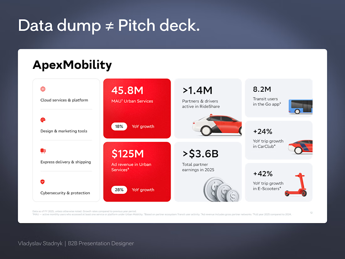

Commercial design does not build aesthetics. It engineers attention is a line worth saving. The ApexMobility example is brilliant, locking the key numbers into their own rigid containers so the buyer's focus gets hijacked before the brain even processes the details.


Little dude waiting at the bus station 🚌🚏
(Interaction animation) Made in Lottie Creator
📂 Go and try it out here!
The little dude waiting at the bus station is adorable, and making it interactive takes it from a cute loop to a real experience. Nice work with Lottie Creator.