The network for creativity
Join 1.25M professional creatives like you
Connect with clients, get discovered, and run your business 100% commission-free
Creatives on Contra have earned over $150M and we are just getting started
Back to feedPost

Nureeff.com — Personal Portfolio Site
Needed a portfolio that does the selling before I even open my mouth. Editorial magazine layout, oversized typography, warm orange palette — the kind of page you don't just scroll, you experience.
Three full language versions — English, Russian, and Arabic with proper right-to-left layout. Every element handcoded from scratch, no builders or templates involved.
PageSpeed: 97 mobile, 100 desktop.
If you're looking at this and thinking "I want my site to feel like that" — that's the whole point.


The network for creativity
Join 1.25M professional creatives like you
Connect with clients, get discovered, and run your business 100% commission-free
Creatives on Contra have earned over $150M and we are just getting started



Related posts

🎨 Brand and web design for Nura, the AI tool for real estate
See Case Study here


Amazing work


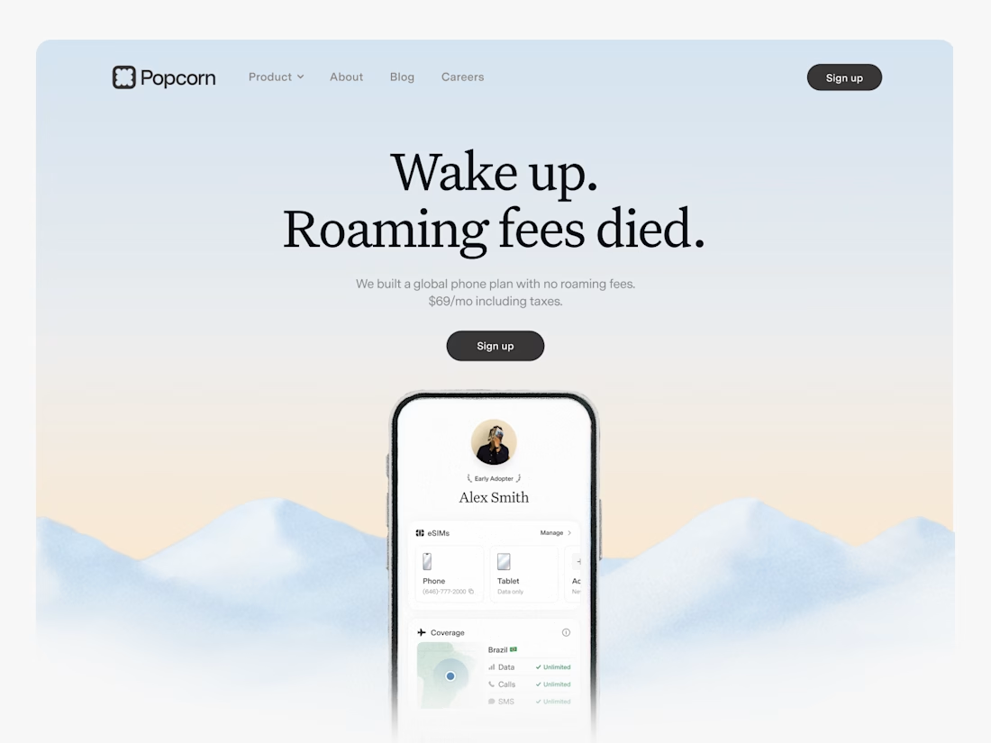

Looks great! What about readability though?
Text seems low contrast to me. Although I have a poor vision and most things seem too small and low contrast to me.
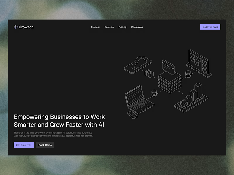
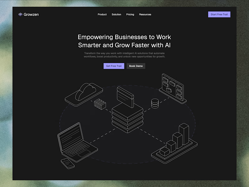
Designed a website concept for AI powered platform.
I wanted to give it a clean, minimal with a custom isometric illustration in the hero section.
Which version do you like better?
19 voted
59%
13 voted
41%
32 votes
Closed
