The network for creativity
Join 1.25M professional creatives like you
Connect with clients, get discovered, and run your business 100% commission-free
Creatives on Contra have earned over $150M and we are just getting started
Back to feedPost

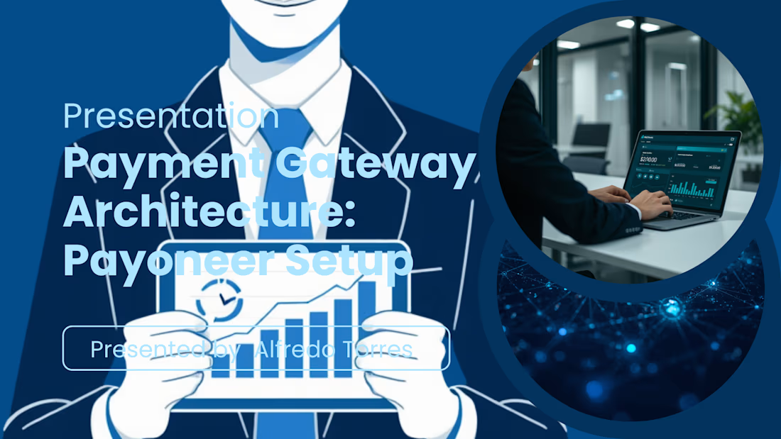
Global Payment Gateway Configuration & KYC Onboarding Verification for E-Commerce Sellers.
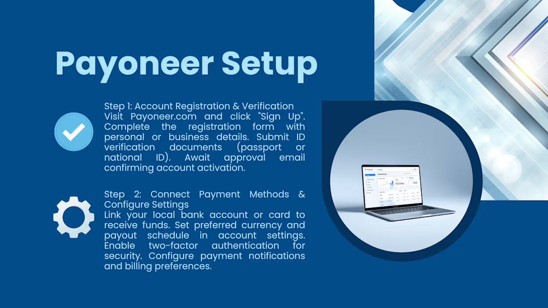
This technical blueprint outlines the exact procedures required to establish a secure cross-border payment gateway via Payoneer, minimizing the risk of funds being frozen or payouts being delayed.
Phase 1: Multi-Currency Balance Architecture
Configure receiving accounts for multiple global currencies including USD, GBP, and EUR.
Align automated transfer rules to streamline payouts from international market platforms directly into regional banking systems.
Phase 2: KYC Compliance & Document Auditing
Review and synchronize registration documentation to pass strict platform security and identity verification checkpoints on the first attempt.
Establish backup secondary payout parameters to maintain uninterrupted checkout workflows.



The network for creativity
Join 1.25M professional creatives like you
Connect with clients, get discovered, and run your business 100% commission-free
Creatives on Contra have earned over $150M and we are just getting started





Related posts

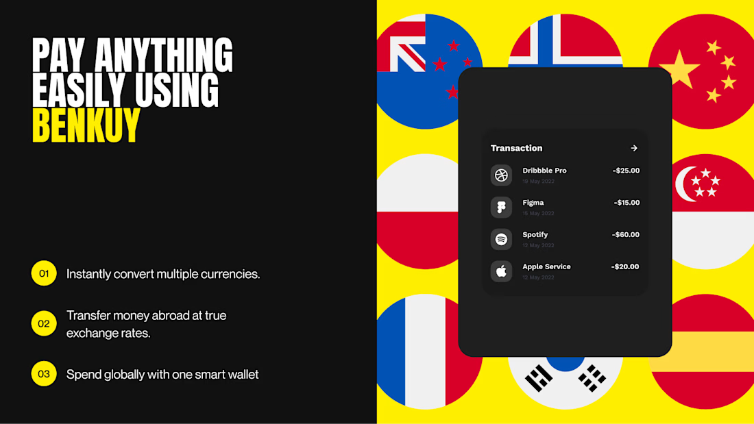
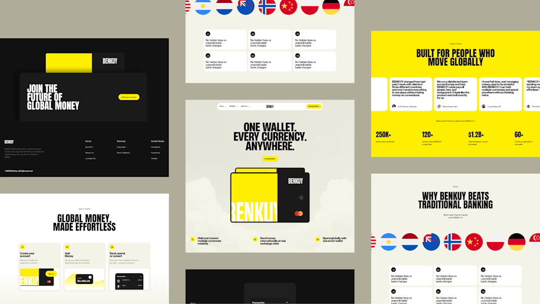
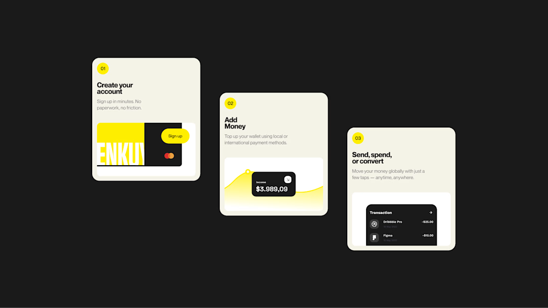
BENKUY - Finance Landing
Simplifies global money movement with one wallet for every currency. A bold, minimal interface combines clean layouts, strong typography, and vibrant accents to create a fast, modern, and seamless experience.
Want to create something like this?
Let's Talk!



That's unbelievable bro keep going 🔥🔥🔥


great work Gumus

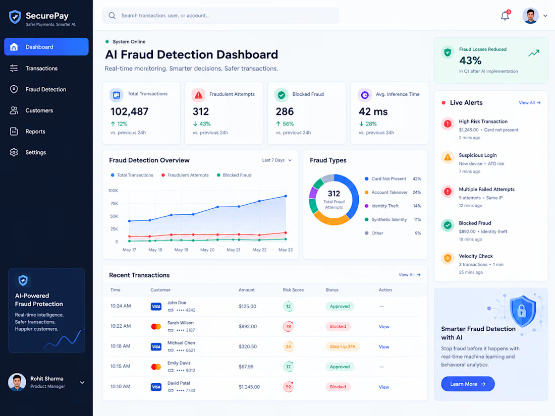
AI Fraud Detection: Real-Time Risk Engine
A digital payments startup processing over 100,000 daily transactions needed a high-throughput, low-latency AI fraud detection engine to intercept fraudulent charges, account takeovers (ATO), and identity theft in real time without creating friction for legitimate customers.
Key Challenges:
Reducing high false-positive rates that caused cart abandonment and user churn.
Evaluating complex behavioral features and payment metadata in under 60 milliseconds.
Adapting to rapidly shifting fraud tactics without requiring full model retraining.
Technical Implementation & Solution:
• Real-Time Feature Pipeline: Engineered an ultra-fast streaming pipeline using Apache Kafka, Redis, and FastAPI to compute transaction velocity and device fingerprints on the fly.
• Hybrid Machine Learning Architecture: Deployed an ensemble model combining XGBoost, Isolation Forests, and Graph Neural Networks (GNN) to uncover hidden mule-account rings.
• Explainable AI (XAI): Integrated SHAP values into the decision engine, providing compliance analysts with immediate human-readable reasons for flagged transactions.
• Automated Webhook Routing: Created dynamic webhooks to instantly trigger Step-Up 2FA, soft declines, or outright blocks based on real-time risk scores.
Results & Impact:
• Slashed fraudulent chargeback losses by 43% in the first quarter.
• Reduced false-positive transaction declines by 28%.
• Achieved sub-45ms average inference latency across peak payment volumes.