The network for creativity
Join 1.25M professional creatives like you
Connect with clients, get discovered, and run your business 100% commission-free
Creatives on Contra have earned over $150M and we are just getting started
Back to feedPost

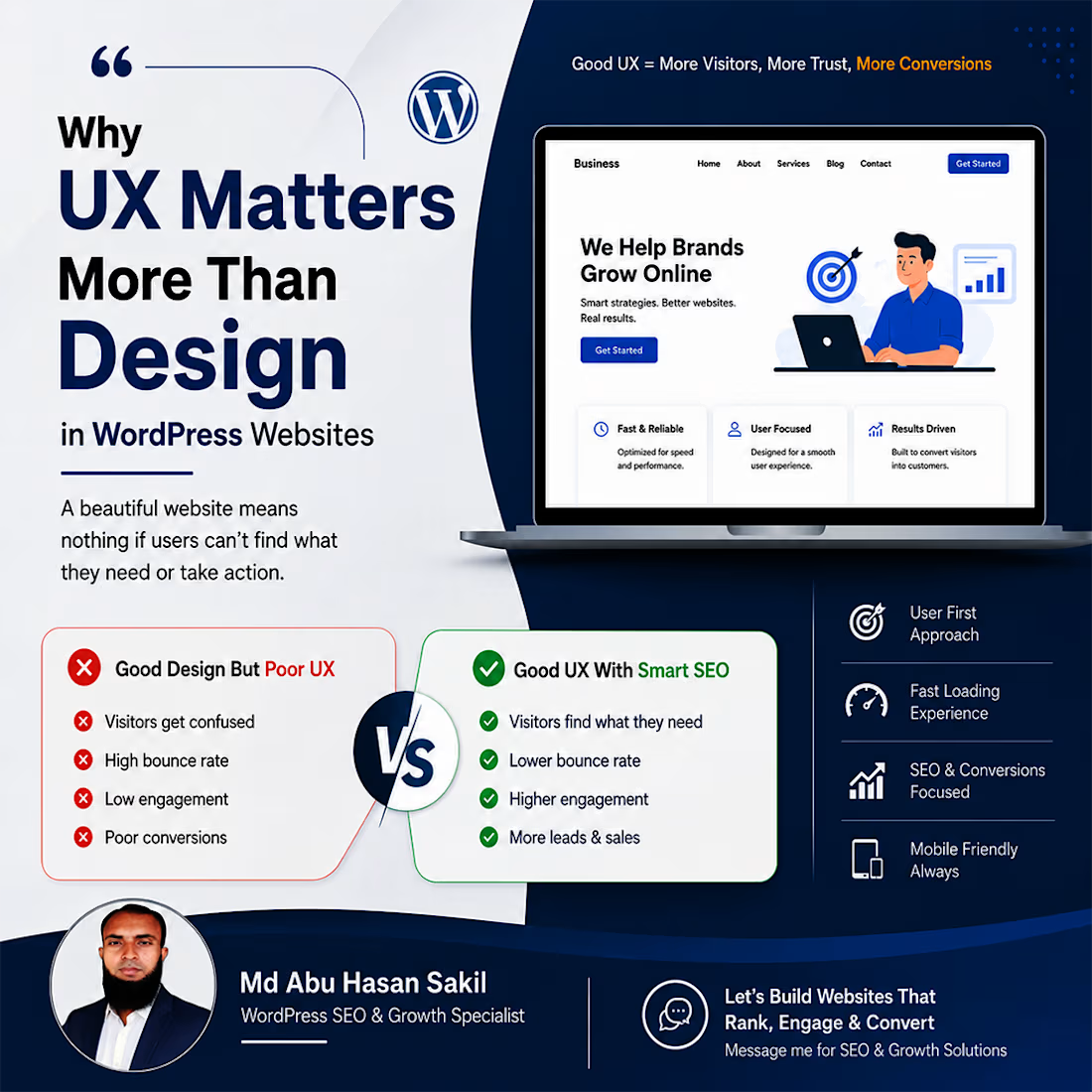
Why UX Matters More Than Design in a WordPress Website
A website can look great and still fail to turn visitors into customers.
From my experience working with WordPress and SEO, I’ve found that the real issue is often not the visual design—it's how easily people can use the website.
A strong WordPress website should help visitors quickly understand:
• What the business offers
• Where they should go next
• Why they should trust the business
• How they can take action
What I focus on
Clear website structure
Simple navigation and logical page structure make it easier for users and search engines to understand the website.
Search-focused content
Good UX should work alongside On-Page SEO — clear headings, useful content, proper internal linking, and content that matches search intent.
Speed & mobile usability
A beautiful website is not enough if it loads slowly or becomes difficult to use on mobile. WordPress performance and Core Web Vitals matter.
Conversion-focused experience
Clear CTAs, easy contact forms, trust signals, and a simple user journey can remove unnecessary friction.
One thing I’ve seen repeatedly: Good design gets attention. Good UX helps visitors understand, trust, and take action.
That’s why I believe UX should be considered part of the overall WordPress SEO and growth strategy—not something added after the website is designed.
If you're improving a WordPress website and want to discuss its SEO, UX, or performance, feel free to reach out.
Md Abu Hasan Sakil
WordPress SEO & Growth Specialist
#WordPress #WordPressSEO #TechnicalSEO #UX #WebsiteOptimization

The network for creativity
Join 1.25M professional creatives like you
Connect with clients, get discovered, and run your business 100% commission-free
Creatives on Contra have earned over $150M and we are just getting started





Related posts


Definitely the new one. Seems more fluid and easier to interact with

From problem to polished product.
I started by identifying the UX problems, then refined the same product through better structure, hierarchy, spacinga navigation, and interactions making the experience clearersimpler, and easier to use.
1 voted
50%
1 voted
50%
2 votes
Closed

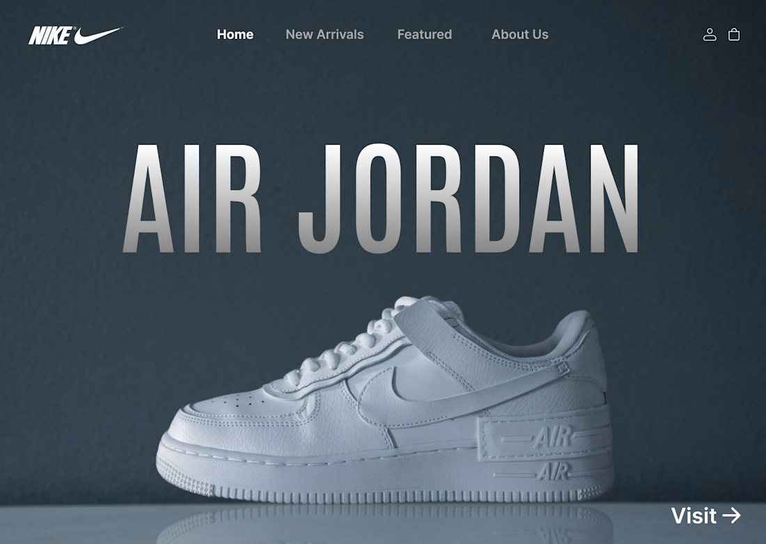
I designed a clean, minimalist e-commerce concept for Nike centered around the iconic Air Jordan series. The goal was to create a bold, modern hero section that instantly grabs attention while keeping the navigation effortless for shoppers.
Key Highlights:
Hero Visual: Featured high-resolution shoe imagery paired with bold display typography.
Minimal Layout: Dark, muted color scheme that makes the product pop without visual noise.
Streamlined UI: Essential navigation tabs paired with a direct CTA for seamless user flow.
#UIDesign #UXDesign #Figma #WebDesign #NikeConcept #LandingPage #DesignShowcase #UXUI #ECommerceDesign