The network for creativity
Join 1.25M professional creatives like you
Connect with clients, get discovered, and run your business 100% commission-free
Creatives on Contra have earned over $150M and we are just getting started
Back to feedPost

What I Built: Vanguard & Co. — Law Firm Landing Page
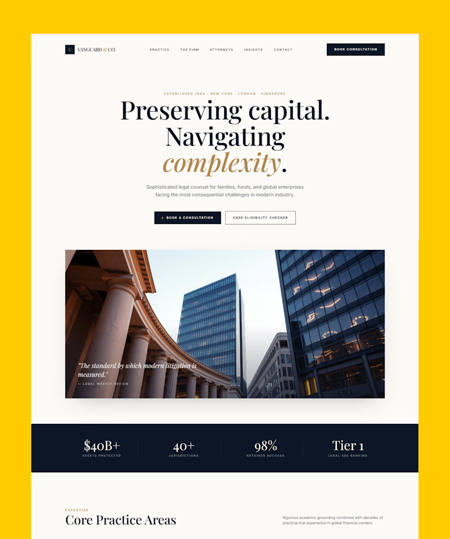
I built Vanguard & Co., a premium law firm landing page created with Lovable AI. The website is designed to establish trust, communicate legal expertise, and guide high-value clients toward booking a confidential consultation.
Premium Legal Website Design: A refined editorial layout, elegant serif typography, deep navy tones, and warm gold accents create a sophisticated visual identity for a global boutique law firm.
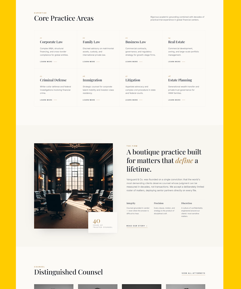
Clear Practice Areas: The site presents corporate law, litigation, real estate, estate planning, criminal defense, immigration, family law, and business law in a structured, easy-to-navigate experience.
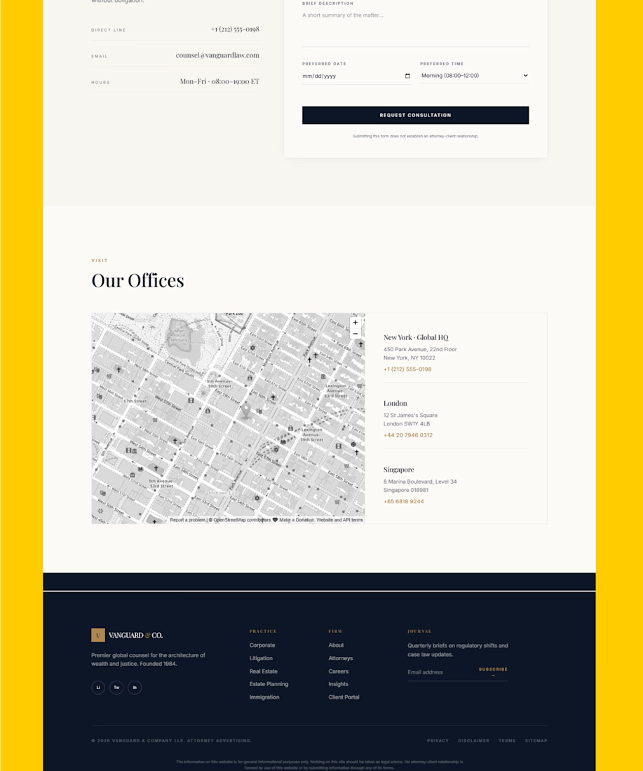
Conversion-Focused UX: Strategic calls to action, consultation booking, case eligibility checking, modern intake tools, and attorney matching help turn visitors into qualified inquiries.
Trust-Building Content: Attorney profiles, client outcomes, firm values, testimonials, global locations, and a clear engagement process reinforce credibility and professionalism.
Modern Legal Intake: The landing page combines traditional legal authority with digital tools such as an AI intake assistant, eligibility checker, fee estimator, and smart attorney matching.
Why I Built It
I wanted to create a law firm website that feels authoritative without becoming intimidating. The goal was to combine premium editorial web design with a clear user journey, making it easy for families, funds, global enterprises, and high-value clients to understand the firm and request legal counsel.
The Lovable AI Challenge: I wanted to explore how far Lovable AI app development, prompt-to-app building, and AI-assisted web design could go when creating a polished, responsive, conversion-focused legal website without traditional coding.
#Lovable #LovableAI #LovableBuild #LovableApp #LovableCommunity #AIWebDesign #NoCode #PromptToApp #LawFirmWebsite #LegalWebsiteDesign #WebDesign #UIDesign #UXDesign #LandingPageDesign #ResponsiveWebDesign #ConversionFocusedDesign #ContraCommunity


The network for creativity
Join 1.25M professional creatives like you
Connect with clients, get discovered, and run your business 100% commission-free
Creatives on Contra have earned over $150M and we are just getting started





Related posts




Option B feels nothing but premium




Which hero visual feels right for this brand?
While working on the homepage for Halfspace, a website design and SEO agency, I explored two different hero visuals for the same headline and layout. Same message, same structure, just a different visual metaphor and mood.
Option 1 - Rocket Launch. Bold, literal, and energetic, visually reinforcing the "launch your business" message with motion and fire.
Option 2 - Glass Cube. Abstract, sleek, and premium, giving a more refined, tech-forward feel without relying on a literal metaphor.
Would love your honest UX/UI take, which direction feels more impactful, memorable, and aligned with a web design/SEO brand, and why?
11 voted
41%
16 voted
59%
27 votes
Closed

Both design are great; it's hard to choose one