The network for creativity
Join 1.25M professional creatives like you
Connect with clients, get discovered, and run your business 100% commission-free
Creatives on Contra have earned over $150M and we are just getting started
Back to feedPost

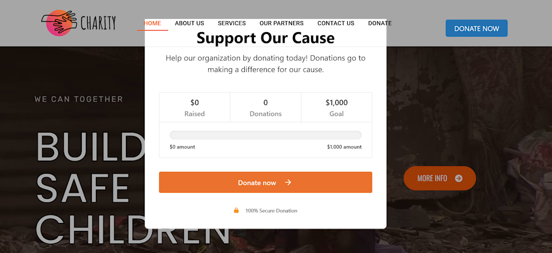
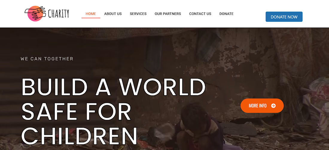
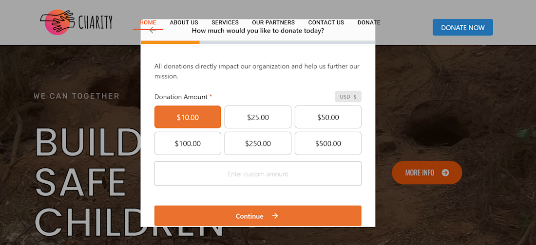
A responsive WordPress concept and layout prototype engineered to demonstrate clean UI development for rapid-response crisis management. This platform features a three-column service grid designed to highlight targeted relief initiatives for vulnerable demographics, including women and children affected by environmental emergencies.
Key Layout Elements Implemented:
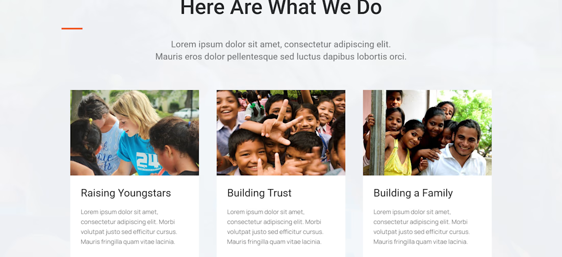
Strategic Information Architecture: Structured an intuitive "Here Are What We Do" content hierarchy with placeholder data matrices to preview full production text flows.
Multi-Card Service Grid: Engineered a clean, responsive layout grid grouping target impact sectors (Youth, Advocacy, and Support Frameworks) with consistent image boundaries and typography alignments.
Adaptive Elementor Styling: Implemented micro-interactions and custom container margins to guarantee fluid layout behavior across desktop and mobile screens.


The network for creativity
Join 1.25M professional creatives like you
Connect with clients, get discovered, and run your business 100% commission-free
Creatives on Contra have earned over $150M and we are just getting started

Challenges
View all


Related posts


Just completed this Webflow website project for CT Moving & Storage
The goal was to make the website feel trustworthy, easy to navigate, and simple for customers who need moving, packing, or storage services.
I focused on clear service sections, strong customer reviews, location-based pages, responsive design, and a smooth quote-request journey that helps visitors move from searching to taking action.
I’d love to hear your thoughts, does the website give you the confidence you’d want before trusting a company with your move?
#Webflow #WebDesign #WebflowDesigner #UIDesign #UXDesign #WebDevelopment #MovingCompany #LocalBusiness #ResponsiveDesign #WebsiteDesign #PortfolioProject #Contra


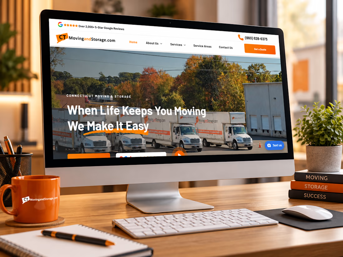

This is a masterclass in design execution. The concept is strong, the presentation is polished, and the visual hierarchy is incredibly well handled. Excellent work from start to finish.

Landing page for TryDoxy, a startup built to make PFE reports easier to create and finish. A powerful editor combining HTML, Markdown, PlantUML, Mermaid, ECharts, and more in one place.


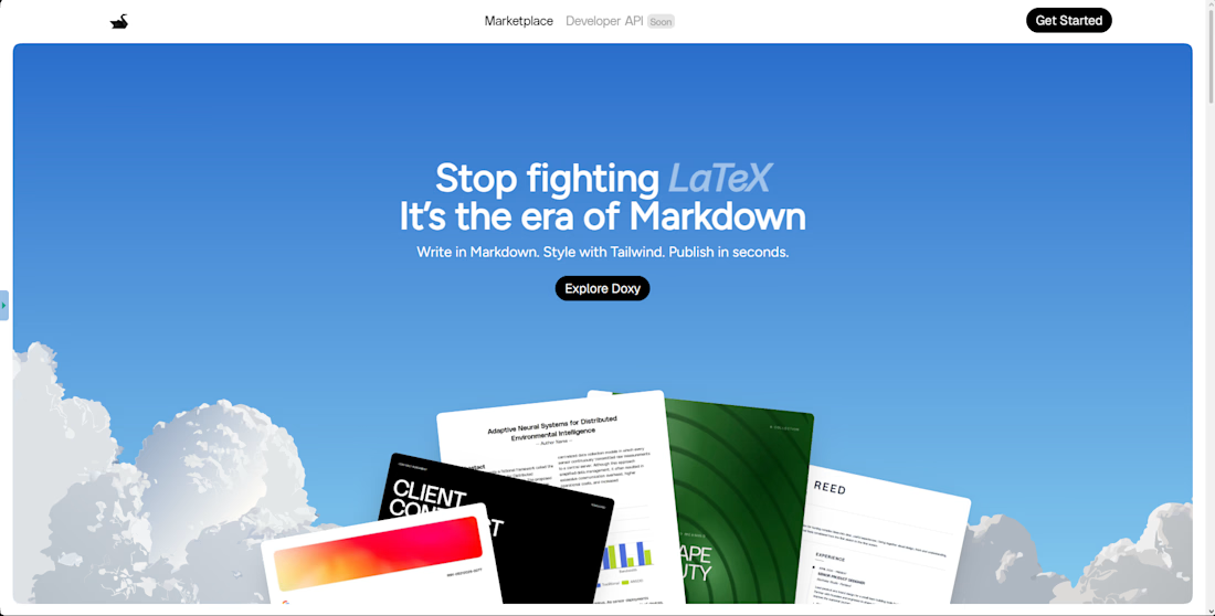
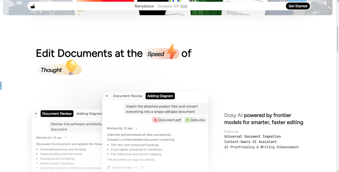
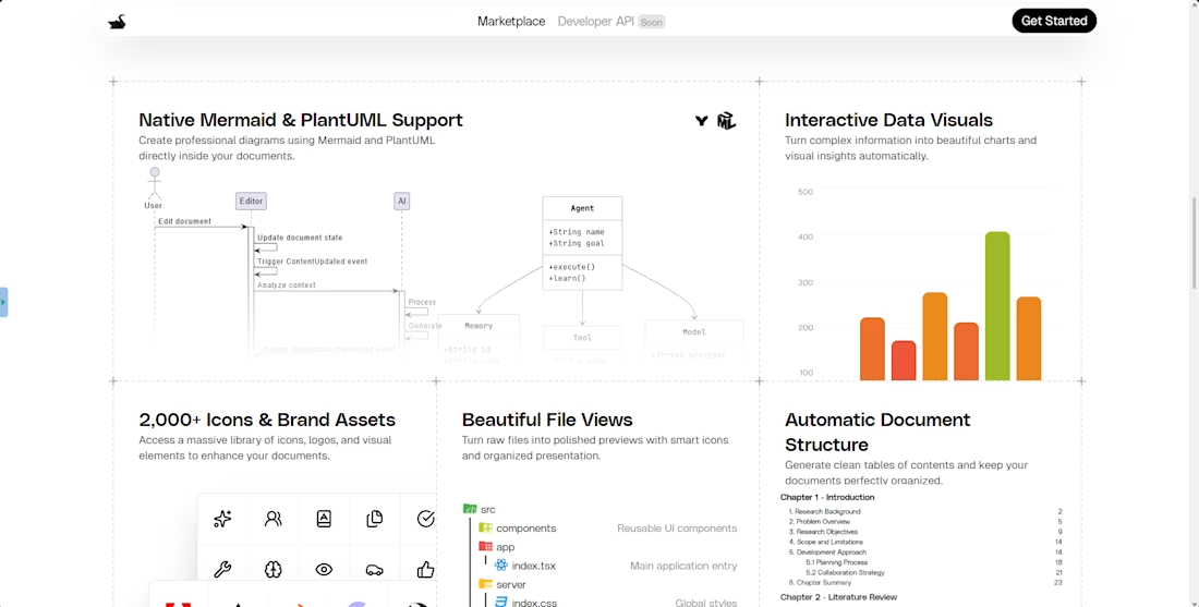

For a report editor, I’d want to see one finished PDF alongside the editing view. Especially with diagrams and charts, the exported result matters as much as the editor UI.


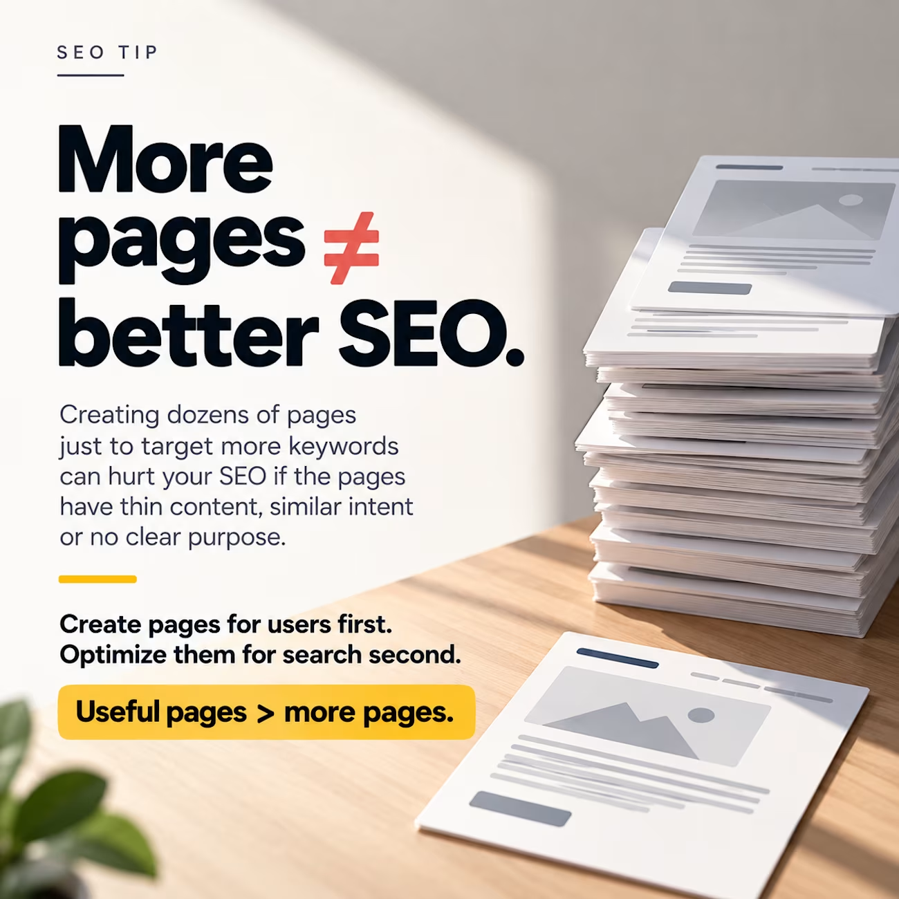
More pages ≠ better SEO.
A common mistake is creating dozens of pages just to target more keywords.
But if those pages have:
– Thin content
– Similar intent
– Little unique value
– No clear purpose
They can make your site harder to manage and harder for search engines to understand.
Before creating a new page, ask:
“Does this deserve its own page?”
Create pages for users first.
Optimize them for search second.
Useful pages > more pages.
#seo #seotips #technicalseo #wordpress #webdevelopment #contra

Absolutely agree. SEO isn’t about publishing more pages—it’s about creating genuinely useful pages that satisfy search intent and provide unique value. Quality and purpose should always come before quantity.