The network for creativity
Join 1.25M professional creatives like you
Connect with clients, get discovered, and run your business 100% commission-free
Creatives on Contra have earned over $150M and we are just getting started
Back to feedPost


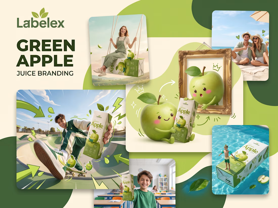
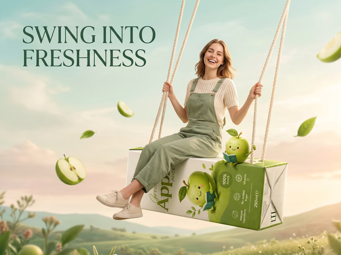
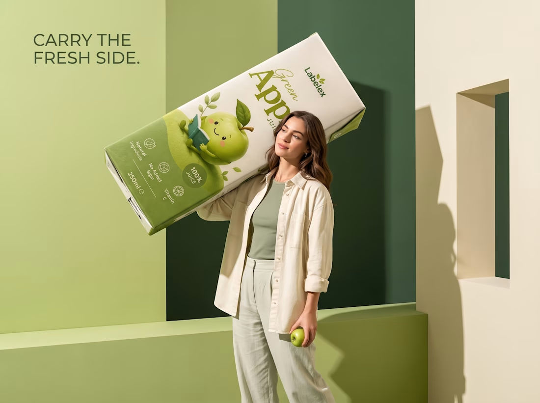
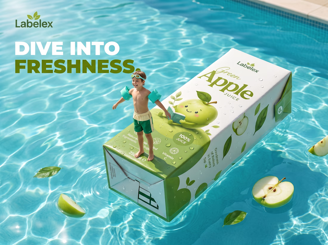
Green Apple Juice — Label Packaging Design & Branding
A fresh and modern Green Apple Juice label, packaging, and branding project created with a clean, natural, and premium visual direction.
The identity combines refreshing green tones, warm cream shades, elegant typography, organic apple-inspired graphics, and a cohesive packaging system designed to create strong shelf presence and brand recognition.
The project explores the complete visual experience of a contemporary beverage brand—from label and carton packaging design to brand identity, product presentation, and campaign applications.
#GreenAppleJuice #PackagingDesign #LabelDesign #JuicePackaging #BeverageBranding #BrandIdentity #ProductPackaging #FMCGBranding #GraphicDesign


The network for creativity
Join 1.25M professional creatives like you
Connect with clients, get discovered, and run your business 100% commission-free
Creatives on Contra have earned over $150M and we are just getting started







Related posts

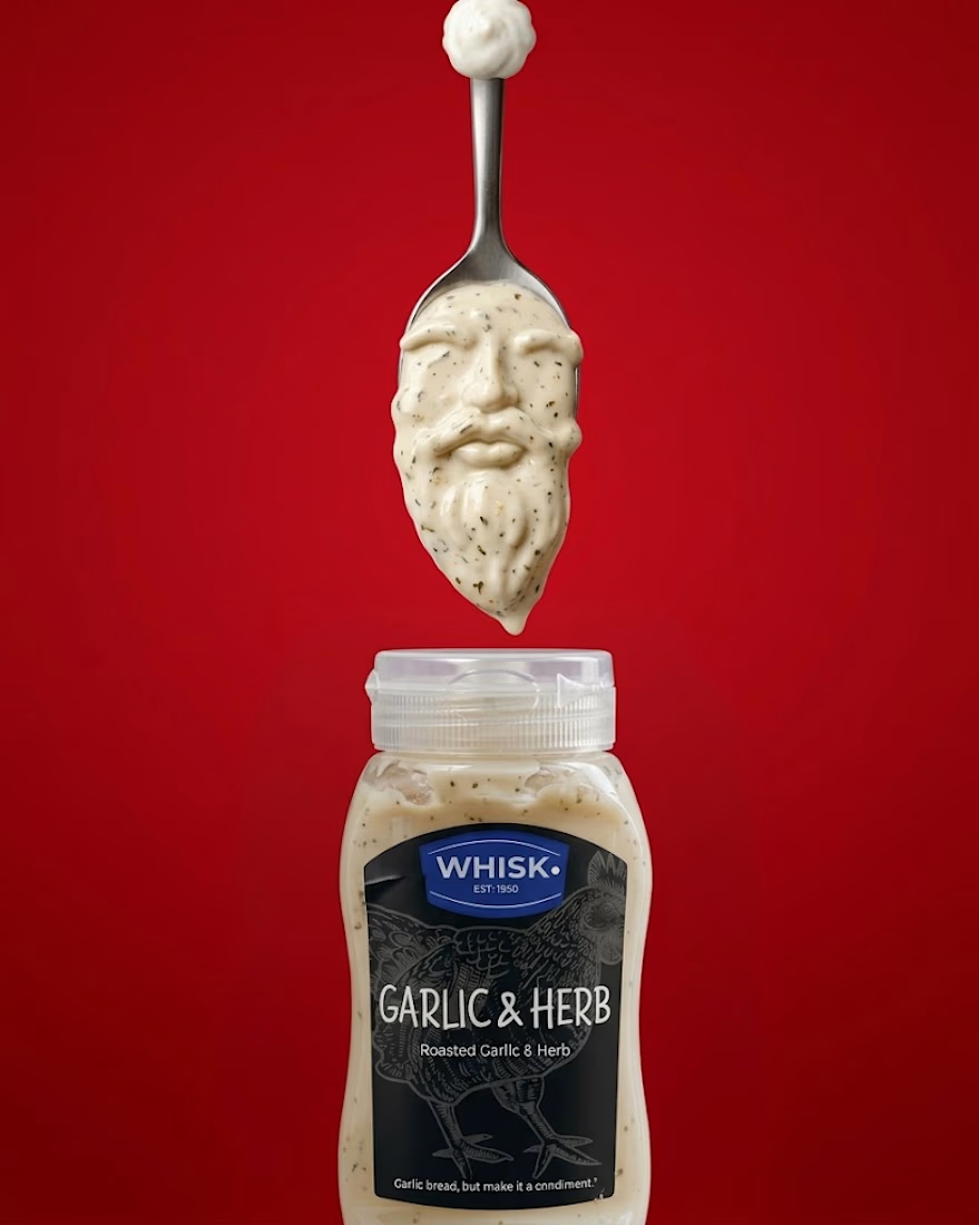
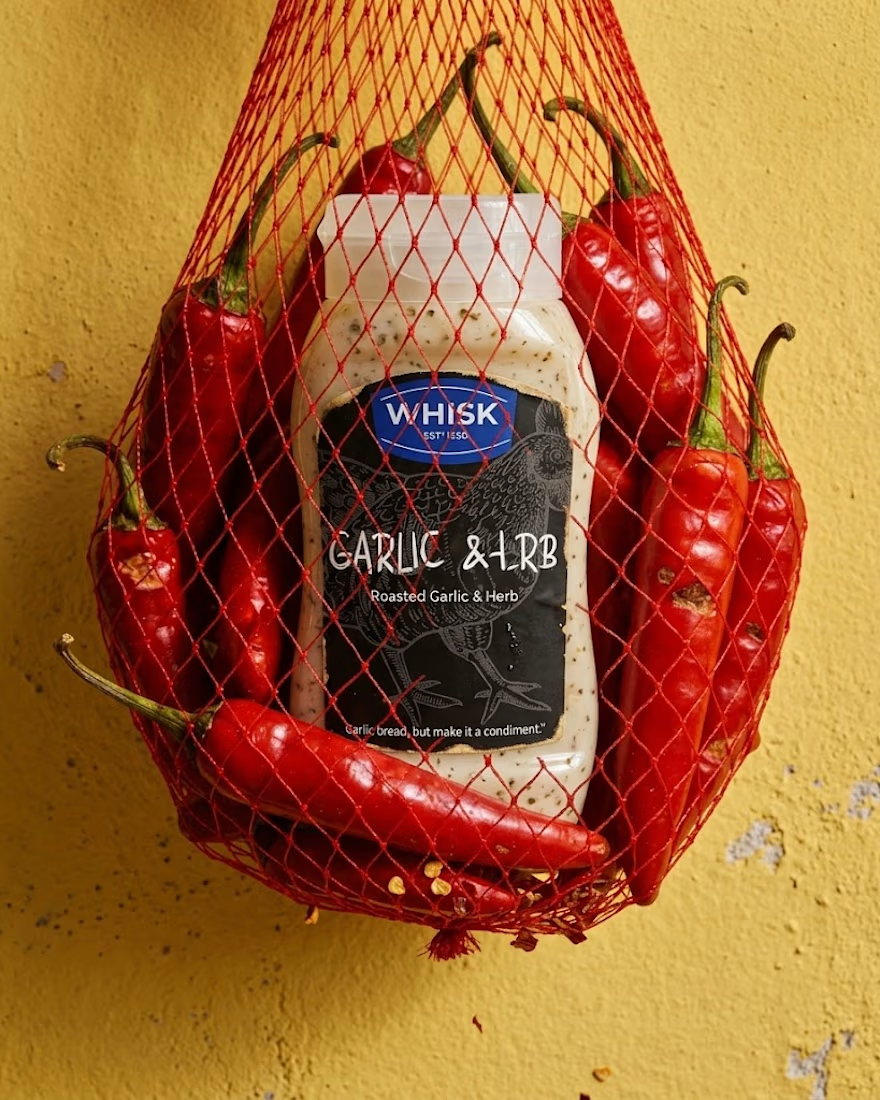
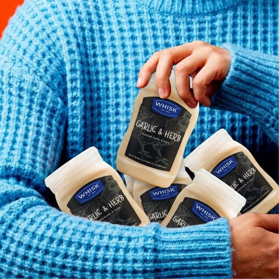
Real eggs. No apologies 🥚
Spent the past week designing WHISK, an artisan mayonnaise brand built on one idea: even the most overlooked item in the fridge deserves a brand that takes it seriously.
No squeeze bottle, no label built to disappear into the shelf. Just a glass jar, a short ingredient list, and four flavors told apart by one accent color each. Classic, garlic and herb, smoked chili, vegan. 🫙
Sometimes the boldest thing a condiment can do is be particular about itself.


The animation looks top tier! Nice work

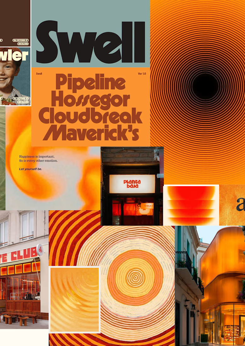
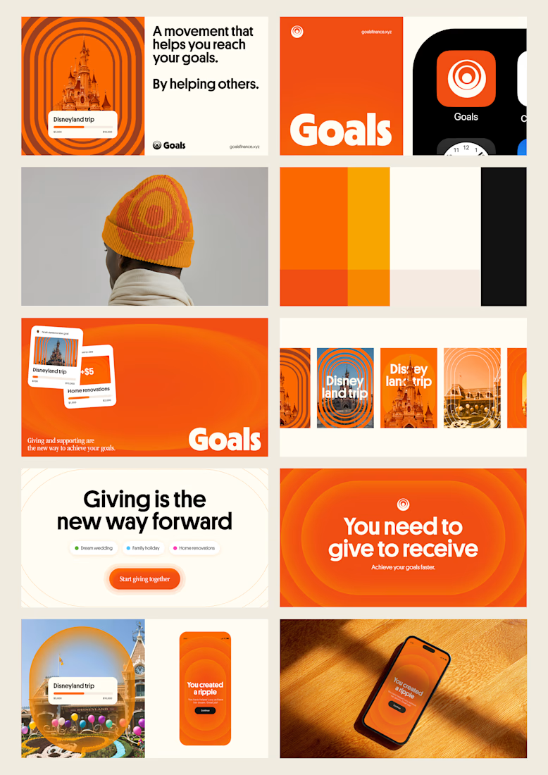
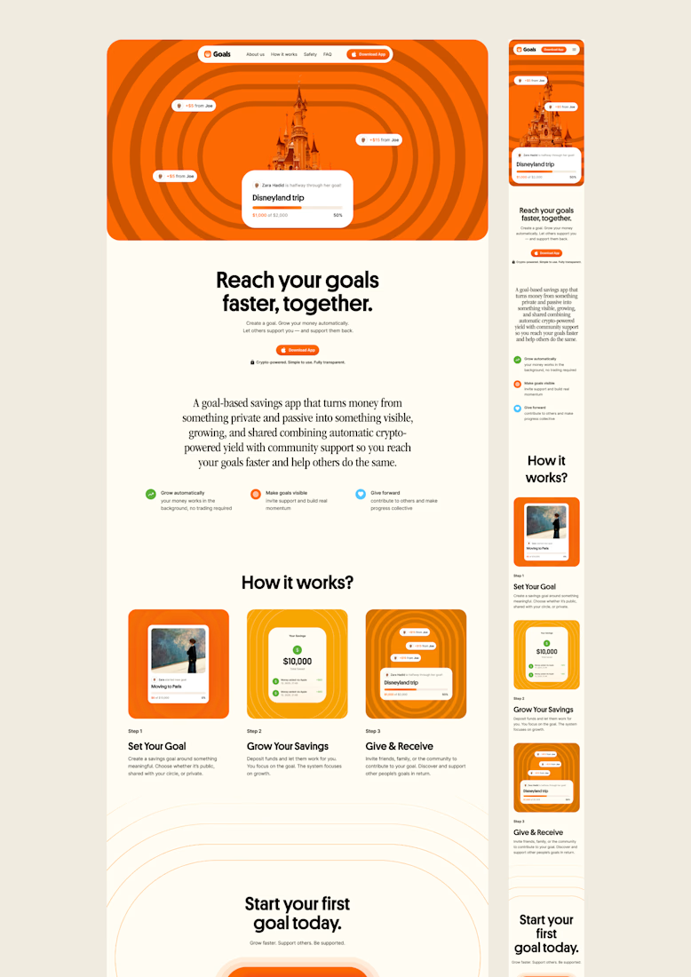
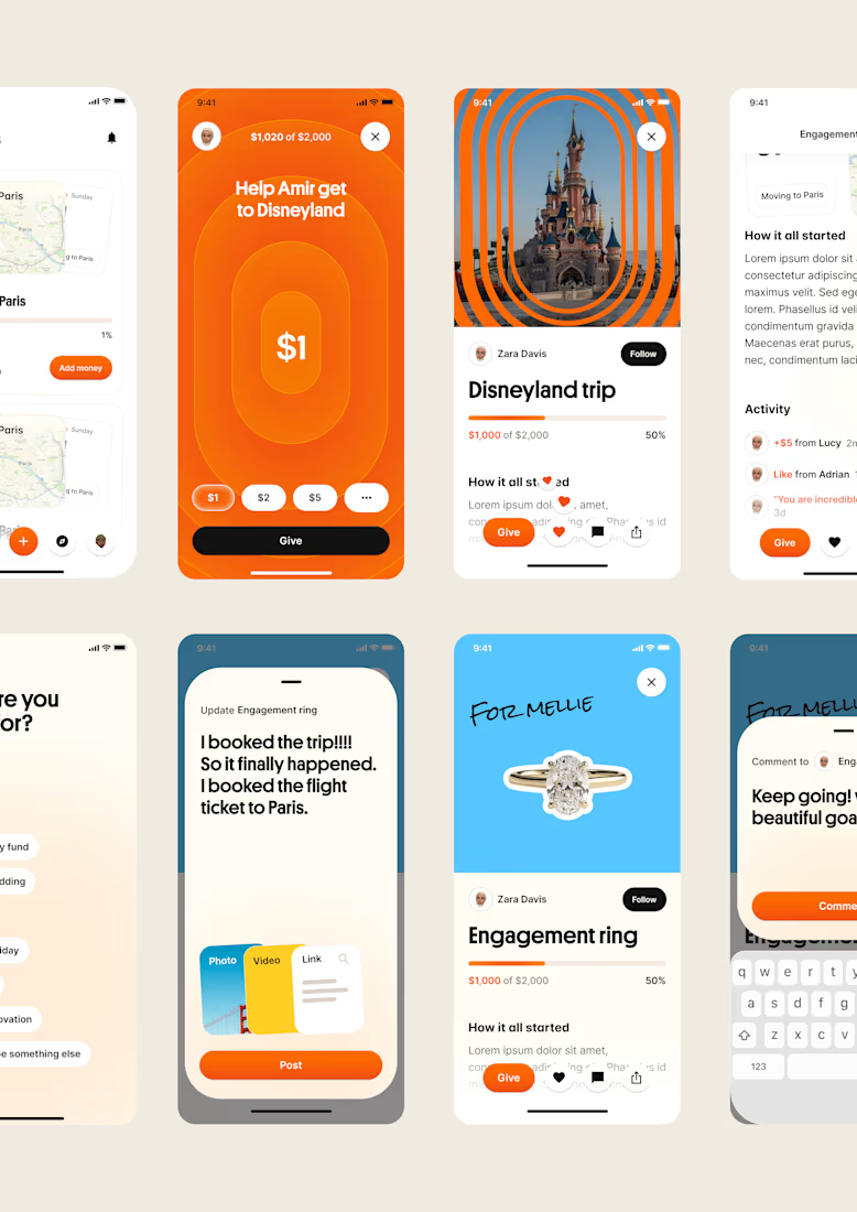
one of my favourite things about running a one-person studio is that nothing gets lost in translation.
the idea behind the brand is the same idea that shapes the website and the product.
no handovers, no starting from scratch, no trying to explain the vision to someone new.
a little look at how that came together for goals, from the first moodboard to the app ↓

Love it!

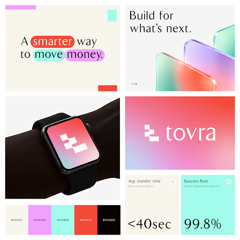
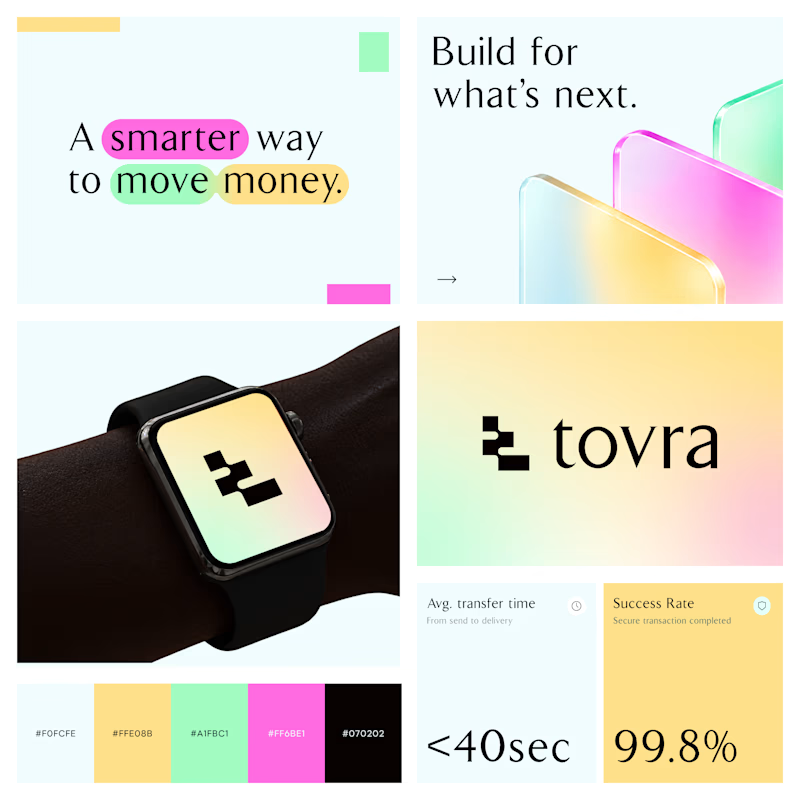
Two Color Directions. One Brand Identity.
Exploring two visual directions for Toyra, a modern fintech brand focused on making money movement smarter and simpler.
Both concepts feature bold typography, vibrant colors, playful gradients, and a clean visual identity.
Which color direction works better for Brand Option A or Option B? 👀
19 voted
40%
29 voted
60%
48 votes
Closed
