The network for creativity
Join 1.25M professional creatives like you
Connect with clients, get discovered, and run your business 100% commission-free
Creatives on Contra have earned over $150M and we are just getting started
Back to feedPost

I don’t like presentations that feel like nothing more than a collection of numbers, charts, and text.
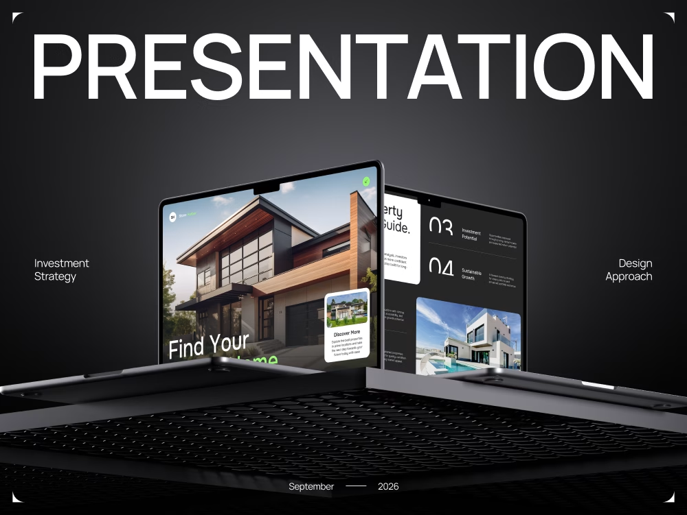
Recently, I completed a new case study – a real estate investment presentation focused on turning complex investment information into a clear and visually cohesive story.
For this project, I focused on:
🔸 Structuring a large amount of information
🔸 Creating a clear visual hierarchy
🔸 Developing a consistent visual language throughout the presentation
🔸 Balancing a strong investment-focused style with modern design
For me, good presentation design isn’t just about making slides look beautiful. It’s about making it easy for people to understand the idea, see the value, and remember what matters most.
The full case study is now available on Behance. I’d love to hear what you think.
https://www.behance.net/gallery/254613337/Real-Estate-Investment-Presentation?platform=direct


The network for creativity
Join 1.25M professional creatives like you
Connect with clients, get discovered, and run your business 100% commission-free
Creatives on Contra have earned over $150M and we are just getting started

Challenges
View all


Related posts

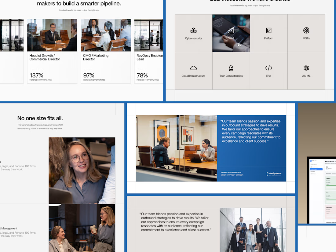
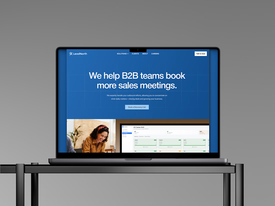
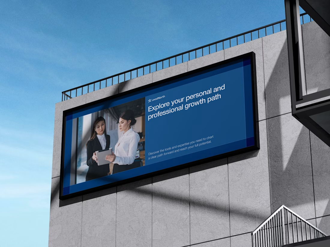
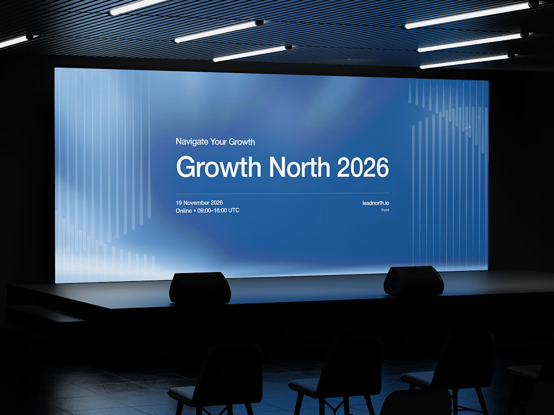


That saturated cobalt blue carries cleanly from the laptop hero onto the outdoor billboard and the Growth North 2026 stage screen.

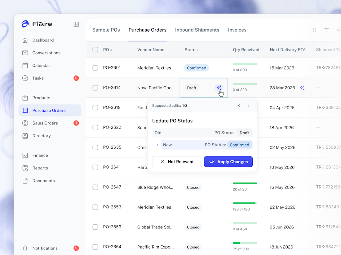
✨ AI Suggestions on the Purchase Orders list. Proposed record edits surface inline for the user to apply or dismiss in one tap.



Great work

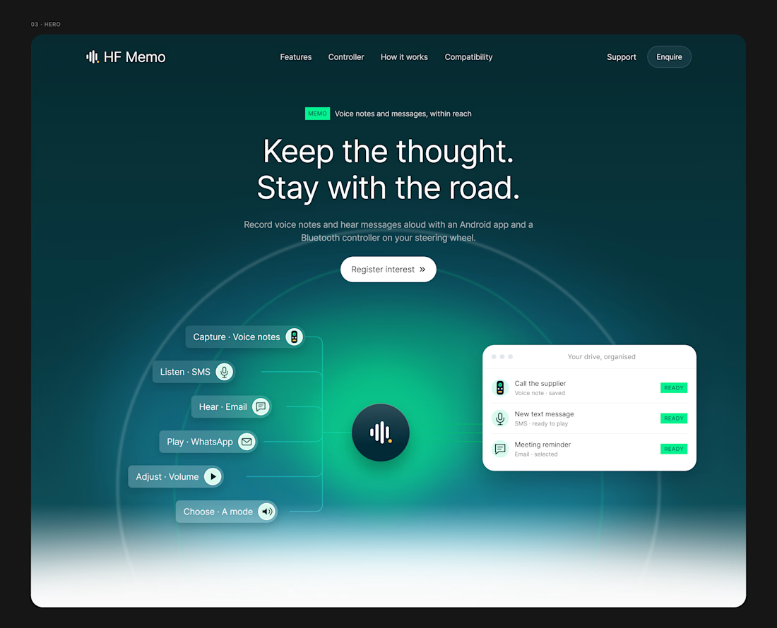
A website should make the product easy to understand.
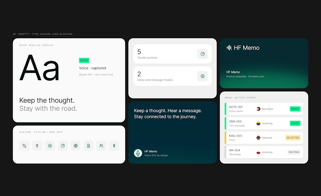
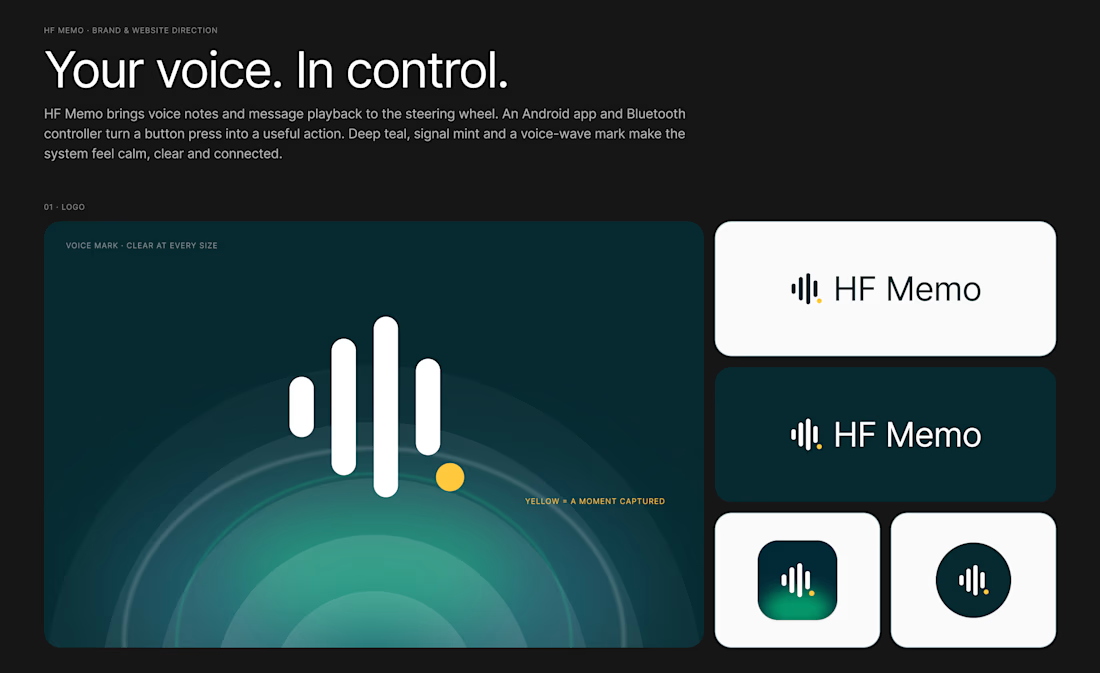
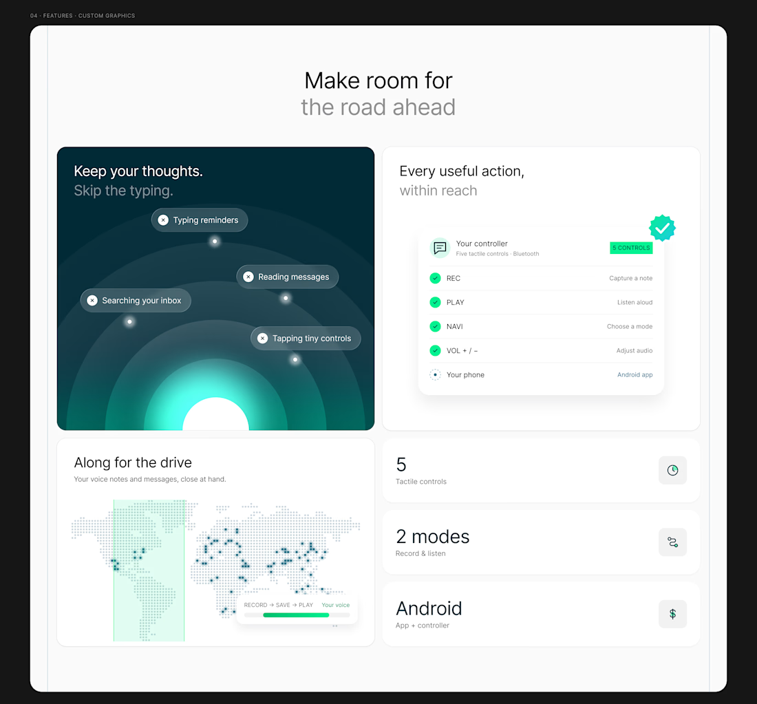
My latest redesign concept explores a new direction for HF Memo—an Android app and Bluetooth controller for recording voice notes and hearing messages aloud.
I focused on showing the experience: capture a thought, replay a recording, and understand what each controller button does.
Clean typography, light backgrounds, and lime accents give the product room to tell its story.
Designed in Figma, with editable layouts and custom graphics.
Have a product that needs a clearer website? Let’s connect.
#webdesign #uidesign #figma #productdesign