The network for creativity
Join 1.25M professional creatives like you
Connect with clients, get discovered, and run your business 100% commission-free
Creatives on Contra have earned over $150M and we are just getting started
Back to feedPost

Bold and Blunt — Elite Marketing Agency Website
A premium, animation-driven marketing agency website built for Bold and Blunt. Designed to feel cinematic and high-end, with scroll-driven animations, a horizontal campaign showcase with embedded YouTube video modals, and a fully integrated contact form with branded transactional emails.
Tech Stack:
Framework: Next.js 15 (App Router) + React 19
Language: TypeScript
Styling: Tailwind CSS
Animations: GSAP (ScrollTrigger) + Framer Motion
Smooth Scrolling: Lenis
Email: Resend API (branded HTML templates)
Forms: React Hook Form + Zod validation
Deployment: Vercel
Key Features:
Cinematic hero with staggered 3D word-by-word text reveal
Scroll-driven horizontal campaign carousel with YouTube video modals
GSAP-powered parallax logo with blur and opacity transitions
Scroll-reactive chromatic background that shifts palette per section
Dual branded email system — team notification + submitter confirmation
Custom font integration (Neusharp-Bold)
Fully responsive, dark theme with gold accent design system
Privacy policy page, social links, and contact form with validation
Live: https://theboldblunt.com


The network for creativity
Join 1.25M professional creatives like you
Connect with clients, get discovered, and run your business 100% commission-free
Creatives on Contra have earned over $150M and we are just getting started








Related posts

How can branding make people feel part of a community?
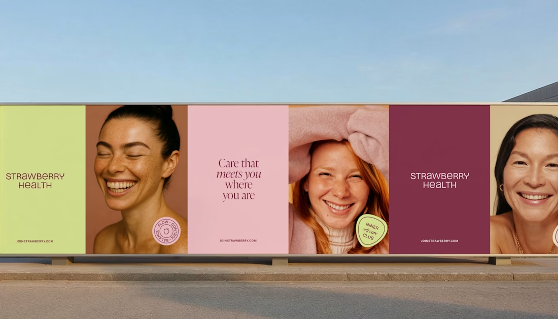
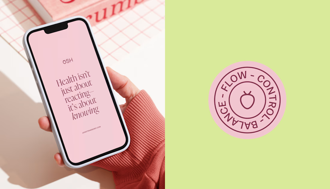
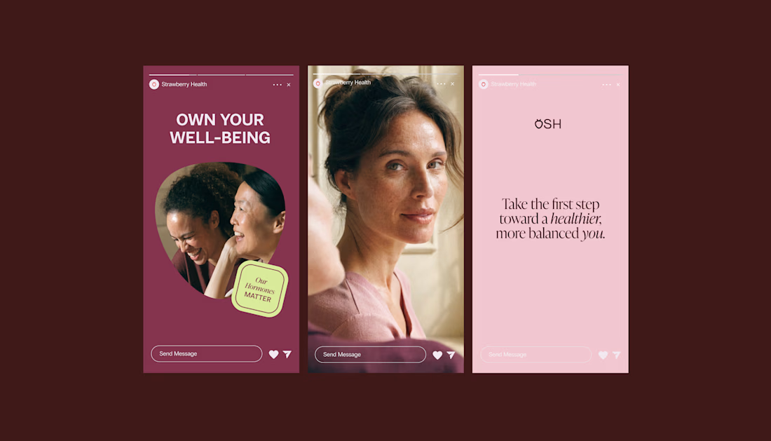
When working on Strawberry Health, we explored how visual identity could make women’s health feel more approachable and collective.
One of the ways was through supporting brand elements: stickers, badges and phrases that could live beyond the logo and become expressions of belonging.
These elements turned the identity into something people could interact with, share and make their own.
It’s a small detail, but I think it’s an important part of building brands around communities: the identity shouldn’t only identify the brand. It should give people something to identify with.
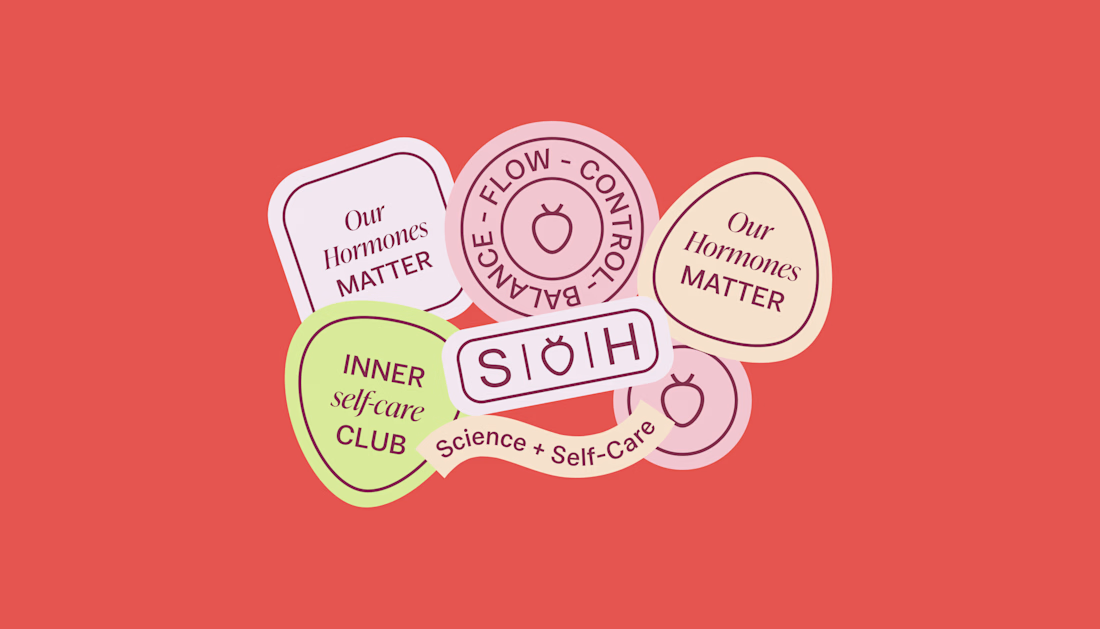

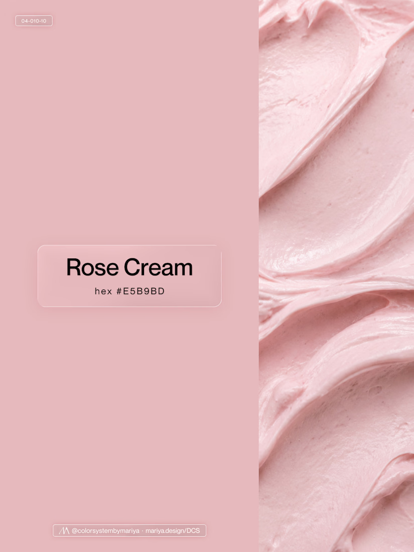
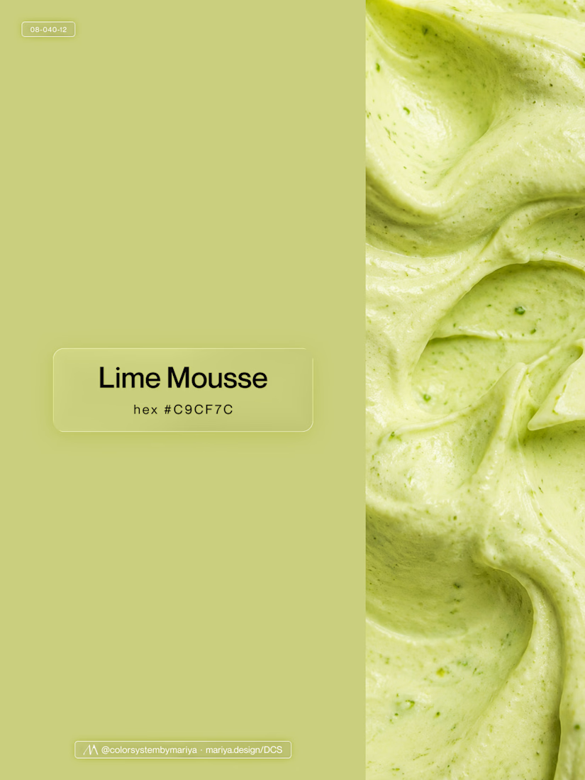
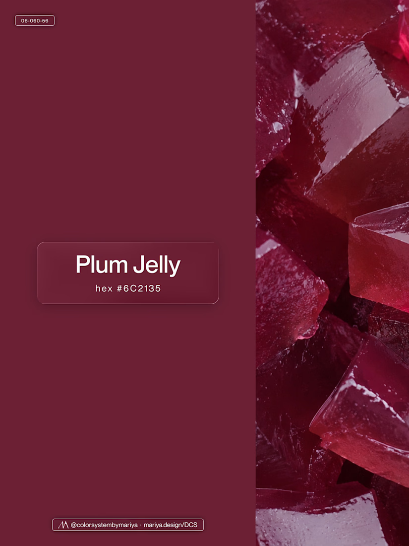
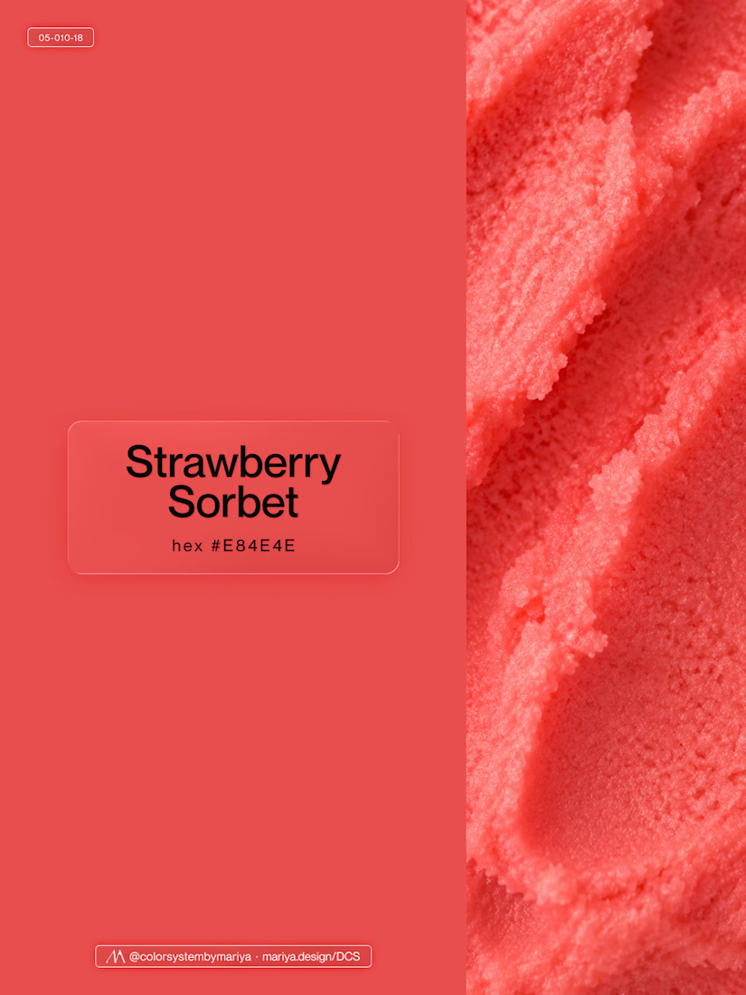
Love, love, love the colors. My mind goes: Rose Cream, Lime Mousse and Plum, hmmmm, which Plum... Plum Jelly. And of course, Strawberry Sorbet.
Let me match the vibe using my delicious swatches 😊


How fast can a template get without changing a single pixel?
⠀
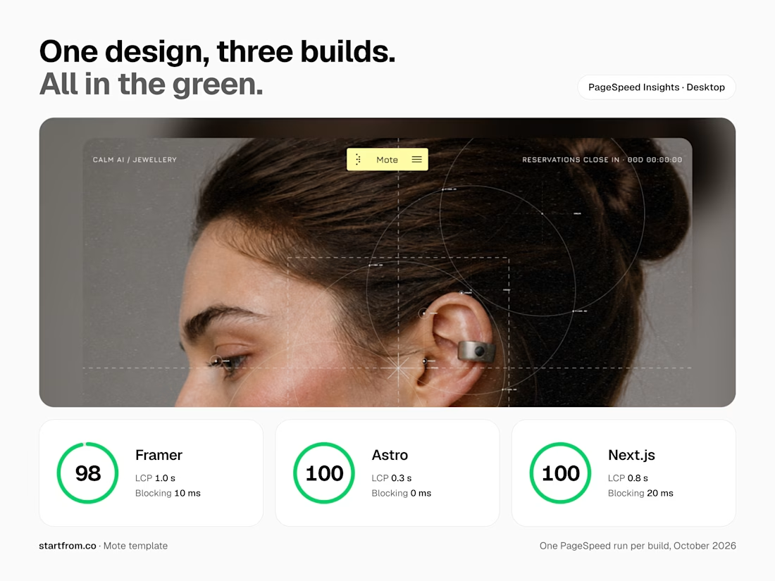
We just optimized 11 of our templates in Framer, Astro and Next.js. The rule was simple: nothing visible changes, only how things load.
⠀
What we changed: CSS inside the page, fonts from our own domain instead of Google Fonts, WebP images with phone-sized copies, videos that load when you scroll near them, heavy videos re-encoded without visible loss (one template went from about 20 MB of video to 2.4 MB), WebGL that starts near the screen, and analytics after the page. Every page was checked pixel by pixel at three widths before and after.
⠀
Mobile PageSpeed now, Astro / Next.js:
Sunbeam 100 / 100
Auria 100 / 96
Lapse 97 / 98, up from 64 / 66
Parley 97 / 94
Nova Quinn 93 / 92 ⠀
On desktop, Mote scores 98 in Framer and 100 in Astro and Next.js.
More posts on the individual fixes coming.



Nothing visible changes, only how things load is such a good rule. Speed work like this is underrated, buyers feel it even if they can't see it.


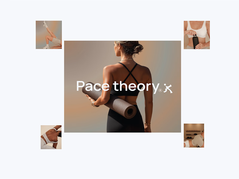
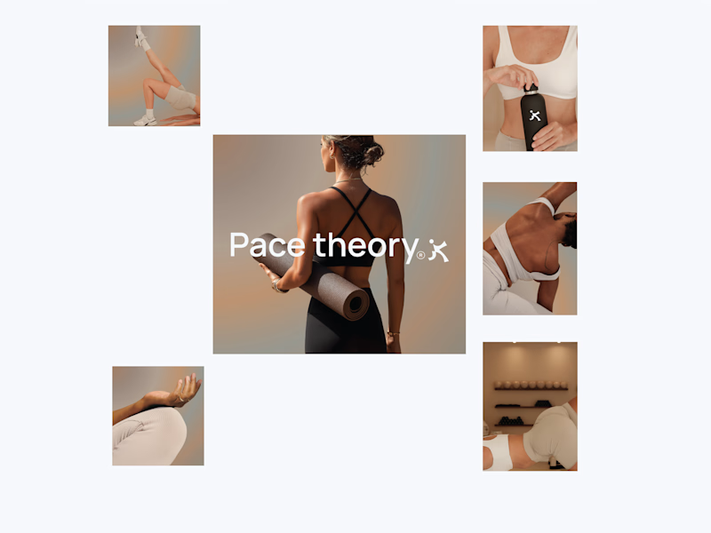
Working on a new brand project: Pace Theory. ✦
Exploring two different directions for the visual identity and brand presentation.
Which variation do you prefer — Left or Right? 👀
I’d love to hear your thoughts on the layout, composition, and overall brand feel.
Drop your pick in the comments 👇

5 voted
33%
10 voted
67%
15 votes
Closed

Left variation is more practical ❤️
great job Shivan🔥🔥