The network for creativity
Join 1.25M professional creatives like you
Connect with clients, get discovered, and run your business 100% commission-free
Creatives on Contra have earned over $150M and we are just getting started
Back to feedPost

Same watch store. Three completely different moods.
I designed Chrono, a concept watch brand, with one idea in mind: every watch should have its own world.
Click Platinum, and the page turns cool and clean. Click Gold, and it warms up to deep green and cream. Click Black, and everything goes sharp and minimal.
What went into the brand:
A simple watch-face logo mark
A color palette built around each product
Bold, clean typography that stays readable at a glance
A circular layout that frames each watch like a spotlight
Interactive thumbnails so visitors can switch between watches in one click
Great brand design makes people feel something before they read a single word.
Working on a brand that needs its own personality? Send me a message. I'd love to help.
Short version
One brand. Three moods.
Meet Chrono, my concept watch brand. Each watch gets its own colors, its own energy, and its own spotlight, all in one interactive page.
Brand design should make people feel something before they read a word.


the page changing mood per watch is a really nice touch
The network for creativity
Join 1.25M professional creatives like you
Connect with clients, get discovered, and run your business 100% commission-free
Creatives on Contra have earned over $150M and we are just getting started





Related posts

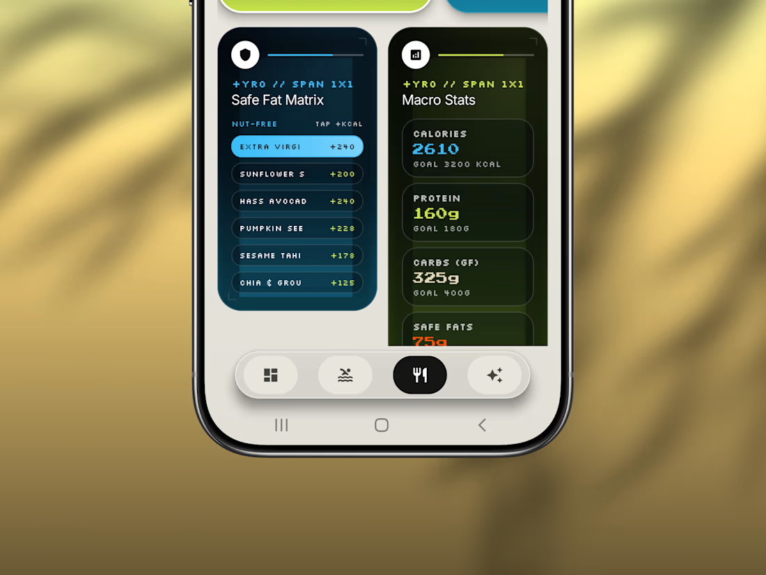
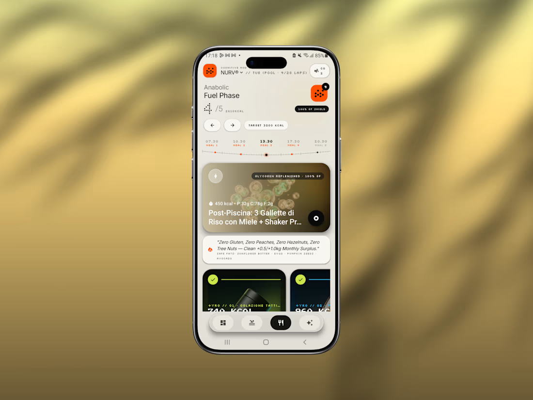
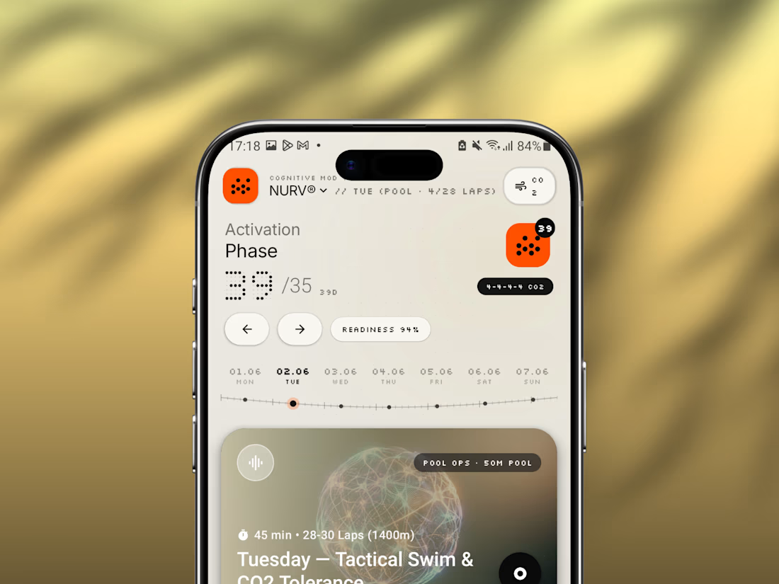
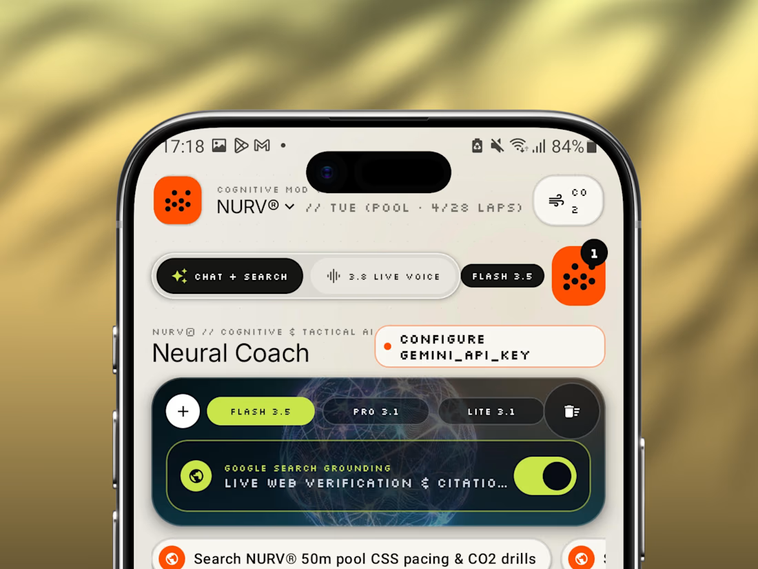
Friday app: NURV® 🟠
Swim training, nutrition and AI coaching in one Android app.
Dot-matrix numerals, a cream canvas, one hot orange accent. Built to feel like a lab instrument, not a fitness tracker.
Pool ops, fuel phases, CO₂ tolerance drills, all in one place.

The Rebranding Challenge - Season Investments
One of the key challenges was deciding what to change and what was worth preserving.
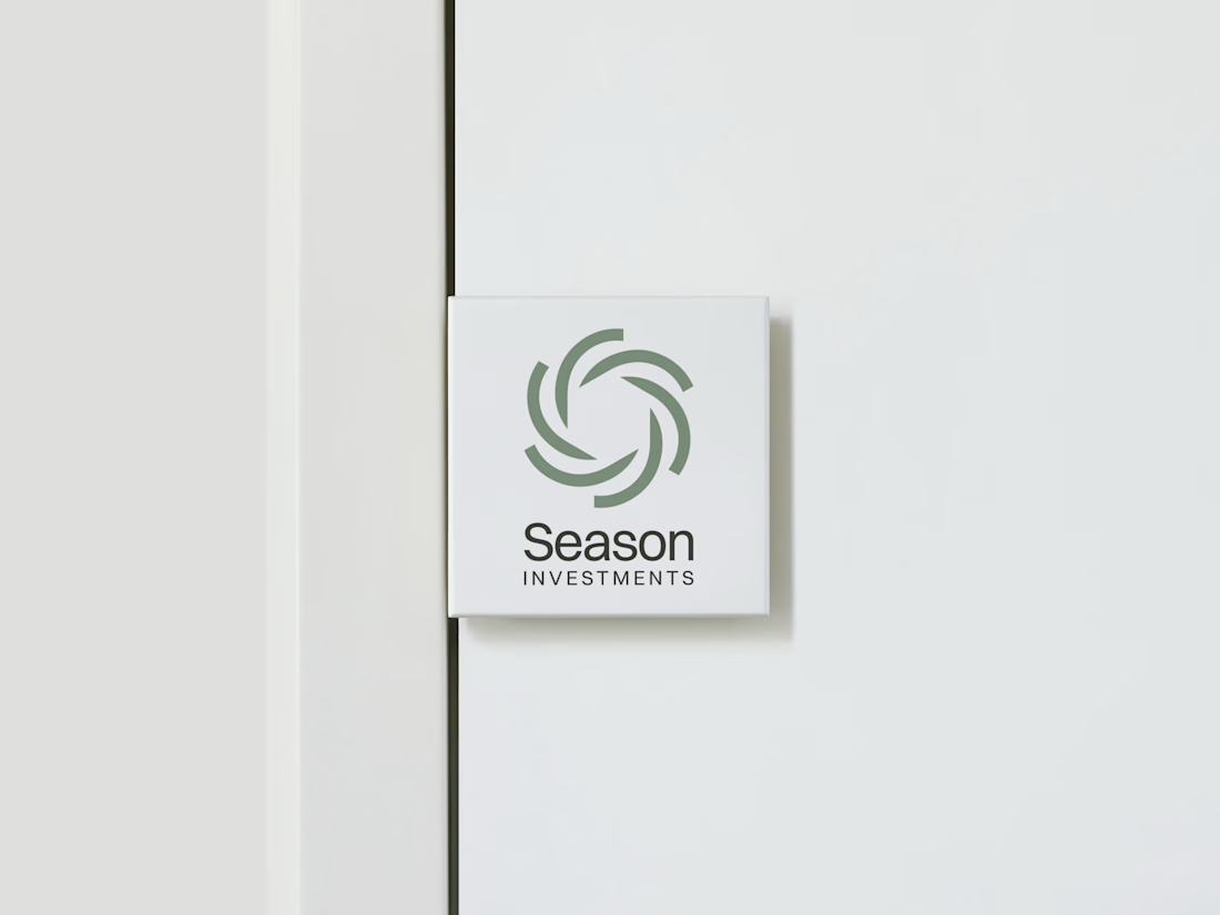
Rather than starting from scratch, the new identity retains a visual connection to Season Investments’ heritage, but reframes it for a more contemporary and flexible brand system.
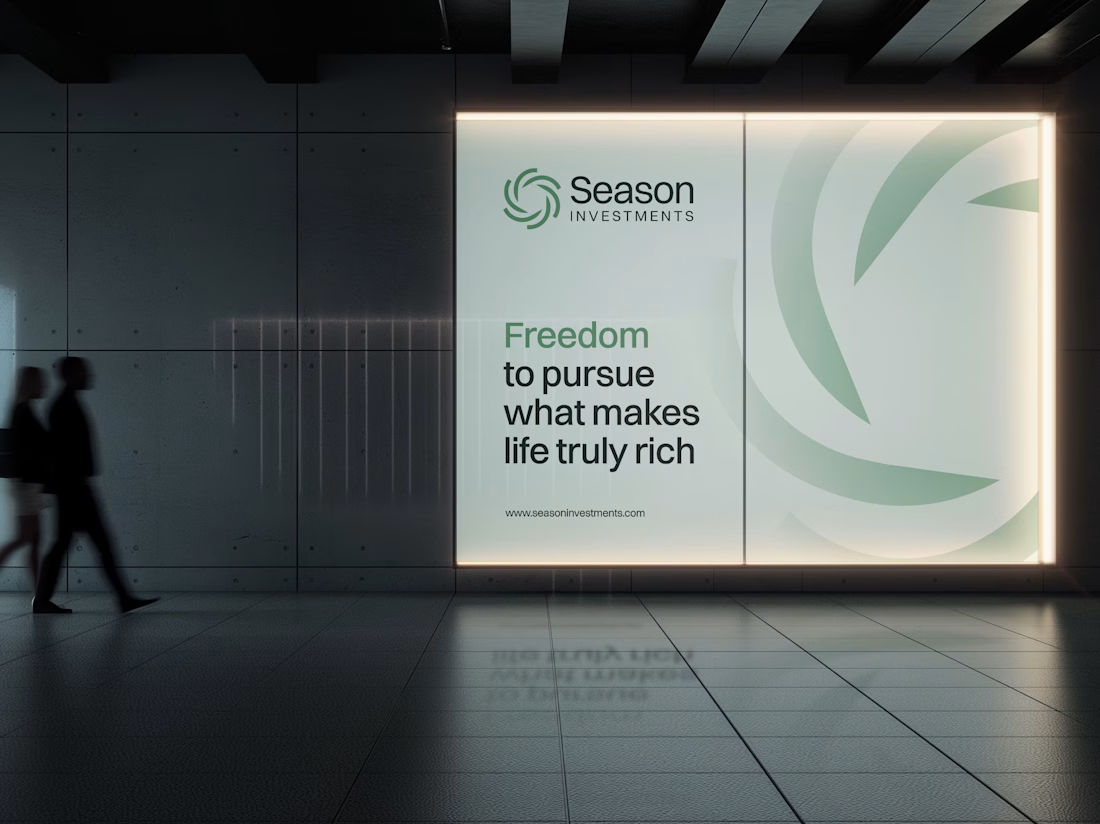
A major improvement was creating a symbol that can work independently from the wordmark. This gives the brand a stronger presence across investment platforms, digital interfaces, profile images, and other compact applications where the previous identity was difficult to use.
The result is a more adaptable system that moves the brand forward without losing its familiarity.





Love how adaptable this feels across compact digital spaces. Really well done. Any plans to post the original before version for comparison?
Every esports brand reaches for neon and a mascot.
RESPAWN ARENA reaches for a scoreboard.
Case study on the stadium-grade identity — typography, system, the whole build — dropping soon.