The network for creativity
Join 1.25M professional creatives like you
Connect with clients, get discovered, and run your business 100% commission-free
Creatives on Contra have earned over $150M and we are just getting started
Back to feedPost

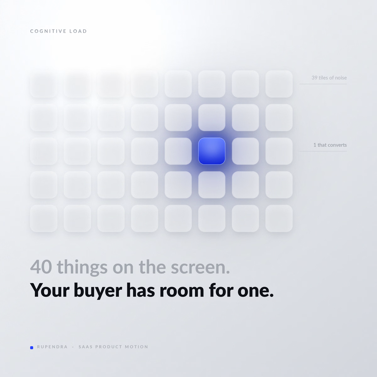
Your dashboard has 40 things on it. Your buyer has room for one.
A founder showed me his new product last week. Glass panels, soft gradients, a blue glow behind the chart. Best-looking thing I'd seen all month.
I asked what a user is supposed to do in the first 30 seconds.
Long pause.
That pause is what every new user feels. They just don't stay long enough to tell you about it.
Beautiful UI and clear UI are different skills. One wins design awards. The other wins the moment someone decides your software is worth learning.
So when I cut a product video, I never start with "how do we make this look premium." I start with: which single number on this screen changes a decision? Then I dim everything else.
Usually that means killing the visual weight of a screen the team spent four months building. That call is never fun.
But the cut gets 20 seconds shorter, and people stop asking what the product does.
Pretty is cheap now — everyone owns the same gradients.
Clarity is the last expensive thing.
#saasmarketing #productmarketing #motiondesign
The network for creativity
Join 1.25M professional creatives like you
Connect with clients, get discovered, and run your business 100% commission-free
Creatives on Contra have earned over $150M and we are just getting started





Related posts

I don't start an explainer by opening Blender.
I start with the voiceover and break it down into simple sections. Each section needs to have a clear purpose and move the story forward.
For this explainer, the structure was:
HOOK → DISCOVER → SOLUTION → PERSONALIZATION → PAYOFF → OUTRO
Once the structure is clear, I can start thinking about the visuals: cameras, 3D scenes, UI animation, transitions, and all the small details.
This helps me avoid creating scenes just because they look good.
Every scene should have a reason to exist.
-
Have a product that needs explaining? Let’s talk 😊


Really curious about your process here. Did you start with a storyboard or go straight into motion?

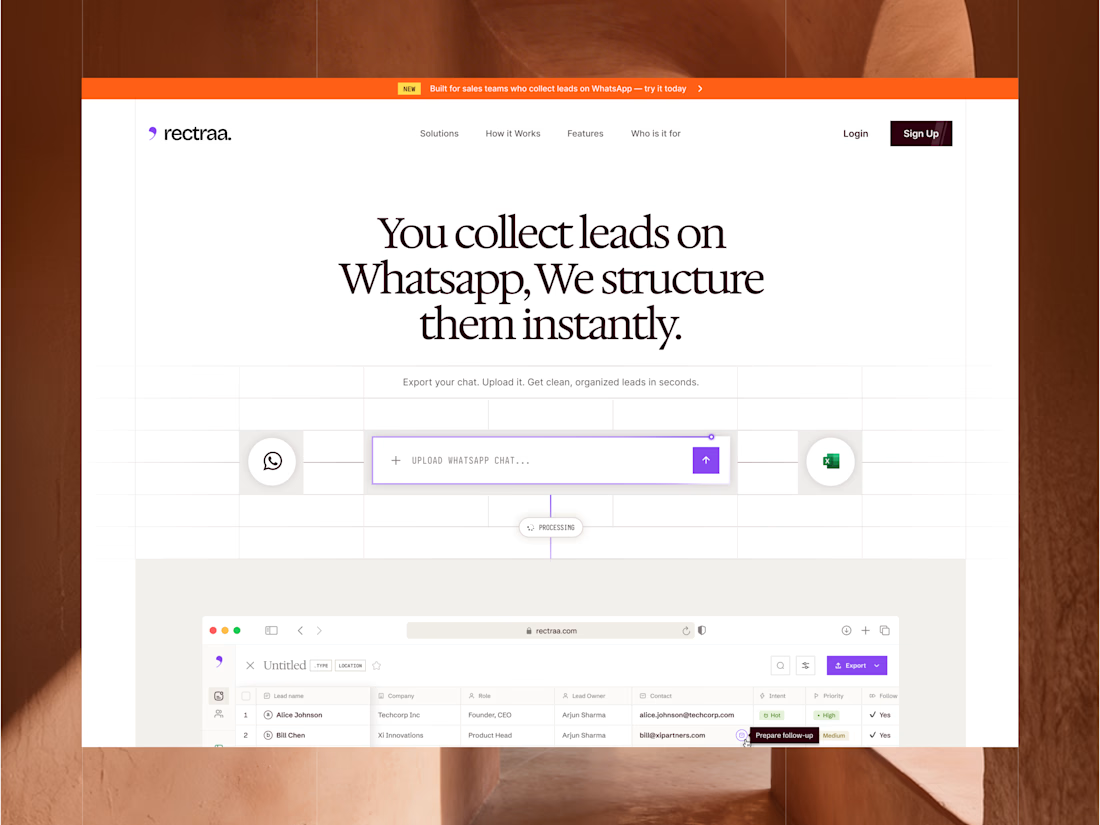
Rectraa helps sales teams extract, classify and organize leads collected through WhatsApp. I designed and developed its marketing website to explain the product clearly, demonstrate its workflow and encourage visitors to try it.
Project information:
Role: Website Designer & Framer Developer
Scope: Website strategy, UI design, responsive design and development
Tools: Figma and Framer
Deliverable: Responsive SaaS marketing website


High end design

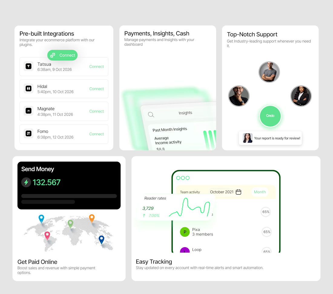
A bento system designed to make a SaaS product feel tangible.
I wanted each card to do more than display a feature — it needed to show the experience.
So I designed a collection of interactive-looking product cards around:
→ Integrations
→ Payments & insights
→ Customer support
→ Global payments
→ Real-time tracking
The visual direction combines minimal layouts, soft green accents, dashboard UI, subtle gradients and strong typography to create a modern fintech/SaaS feel.
The goal was simple:
Make the product feel useful before the user even clicks anything.
I'm currently open to UI/UX, Product Design and freelance opportunities.
If you're building a SaaS, fintech, Web3 or Web2 product and need a designer who can turn ideas into polished interfaces, let's work.
Available for new projects →
#UIDesign #ProductDesign #SaaS #Fintech #UXDesign #Figma #WebDesign #FreelanceDesigner

Love the vibe of this!