The network for creativity
Join 1.25M professional creatives like you
Connect with clients, get discovered, and run your business 100% commission-free
Creatives on Contra have earned over $150M and we are just getting started
Back to feedPost


The network for creativity
Join 1.25M professional creatives like you
Connect with clients, get discovered, and run your business 100% commission-free
Creatives on Contra have earned over $150M and we are just getting started

Challenges
View all


Related posts

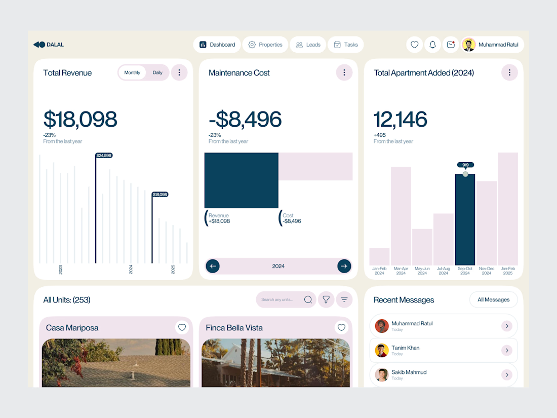
Real Estate SaaS Dashboard
Real estate software often sits on top of a large amount of operational data.
Properties, leads, deals, revenue, tasks and performance all need to be visible without turning the product into an information wall.
For this dashboard concept, the design process started with hierarchy.
The most important metrics get immediate visibility. Supporting information is organized into focused sections, while actions remain close to the data they relate to.
The result is a SaaS interface designed around clarity, decision-making and everyday workflow.
Focus: Real Estate SaaS · PropTech UI/UX · Dashboard Design · Data Visualization · Property Management Software
The goal wasn't to make the product look complex.
It was to make a complex business easier to operate.
Designed by WaxyWeb.
Working on a SaaS or PropTech product?
hello.waxyweb@gmail.com
www.waxyweb.com


great one

A brilliant SaaS tool needs a landing page that instantly builds trust and drives action.
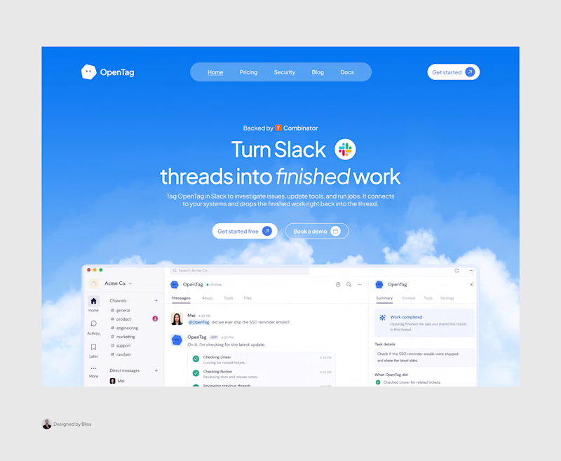
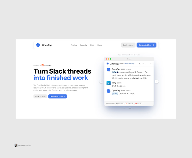
I recently put together this visual upgrade for OpenTag to explore how tightening the layout could elevate their first impression.
Option A (The Original): Strong product copy, but the split layout and floating elements create competing focal points that divide the user's attention.
Option B (The Redesign): Centered messaging, a much clearer visual hierarchy, and a dynamic, breathable layout. The goal was to remove distractions and let the product interface take center stage.
Which direction do you think communicates the value better and creates a stronger first impression?
Let me know your pick!
8 voted
100%
0 voted
0%
8 votes
Closed

Great work, Emmanuel!

Which of the version of design for linear landing page will you go for ?


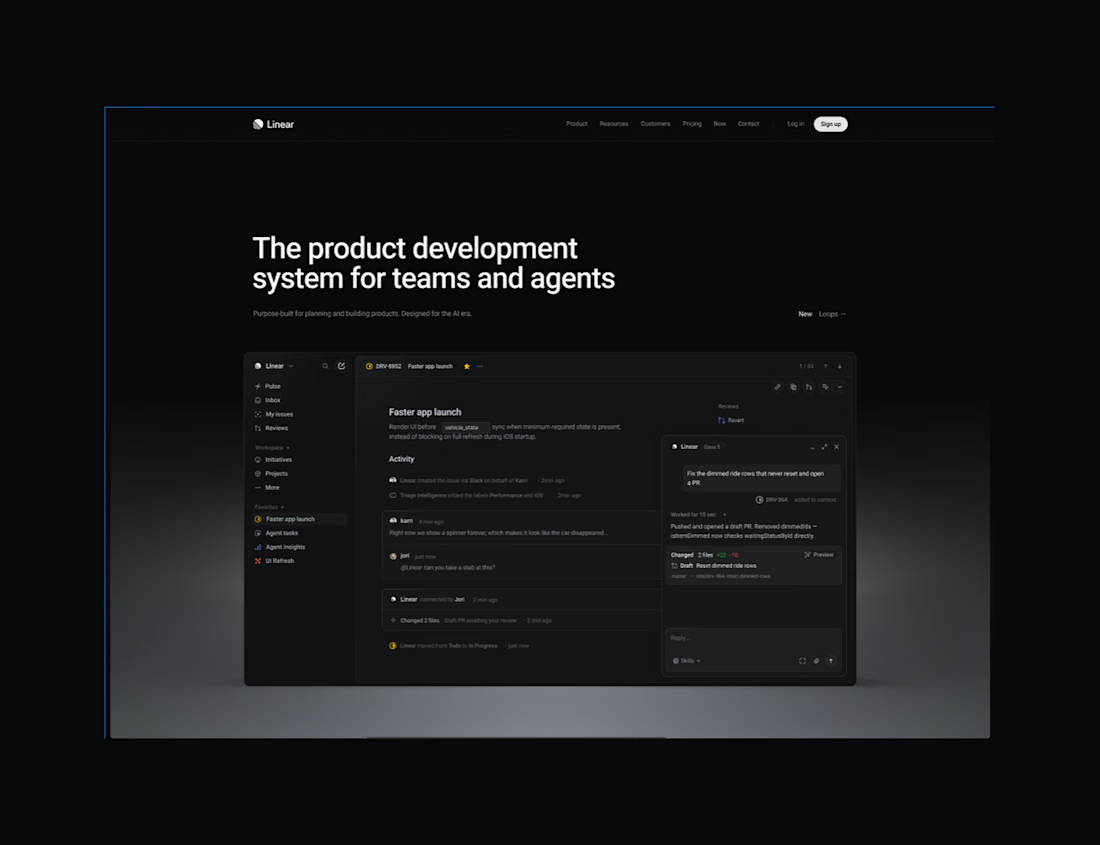
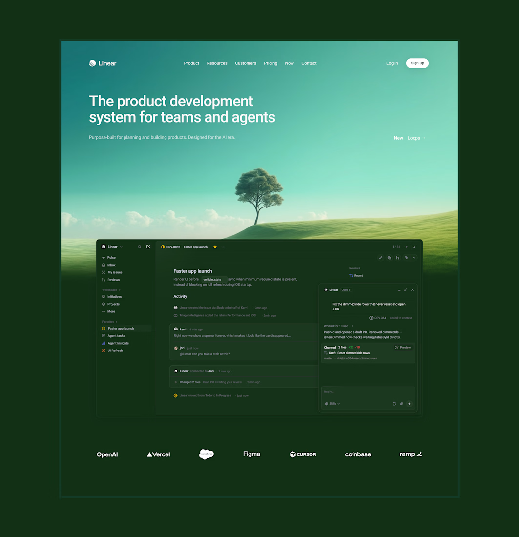

The Right.