The network for creativity
Join 1.25M professional creatives like you
Connect with clients, get discovered, and run your business 100% commission-free
Creatives on Contra have earned over $150M and we are just getting started
Back to feedPost

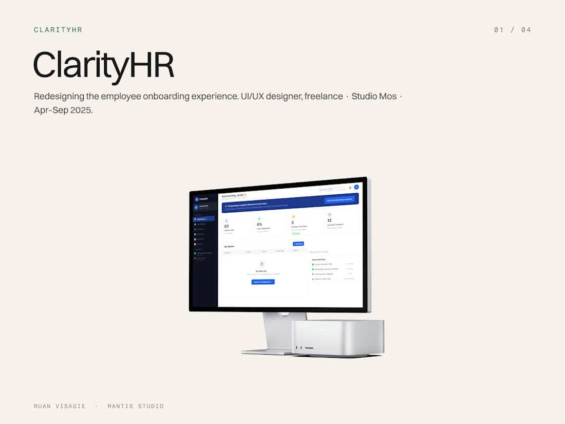
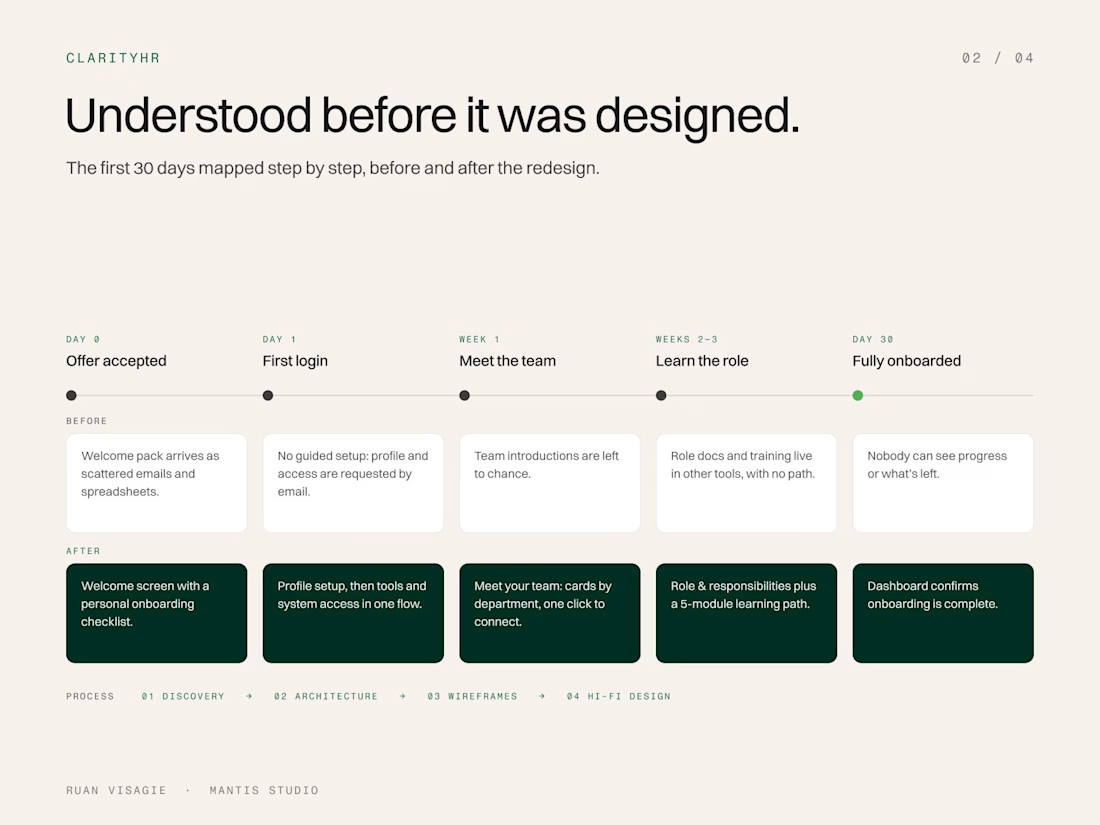
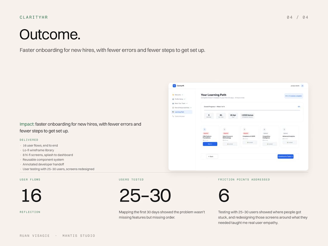
New hires were overwhelmed and unclear on their role, and they had disengaged before their first week was done. Profile setup, team intros, training and tool access all lived in disconnected emails and spreadsheets.
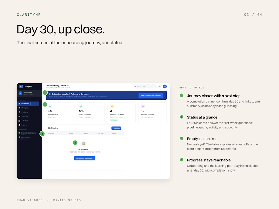
I ran a competitive audit of 5 HR platforms, mapped the first 30 days step by step, and turned six friction points into a structured onboarding platform: 16 user flows from authentication to a unified dashboard. I tested the designs with 25–30 users and rebuilt the screens people struggled with.
What I delivered
Competitive audit (5 HR platforms) and a 30-day journey map
16 user flows, end to end
A lo-fi wireframe library
8 hi-fi screens, from splash to dashboard
A reusable component system and annotated developer handoff
User testing with 25–30 users, with screens redesigned
Results
Faster onboarding for new hires
Fewer errors and fewer steps to get set up
Role: UI/UX Designer, freelance · Studio Mos · Apr–Sep 2025
Team: Product designers, PM, developers
Tools: Figma, FigJam
Skills / tags: UX Design, UI Design, HR Tech, User Research, Journey Mapping, User Testing, Web App


The network for creativity
Join 1.25M professional creatives like you
Connect with clients, get discovered, and run your business 100% commission-free
Creatives on Contra have earned over $150M and we are just getting started
Related posts

AI Mental Wellness Platform UI/UX Design
Designed a modern and intuitive AI-powered mental wellness website focused on emotional well-being and personalized digital experiences.
The platform features an AI therapist, mood tracking, meditation, sleep improvement, wellness plans, and data-driven insights. A calming blue color palette, immersive visuals, clean layouts, and thoughtful UI elements create a seamless and engaging user experience.
mentalhealthwebsitedesignartificialintelligenceAI VIsual DesignerResponsive DesignWeb DesignClaudeFigma

love how calm the mood tracking and meditation screens feel in this wellness design


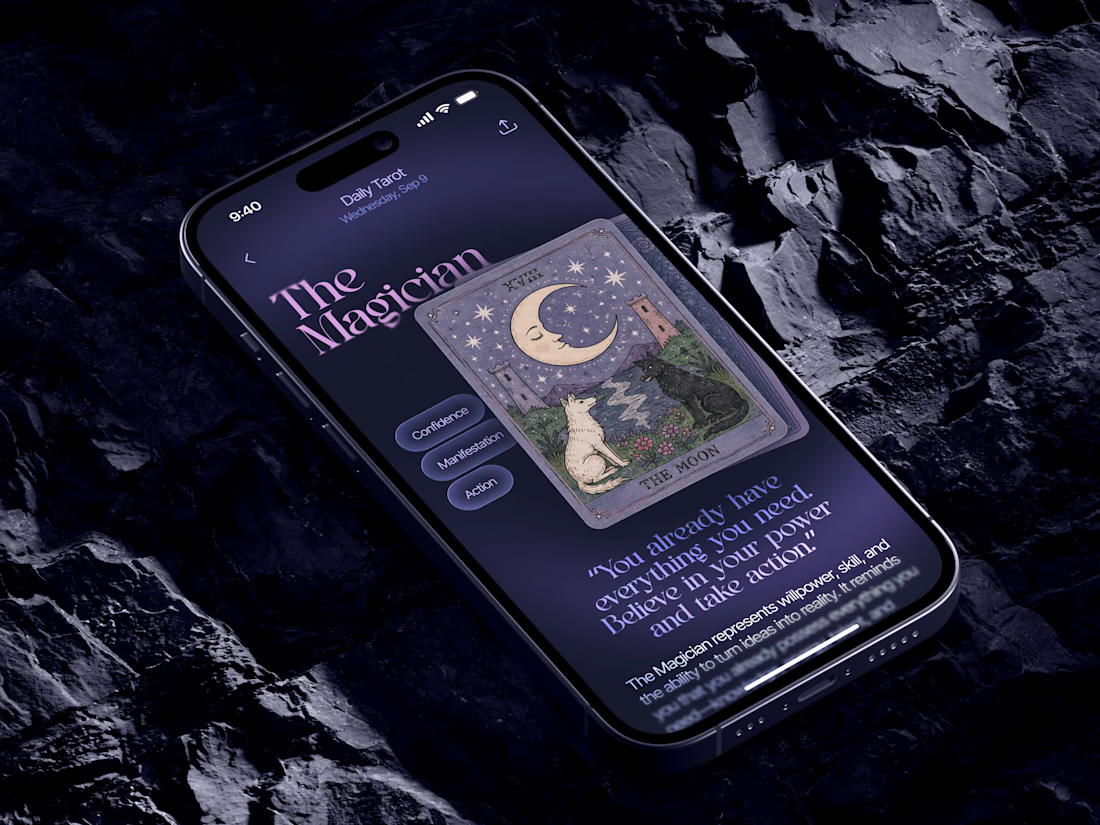
Just in time for Halloween! 🎃🔮 Excited to share this mystical tarot reading app concept, inspired by a little spooky season magic. Would love to hear your thoughts! ✨


Excellent work!

Lately, I've been inspired by amazing wedding photographers across the UK, and while I was browsing Google Maps, Birmingham randomly caught my attention. I reviewed some user testimonials there and found out there's an often-occurring problem of too-long turnaround times to get edited pictures from a photographer, especially during the hot summer season (a lot of weddings take place in the summer).
This user problem inspired me to design this hero section while experimenting with Figma Motion. No AI was used for the concept design, only for user research purposes to compare what's on the market from the USP point of view — after reviewing and comparing 12 websites by hand myself.
I came up with a USP as well eventually — a simple, yet quickly scannable message with a clear value from the very first screen.
And of course, my ever-rotating peonies sending a photographer's message of being fun. What can you do with me?
To take a closer look (likes and comments are appreciated 🙌 ):

That looks so lovely! Well done!