The network for creativity
Join 1.25M professional creatives like you
Connect with clients, get discovered, and run your business 100% commission-free
Creatives on Contra have earned over $150M and we are just getting started
Back to feedPost

The Smallest Thing
An interactive literary publication about love, and everything we make of it.
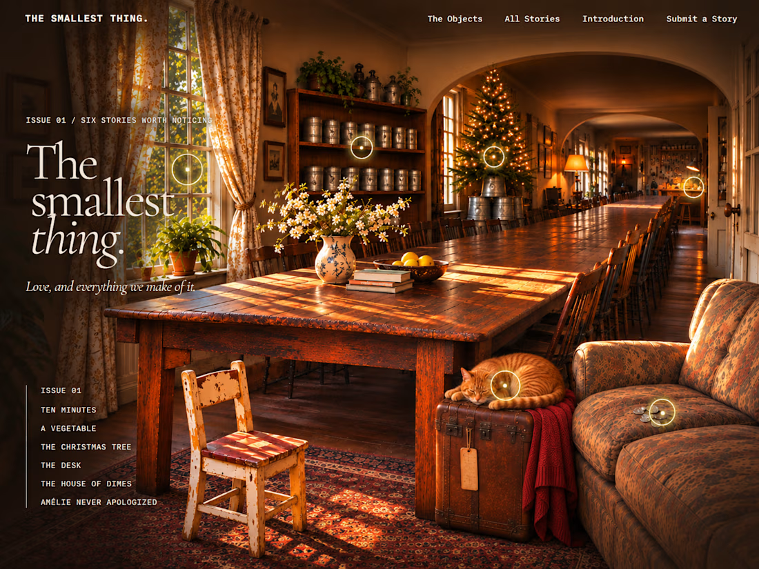
What if a story didn't begin with a title, but with something ordinary enough to overlook?
A handful of dimes. An unlabeled can. A Christmas tree balanced on buckets. A cat occupying the suitcase you were about to pack.
The Smallest Thing is an independent digital literary publication exploring the disproportionate significance of ordinary experiences. Some stories are funny. Some are uncomfortable. Others resist easy classification entirely.
The design challenge was to create a digital environment that could hold those contradictions without imposing a single emotional interpretation on the work.
The approach
Rather than building a conventional article grid, I developed an immersive editorial environment organized around discoverable objects. Each object connects to a story, creating an alternative way to encounter the writing.
The experience combines:
Narrative architecture: Connecting physical environments, ordinary objects, and literary content through meaningful interactions.
Art direction: Developing a cinematic visual language built around exaggerated proportion, domestic familiarity, and subtle absurdity.
Interaction design: Creating discoverable story entry points while preserving direct access to traditional reading pages.
Editorial systems: Establishing story classifications, reading routes, provenance, and an expandable publication structure.
Submission workflow: Building a contributor submission process with a private editorial review queue and publication controls.
Responsive design: Adapting the visual experience for smaller screens without requiring readers to navigate a complex interactive scene.
The central design principle
An interaction should reward attention, not merely demand it.
The objects aren't decorations or illustrations of a predetermined lesson. They're invitations to notice something, enter a story, and make your own sense of it.
This is also an exploration of a larger design question: how can digital interfaces create opportunities for discovery without interfering with the content they're meant to serve?
Built with: Base44, React, interactive UI components, AI-assisted visual development, and custom editorial content architecture.
Explore the project: https://small-thing-scale.base44.app/
I'm interested in projects where storytelling, research, strategy, and interaction design intersect, particularly digital publications, editorial platforms, concept-driven websites, and unconventional product experiences.


The network for creativity
Join 1.25M professional creatives like you
Connect with clients, get discovered, and run your business 100% commission-free
Creatives on Contra have earned over $150M and we are just getting started


Related posts

A little creative experiment I'm working on ✳️
Playing with bold typography, playful motion, and unexpected interactions for a UGC creator portfolio.
Still a work in progress, but having way too much fun with this one.


The big stacked WORK / RESULTS / RATES menu next to the loose purple stickers keeps the portfolio playful while the navigation stays easy to scan. Do the stickers react on hover, or are they tied to scroll?

I had so much fun working on this challenge and exploring how we interact with media on a daily basis. It pushed me to rethink familiar interfaces from scratch. Here is what I came up with:
SOMA / Control, Reimagined
Most video players force your eyes down to a rigid bar at the bottom of the screen, pulling you out of the moment every time you want to take control. SOMA changes that by turning playback into a smooth, circular gesture right where your attention already is.
Built around how our hands naturally move, SOMA gathers timeline scrubbing, scene previews, audio, and settings into one intuitive dial. Whether you are clicking with a mouse or guiding with a thumb, you stay inside the story while moving through time effortlessly.
Let me know how you feel about this in the comments! 😊

It's crazyyy! 😍🔥 love it!

NEXUS — Beyond Playback.
A new interface for the next generation of media.
What if a video player didn't feel like a utility, but like a piece of technology from the future?
Meet NEXUS, a futuristic media player skin built around a simple idea: technology should look extraordinary without becoming difficult to use.
Inspired by cyberpunk architecture, neon-lit environments, and industrial sci-fi interfaces, NEXUS introduces a distinctive visual identity built on deep graphite surfaces, electric cyan accents, controlled magenta highlights, and subtle amber indicators.
But NEXUS isn't just about looking futuristic.
It's designed to work beautifully.
Every interaction has a purpose. Playback controls are prominent and intuitive. Buttons are generously sized. Navigation is straightforward. Timelines are easy to interact with, and important functions remain accessible without overwhelming the screen.
Accessibility isn't an afterthought. It's part of the design philosophy: high-contrast elements, visible keyboard focus, responsive layouts, readable typography, and support for accessible playback controls.
What makes NEXUS different?
Distinctive visual identity: An original cyberpunk-inspired aesthetic without copying an existing franchise.
Function over decoration: Every visual element serves a practical purpose.
Accessibility-first thinking: Large interaction targets, clear visual hierarchy, keyboard navigation, and caption support.
Modern responsiveness: Designed to adapt to desktop, tablet, and mobile screens.
A cohesive experience: A consistent design language across playback, settings, volume, captions, and navigation.
The philosophy
Most players focus on delivering content. NEXUS focuses on how people experience it.
We believe a great interface should make technology feel exciting, intuitive, and inclusive at the same time.
No unnecessary complexity. No sacrificing usability for aesthetics. No futuristic design that makes users fight the interface.
Just a smarter, more immersive way to experience media.
NEXUS — Beyond Playback.
The future should be intuitive.

Cyberpunk look that still stays easy to use, that's the hard part. Nice work.