The network for creativity
Join 1.25M professional creatives like you
Connect with clients, get discovered, and run your business 100% commission-free
Creatives on Contra have earned over $150M and we are just getting started
Back to feedPost


LIVV has six new people.
Sort of.
Most of our internal work already runs through agents.
One reviews design.
One builds.
One listens to what the market is actually saying.
One questions the idea.
One explains it.
One asks whether any of it makes money.
They had no faces, no names, and no reason to exist outside our internal systems.
So we gave them all three.
The Eye decides what’s worth looking at.
The Hand builds.
The Mouth explains it.
The Brain decides whether the idea actually holds up.
Elías listens.
The Pulse asks the uncomfortable question at the end of a nice presentation:
Does any of this actually matter for the business?
This is one of our first experiments with them.
Right now, we're testing how they work as a presentation format — turning the way LIVV thinks, designs and builds into something you can actually watch.
Next, we want to go further.
Instead of making them explain LIVV from a studio, we're going to put them to work.
Meetings.
Bad ideas.
Client feedback.
Design reviews.
Experiments.
Arguments.
Things breaking.
Things working unexpectedly well.
Basically: the everyday life of a slightly strange office.
Except the office is partly run by agents.
And through those stories, we'll show the things LIVV actually does — design, development, automation, AI, growth and whatever we decide to build next.
But we're still figuring this out.
So tell us what feels wrong.
What feels forced.
Who you'd change.
What you'd want to see them do.
And, most importantly:
Who is this team still missing?
If the idea is good enough, we'll build them.


The network for creativity
Join 1.25M professional creatives like you
Connect with clients, get discovered, and run your business 100% commission-free
Creatives on Contra have earned over $150M and we are just getting started











Related posts

Who needs an invitation when you have a little imagination and a lot of fantasy?
That's how I got to the CapCut World LA event at the Audrey Irmas Pavilion. The trip was... intense! 🦄
This is my entry for the new Contra × CapCut challenge.
My workflow:
① I created the character sheet and the prop sheet for the mushroom, as well as the location sheets for a nature landscape and the Audrey Irmas Pavilion.
② I created still shots using my internal AI image generation tool.
③ I created trippy 2D/3D animated images to use as the opening frames of the videos.
④ I imported all the images into the CapCut Video Studio and used the CapCut AI to animate them.
⑤ I created the music in ElevenLabs/ElevenMusic.
⑥ I edited the videos using DaVinci Resolve.


Shipped my first feature on Delphi last week!
We touched on profiles to add more entry points to a conversation, based off the users life experiences.
Already working on v1.2, stay tuned!


Solid work here can't wait for v1.2

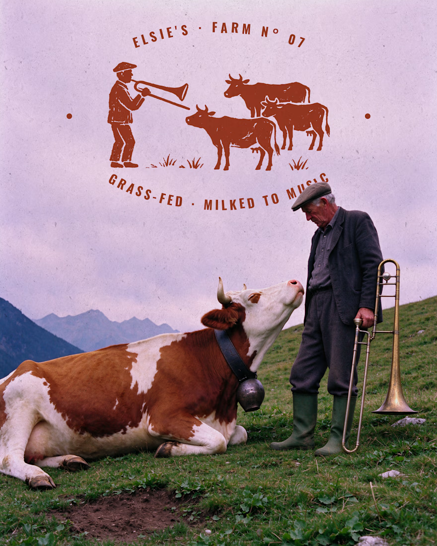
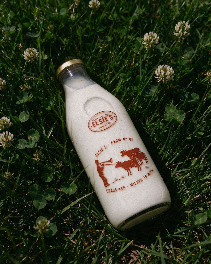
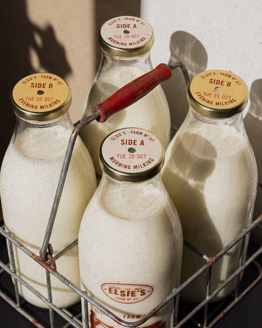
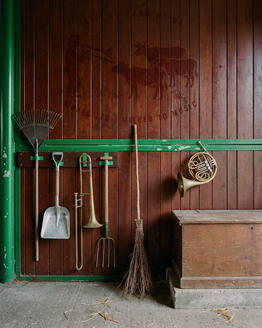
Elsie's: brand identity and packaging for the @designerbriefs weekly challenge (Brief 183). An organic milk brand from very happy cows who love fresh grass and good music.
The logo comes from the brass name plates farmers fixed to their milk cans, with every letter struck by hand. Then came a stamp-style illustration of a farmer playing to his herd, and a returnable glass bottle printed in barn red. All the imagery was made with my Augmented Art Direction process: AI as the tool, art direction and Photoshop retouching to finish every image by hand.
What song would you play to Elsie's cows? 🎺🐄



great work andreu