The network for creativity
Join 1.25M professional creatives like you
Connect with clients, get discovered, and run your business 100% commission-free
Creatives on Contra have earned over $150M and we are just getting started


The network for creativity
Join 1.25M professional creatives like you
Connect with clients, get discovered, and run your business 100% commission-free
Creatives on Contra have earned over $150M and we are just getting started






Related posts


Clean portfolio direction, keep building it.


Showcasing a fresh and hydrating product design concept for Aqua Lume (Hydro Boost Water Gel).
Would love to hear your thoughts on the layout and color palette!

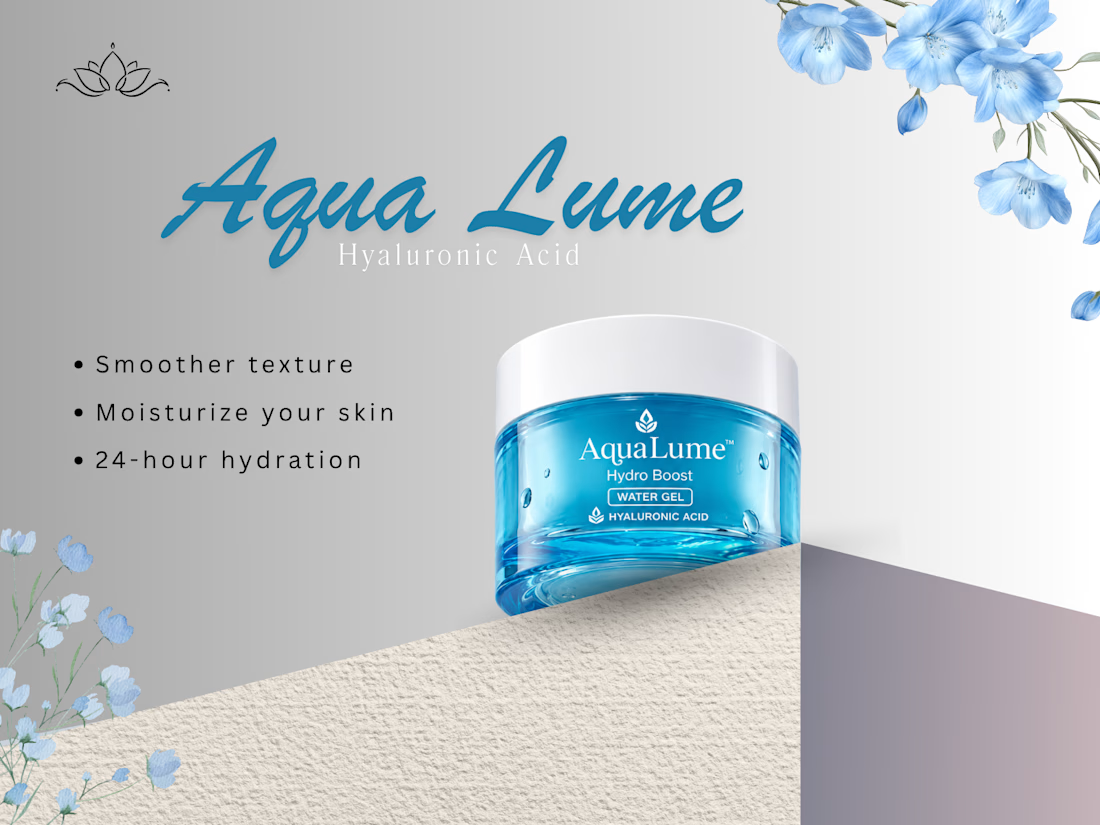

The blue jar against the grey gradient is the strongest moment here. On layout, "Hyaluronic Acid" is thin and letterspaced under a heavy script wordmark, so it fades into the grey. A bit more weight or contrast on that line would help it read at a glance.