The network for creativity
Join 1.25M professional creatives like you
Connect with clients, get discovered, and run your business 100% commission-free
Creatives on Contra have earned over $150M and we are just getting started
Back to feedPost
Showcasing a fresh and hydrating product design concept for Aqua Lume (Hydro Boost Water Gel).
Would love to hear your thoughts on the layout and color palette!

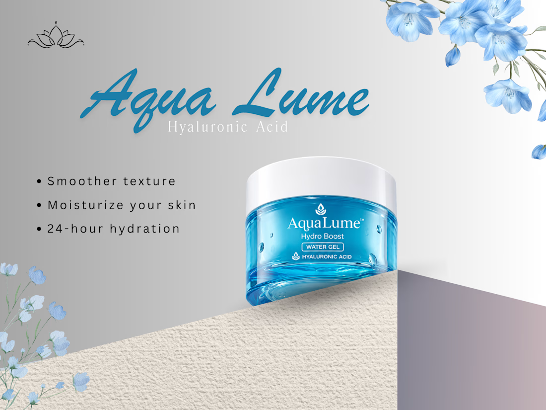

The blue jar against the grey gradient is the strongest moment here. On layout, "Hyaluronic Acid" is thin and letterspaced under a heavy script wordmark, so it fades into the grey. A bit more weight or contrast on that line would help it read at a glance.

Really appreciate this! The contrast between the blue jar and grey was intentional, glad it landed. The subline is a fair critique, I’ll try a heavier weight and see if it holds. 😊
The network for creativity
Join 1.25M professional creatives like you
Connect with clients, get discovered, and run your business 100% commission-free
Creatives on Contra have earned over $150M and we are just getting started





Related posts

Which navigation do you prefer more? With side or floating action?
11 voted
48%
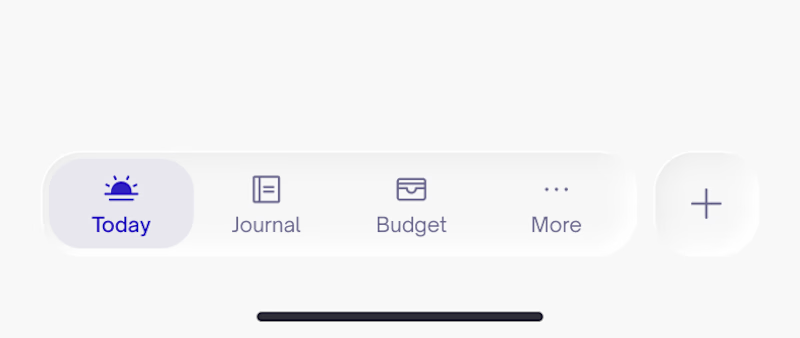
12 voted
52%
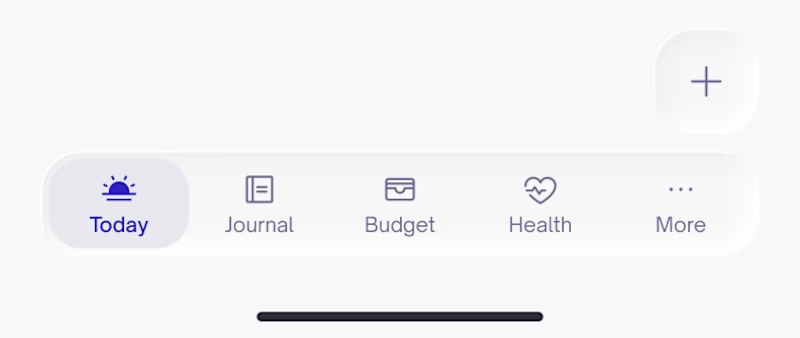
23 votes
Closed

Depends on the product and how data heavy it is. For example, an app for insurances and alot of document handling the FAB works best 👌

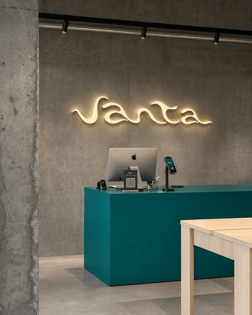
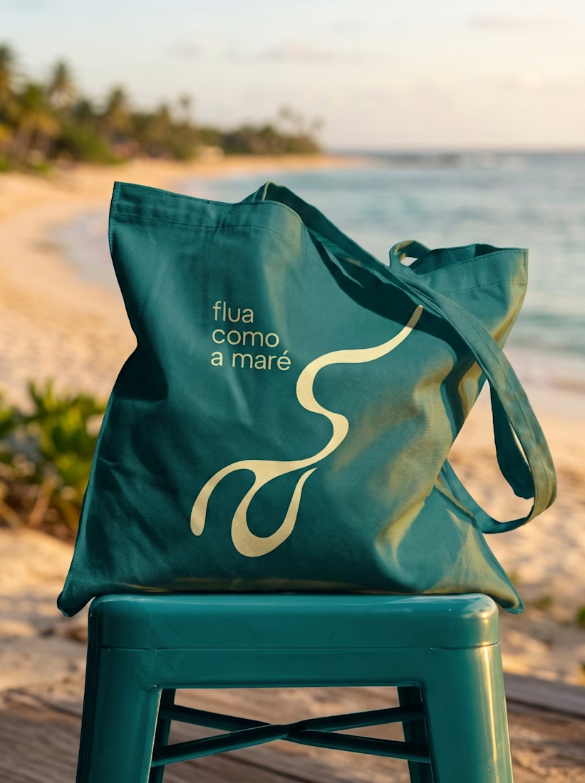
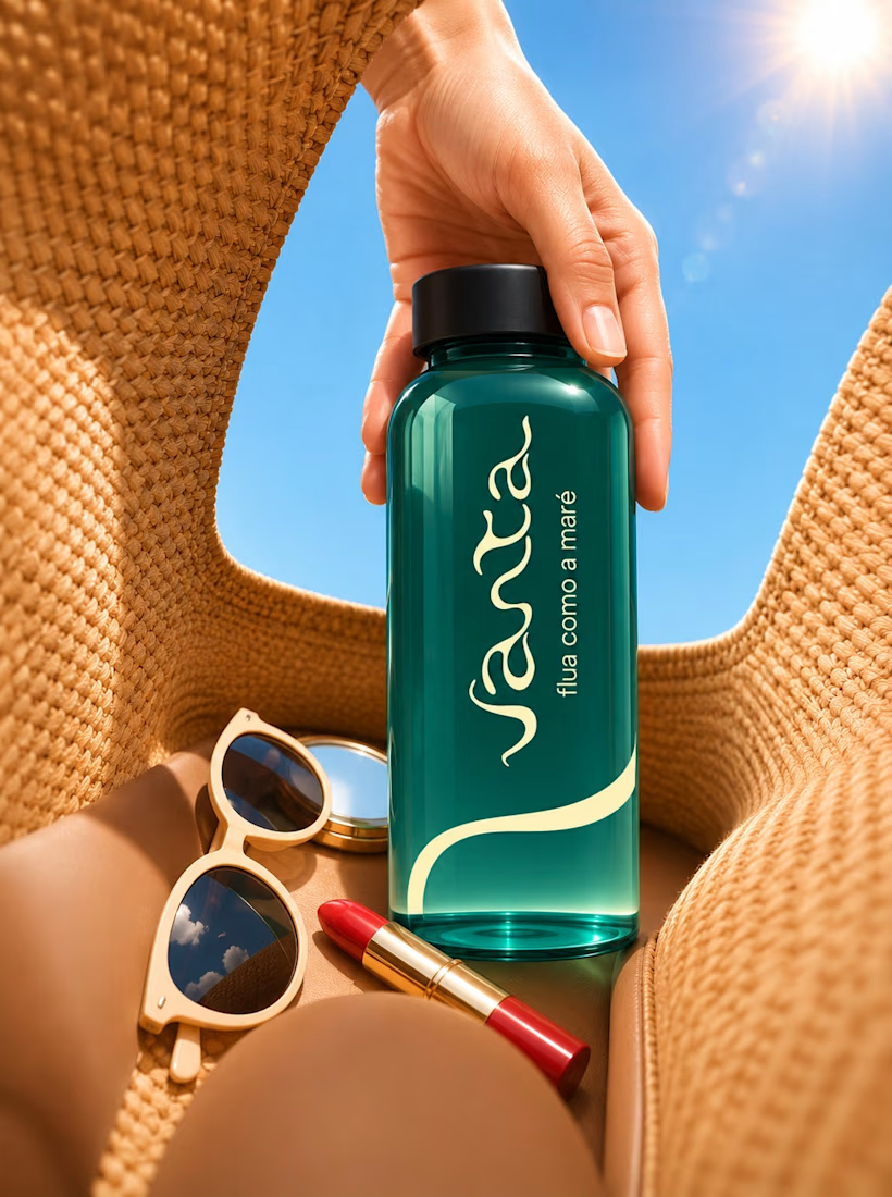
Just wrapped up this brand identity for Vanta and wanted to share a quick peek! Kept the visuals super clean, warm, and fluid, letting the product and textures breathe. Let me know what you think!

Great work!



The glossy chair looks like someone just got up from it 😄 Love how the effect keeps the shapes readable instead of turning everything into noise. Will it work on video in aftrglo too?