The network for creativity
Join 1.25M professional creatives like you
Connect with clients, get discovered, and run your business 100% commission-free
Creatives on Contra have earned over $150M and we are just getting started
Back to feedPost

UI/UX Design for a US Musical Theater Audition Platform


The network for creativity
Join 1.25M professional creatives like you
Connect with clients, get discovered, and run your business 100% commission-free
Creatives on Contra have earned over $150M and we are just getting started
Related posts

Casemate: making malware analysis feel calm instead of scary
Cybersecurity websites usually look the same: black background, green code, a hooded guy. I wanted to try the opposite for Casemate, a concept for a malware analysis tool.
The idea is simple: the product keeps a suspicious file in a sealed chamber and watches what it does. So I put a bug frozen in amber in the middle of a canyon. It’s dangerous and under control at the same time, and you get it without reading a word.
Then I made sure the page still works for a security lead who wants facts. The stats sit right next to the headline: threats isolated, latency, endpoints covered.
The hardest part was keeping it warm without losing trust. I stayed with one terracotta colour, wide capitals and mono labels, so it reads like a serious tool and not a poster.
I’m taking on new projects for SaaS and tech teams. If you have a product that’s hard to explain in one glance, send me a message.
What do you think, would you trust a security product with a canyon on the homepage?


I love it! It feels so calm, and I would definitely try it! This is amazing, Kris. I never thought cybersecurity could be this cool ❤️🔥


A great website should do more than look good, it should make choosing a business feel easy.
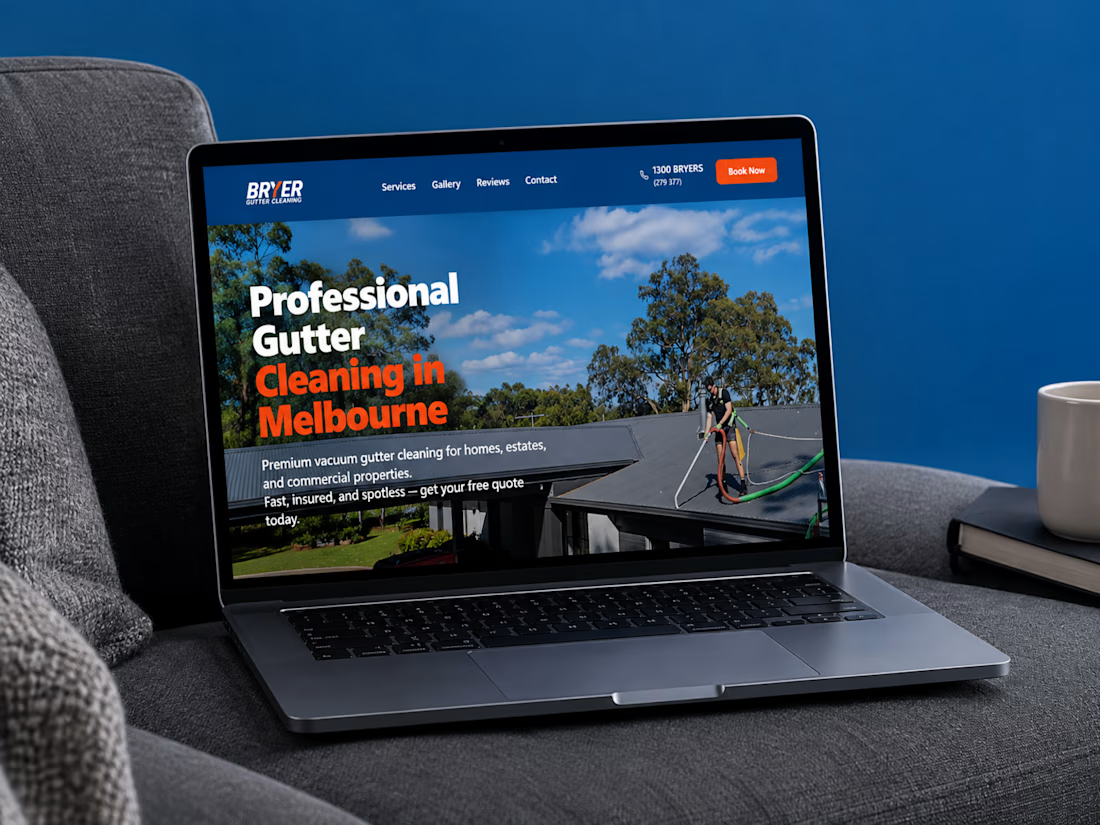
I recently completed a website project for Bryer, a Melbourne-based gutter and solar panel cleaning business.
The goal was to create a clean, professional online presence that communicates their services clearly, builds trust, and makes it easier for potential customers to request a quote.
Now, I’m curious:
When you visit a service-based business website, what matters most to you, the design, the information, or how easy it is to get in touch?
Let’s hear your thoughts! 👇
#WebDesign #Webflow #UXDesign #WebDevelopment #WebsiteDesign #Contra



this is amazing work

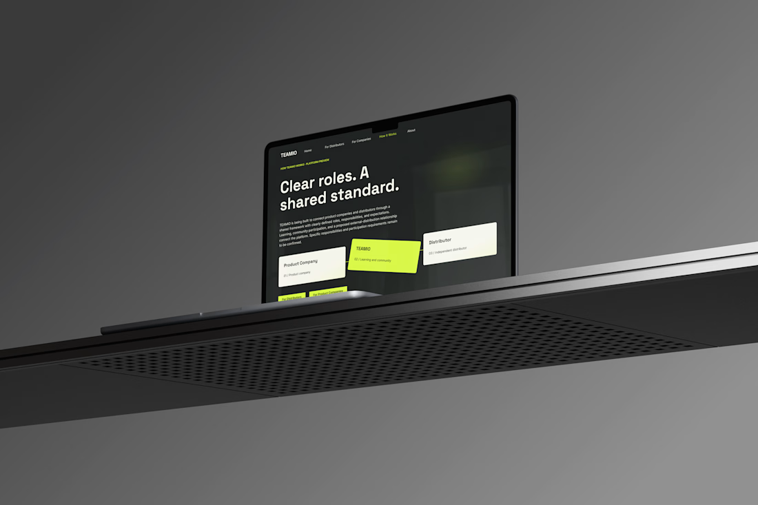
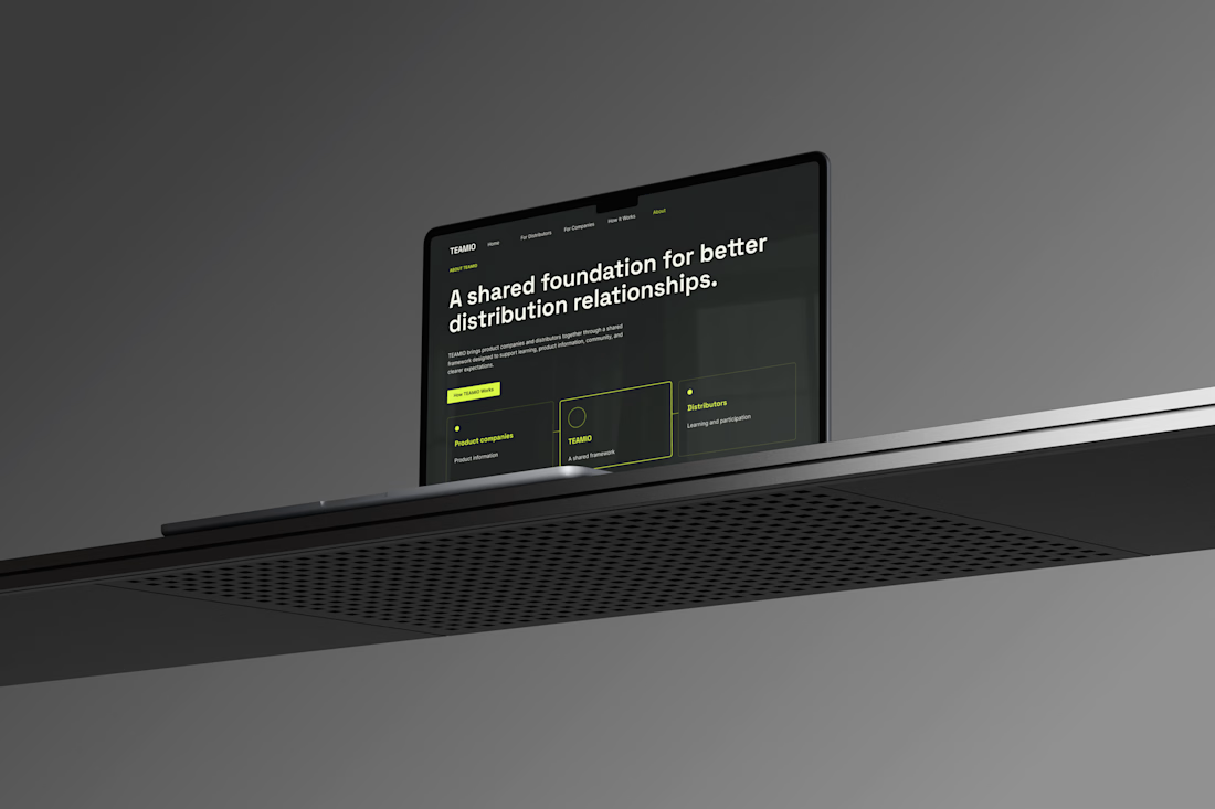
One produc Multiple experiences One cohesive design system
Meet TEAMIO a product I designed from the marketing website to the partner dashboard, bringing the entire experience together through thoughtful UX and consistent UI
Which screen is your favorite?



I like the colour combinations and the website vibes it's super elegant but still very creative 👏✅