The network for creativity
Join 1.25M professional creatives like you
Connect with clients, get discovered, and run your business 100% commission-free
Creatives on Contra have earned over $150M and we are just getting started
Back to feedPost


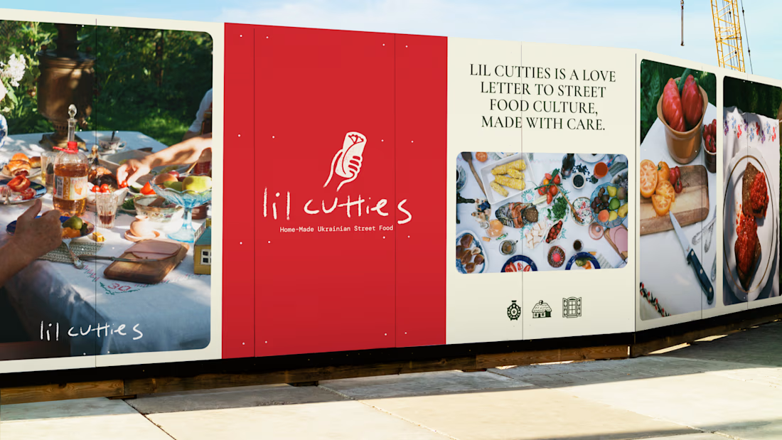
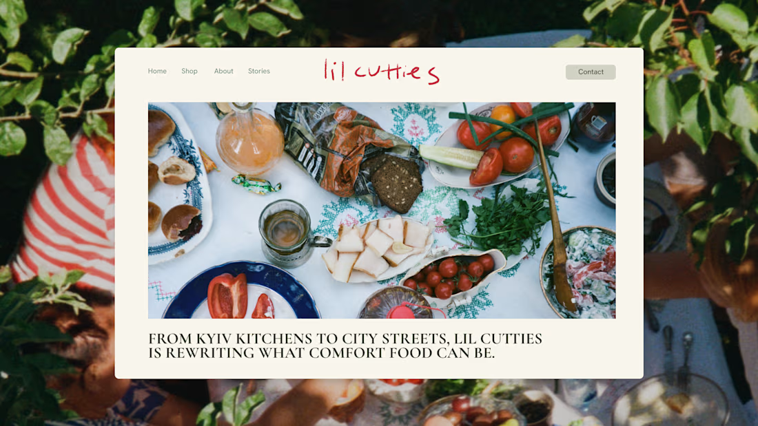
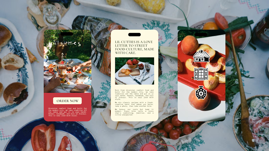
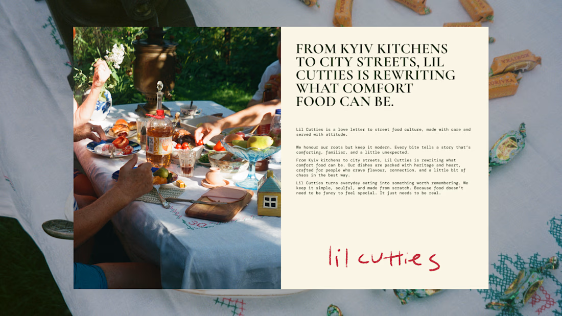
Lil Cutties arrived as a family-run Ukrainian street food concept, built around a family cutlet recipe and a stall in a Bristol food market.
The ambition was a brand that felt unmistakably Ukrainian without leaning on the obvious signals, flags, colours, folk patterns straight off the shelf. Going there risked flattening a genuinely personal story into a costume, so the design had to earn that heritage through craft instead of decoration.
Every colour got rooted in the actual ingredients, cucumber, tomato, pickled onion, rather than pulled from a mood board. The typography leaned hand-done and imperfect, less printed sign, more something scribbled with care. Photography built around a cross-section cut of the roll itself, so the product does the selling before anyone reads a word.
The result is homely, hand-done, and full of craft, modern and new without ever tipping into gimmick, and quietly Ukrainian in a way that feels earned rather than performed.



Beautiful work 😍
Thank you!
The network for creativity
Join 1.25M professional creatives like you
Connect with clients, get discovered, and run your business 100% commission-free
Creatives on Contra have earned over $150M and we are just getting started











Related posts

Same design. Which palette? 👀
You picked your favorite preview last time. This time, I’m putting the colors to the vote.
One body-care packaging concept, with the same typography and composition:
A · Rose Cream, Strawberry Sorbet + Plum Jelly
B · Lime Mousse, Coconut Cream + Plum Jelly
Which would you choose and what does it make you feel about the brand?
Both palettes use colors and matching ingredient textures from DCS 654, my library of 654 dessert-inspired colors.
Take a closer look: dcs.mariya.design
7 voted
44%
9 voted
56%
16 votes
Closed

B is absolutely stunning 🎉🎉🎉🎉
Great job Mariya❤️

A flower that inflates arrives in the mail.
Next month, a phone made of shell.
STILL LIFE SERVICE. Case study dropping soon.
Which object earns your shelf? Reply below.
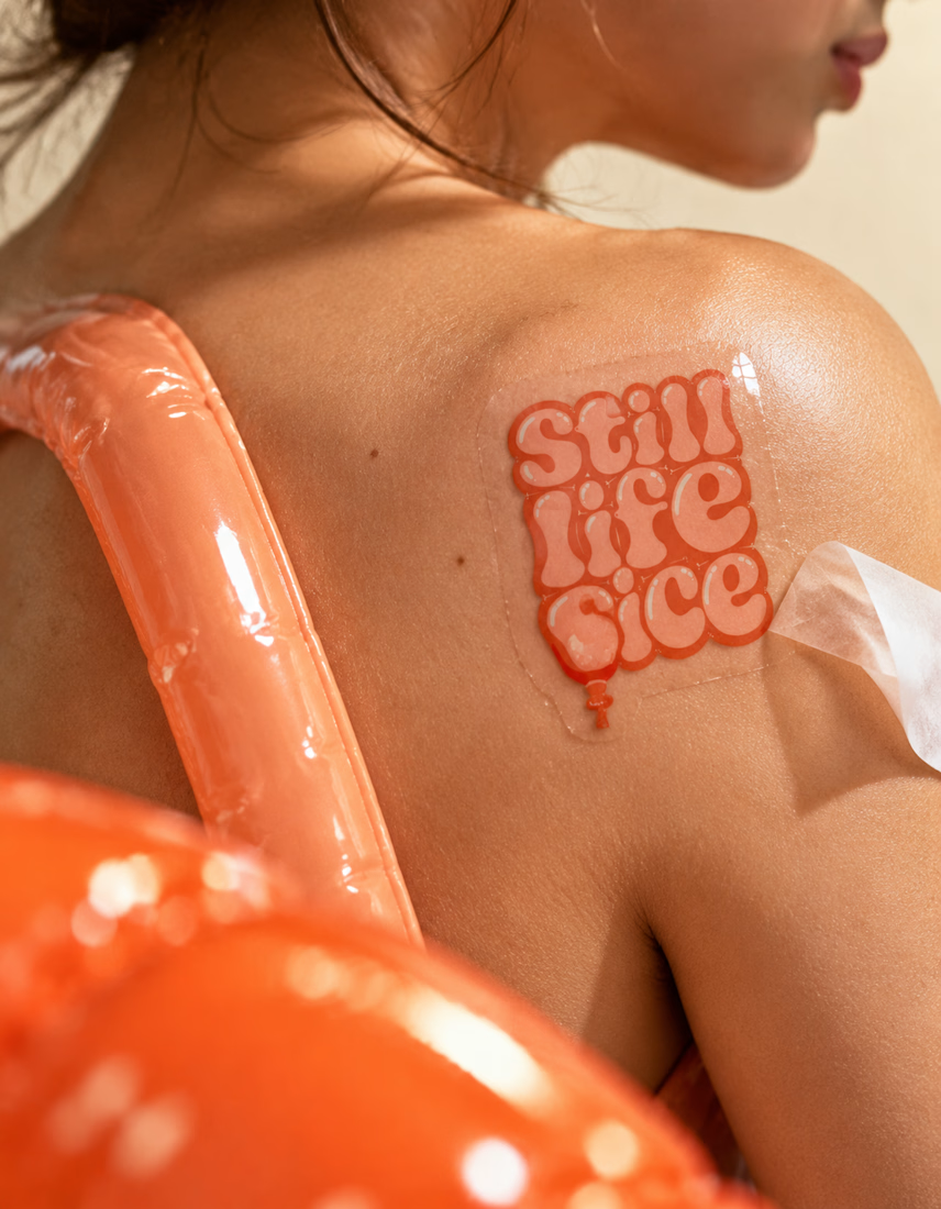
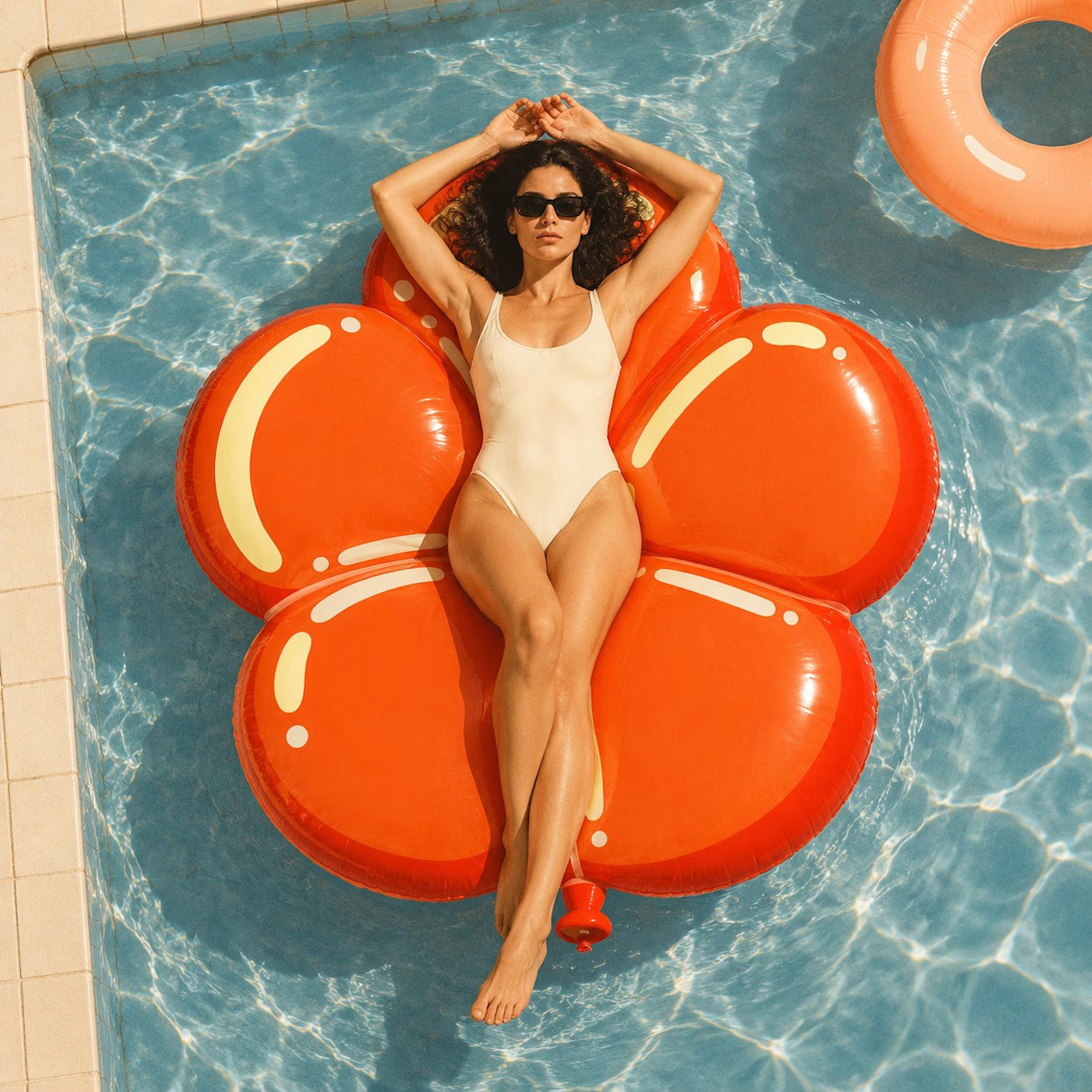
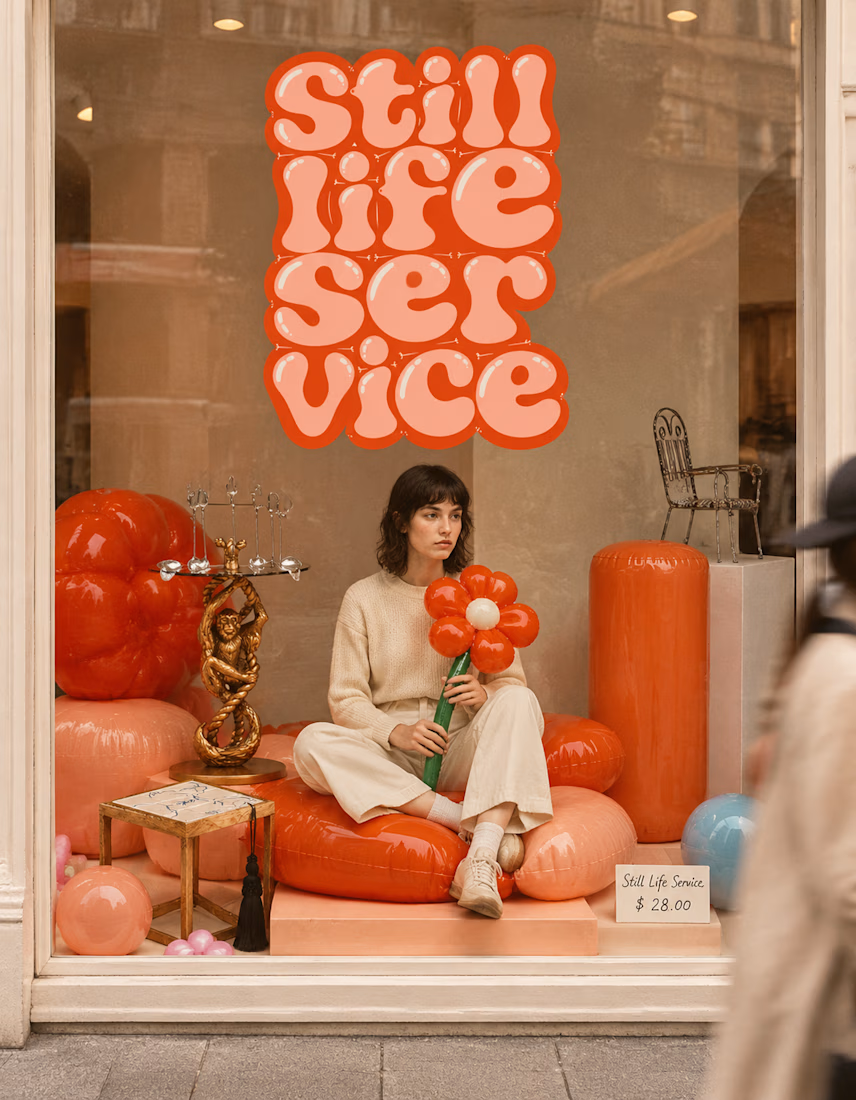

The inflatable flower. Only houseplant I'm guaranteed not to kill. Also, a new object every month is a sneaky good retention hook, people will stay subscribed just to see what's next.


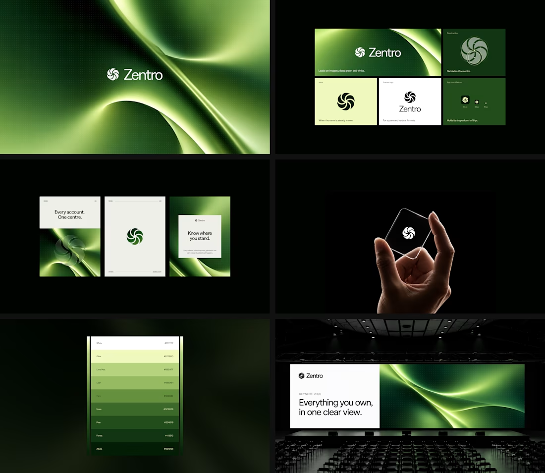

Clean and confident work! The green gradient with the mark feels very modern for fintech - trustworthy but not boring. The app screens look really polished. Curious how you landed on this mark, does it represent growth / movement?