The network for creativity
Join 1.25M professional creatives like you
Connect with clients, get discovered, and run your business 100% commission-free
Creatives on Contra have earned over $150M and we are just getting started
Back to feedPost

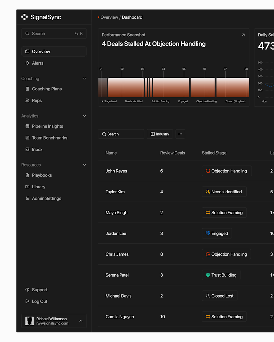
Built this for a client in the coaching/business space, basically a dashboard where they manage clients, track sessions, all that.
The brief was simple: "make it look professional but not boring." Here's a quick look 👇
Honestly business apps are slept on, they don't need to be flashy, they just need to actually work and feel trustworthy.

The network for creativity
Join 1.25M professional creatives like you
Connect with clients, get discovered, and run your business 100% commission-free
Creatives on Contra have earned over $150M and we are just getting started





Related posts

NURV® 🟠
Phase 39/35. Readiness 94%. 4/28 laps.
A swim, nutrition and supplement app where every number is made of dots and the only color is the one that matters.
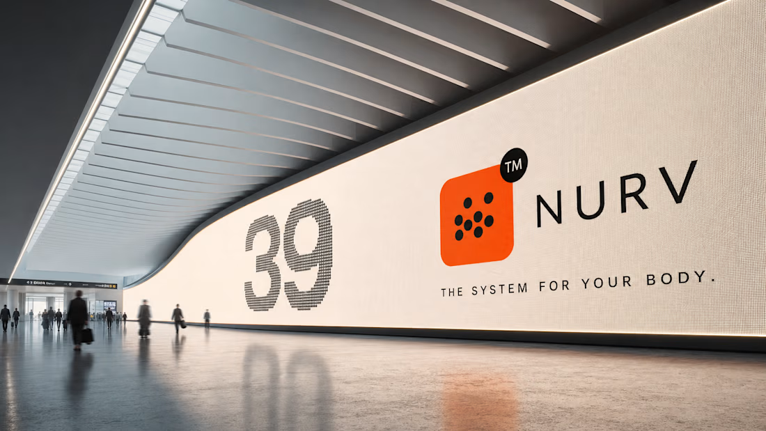

Dots as the only visual language with one orange accent is a bold, consistent call.


Built the StupidFish Design System from the ground up and covering everything from color, typography, spacing, and components to comprehensive documentation.
Designed and documented for both web and mobile, creating a consistent, scalable foundation that makes product design and development faster and more cohesive.
Check out the full case study here →


Really thorough system, nice job



Super clean work!