The network for creativity
Join 1.25M professional creatives like you
Connect with clients, get discovered, and run your business 100% commission-free
Creatives on Contra have earned over $150M and we are just getting started
Back to feedPost
Taste Test

I designed these posters back in 2018, and I recently came across them unexpectedly while going through my Google Photos. It was interesting to look back at some of my older work and see how my design style has evolved over the years.
I would love to hear your opinion.
Which one do you think is the strongest design, and why?
I am curious to know which concept catches your attention first, whether it is the composition, typography, colors, visual hierarchy, or overall concept.
Looking back at older work is always a great way to see how much you have learned and how your design thinking has changed.
Hope you guys like these designs! I would love to hear your feedback.
3 voted
100%

0 voted
0%

3 votes
Closed
The network for creativity
Join 1.25M professional creatives like you
Connect with clients, get discovered, and run your business 100% commission-free
Creatives on Contra have earned over $150M and we are just getting started




Related posts

The blur on the buttons is the only difference between these two clips. timing, easing and colors match.
Most people won't notice. if you do, drop a 1 or a 2.
5 voted
42%
7 voted
58%
12 votes
Closed


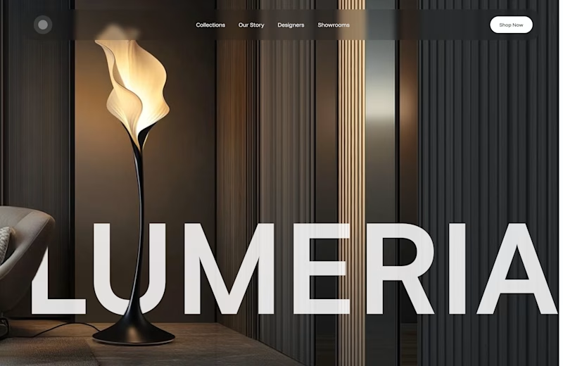
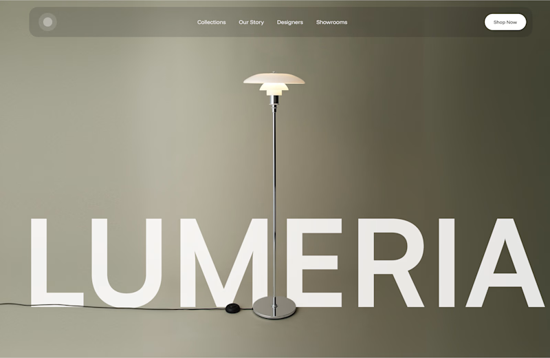
A little design exploration for practice ✨
This time, I’m working on a concept for a lighting brand.
Which direction do you prefer?

74 voted
70%
31 voted
30%
105 votes
Closed

Atmospheric, for a lighting brand it feels almost unfair not to show the product actually doing its job in a real room. The minimal version reads more like a furniture catalog to me. Is Lumeria leaning toward a specific price point or market that would push this one way or the other?

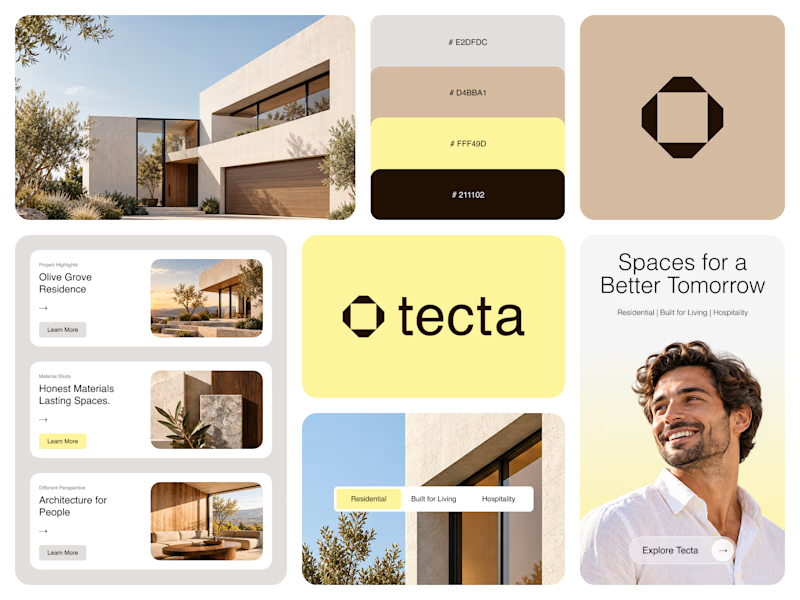
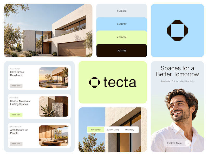
Color Direction Test - Tecta Architecture
Exploring two visual directions for Tecta, a contemporary architecture brand built around clarity, form, and human-centered spaces.
Direction 01 - Warm, calm, and timeless.
Direction 02 - Fresh, modern, and expressive.
Same identity. Different atmosphere.
Which direction feels stronger for an architecture brand - 01 or 02?
21 voted
38%
35 voted
62%
56 votes
Closed

Great branding! The presentation is top-notch. Learned something new from this.