The network for creativity
Join 1.25M professional creatives like you
Connect with clients, get discovered, and run your business 100% commission-free
Creatives on Contra have earned over $150M and we are just getting started
Back to feedPost

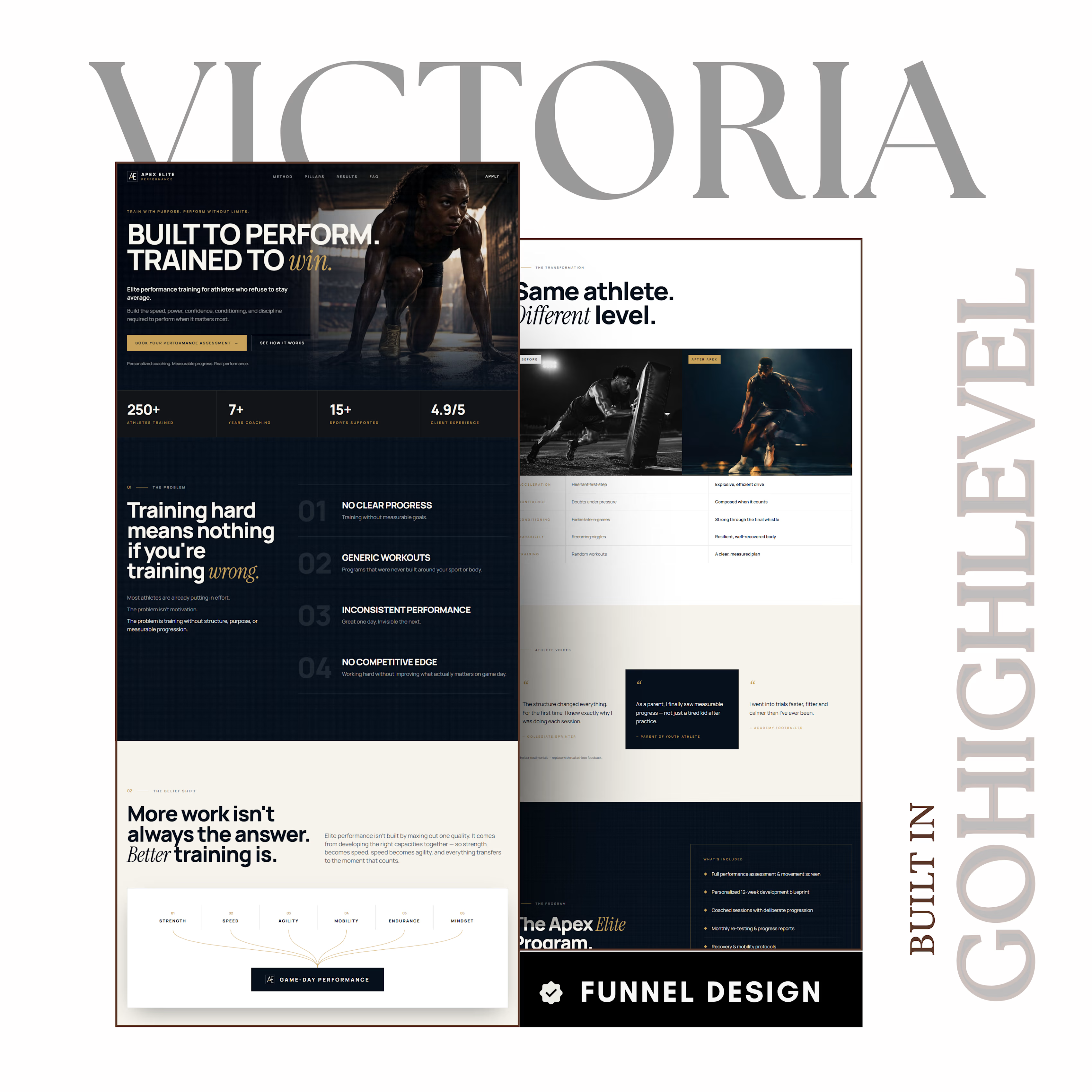
Designed and built a high-converting two-page sports performance funnel for elite athletes, combining luxury editorial design, technical performance storytelling, and a personalised assessment flow to turn serious prospects into qualified coaching applications.


The network for creativity
Join 1.25M professional creatives like you
Connect with clients, get discovered, and run your business 100% commission-free
Creatives on Contra have earned over $150M and we are just getting started











Related posts

Built this in Framer as a concept project. Goal was to make it feel run by ex-journalists. Choices: editorial serif (Libre Baskerville), a dark photo with one color accent, and copy that positions against blast-style PR.
Where I’m unsure: text legibility over the photo and whether the two CTAs compete. What would you change?




That's great design it feels professional I like how the background mixed with interface ❤️❤️
Great job Cheree🎉🎉

A flower that inflates arrives in the mail.
Next month, a phone made of shell.
STILL LIFE SERVICE. Case study dropping soon.
Which object earns your shelf? Reply below.
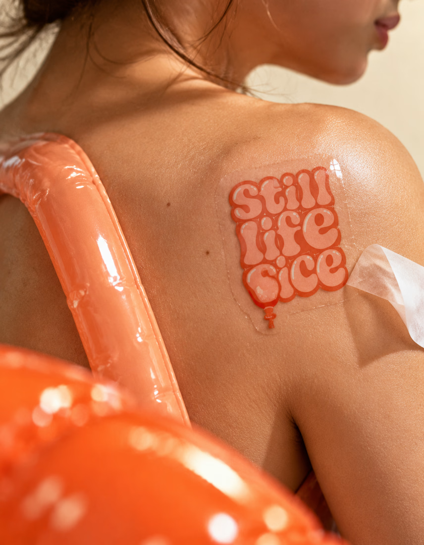
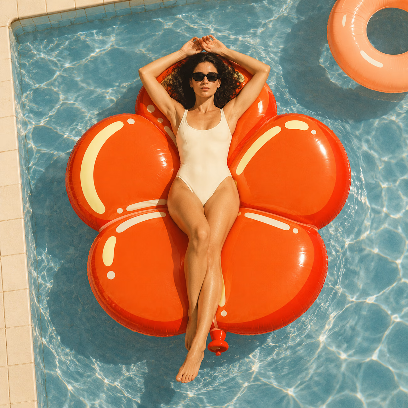
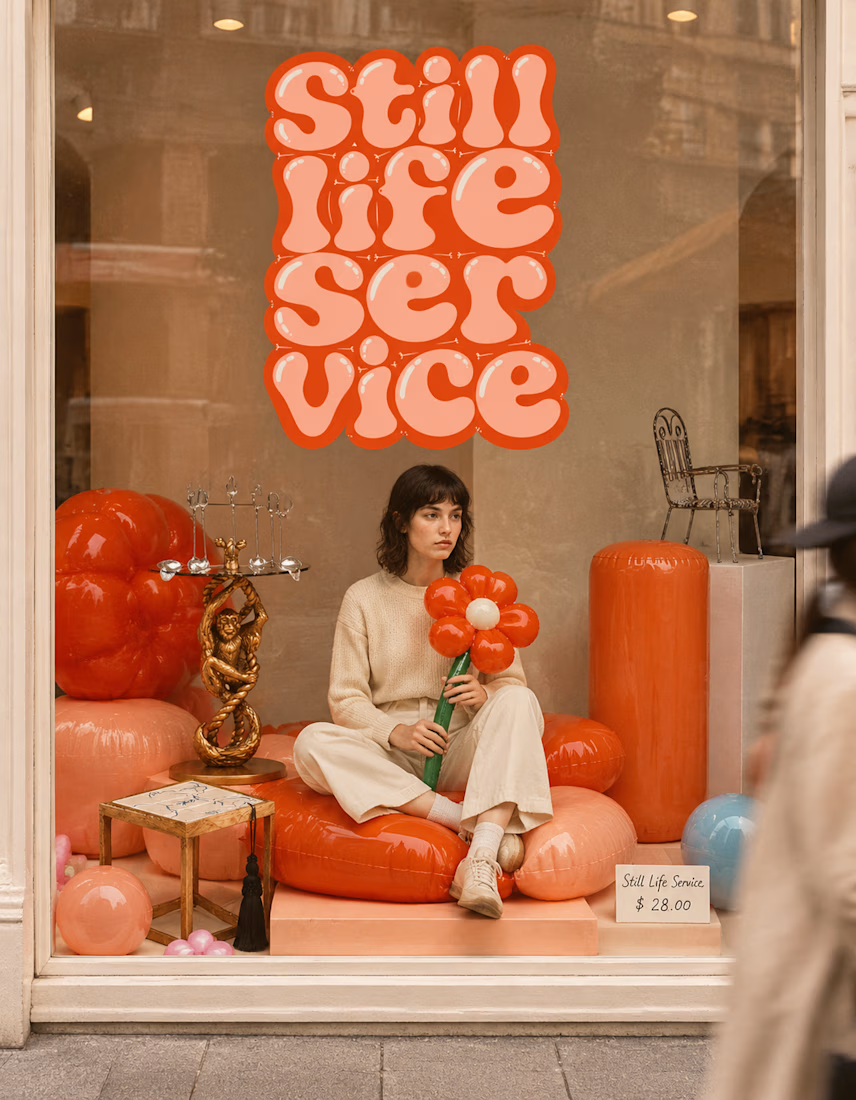

The inflatable flower. Only houseplant I'm guaranteed not to kill. Also, a new object every month is a sneaky good retention hook, people will stay subscribed just to see what's next.


I don’t avoid templates just to make things look different.
I avoid flattening a physical brand into a generic digital experience.
A restaurant, studio, fashion label or product can have incredible character in the real world, then lose all of it the moment it becomes a website.
That gap is what interests me.
The website should be able to carry the atmosphere through layout, typography, pacing, motion and interaction, and ideally attract people before they ever experience the physical space.
Not every project needs to be highly expressive.
Some websites should stay simple, direct and functional.
But even simplicity can carry identity.
Bolluni was built with that in mind: translating the character of the restaurant into a digital experience rather than simply presenting information.
Embrace the Creativity.

So well said. That's exactly the problem - a restaurant can have so much soul IRL then become another generic grid online. Love that you don't just avoid templates to be different, but to protect the brand's actual character. 100% agree.