The network for creativity
Join 1.25M professional creatives like you
Connect with clients, get discovered, and run your business 100% commission-free
Creatives on Contra have earned over $150M and we are just getting started
Back to feedPost

The Secret to Ranking Fast USA Tech & Health Guest Posts 🎯
The network for creativity
Join 1.25M professional creatives like you
Connect with clients, get discovered, and run your business 100% commission-free
Creatives on Contra have earned over $150M and we are just getting started




Related posts

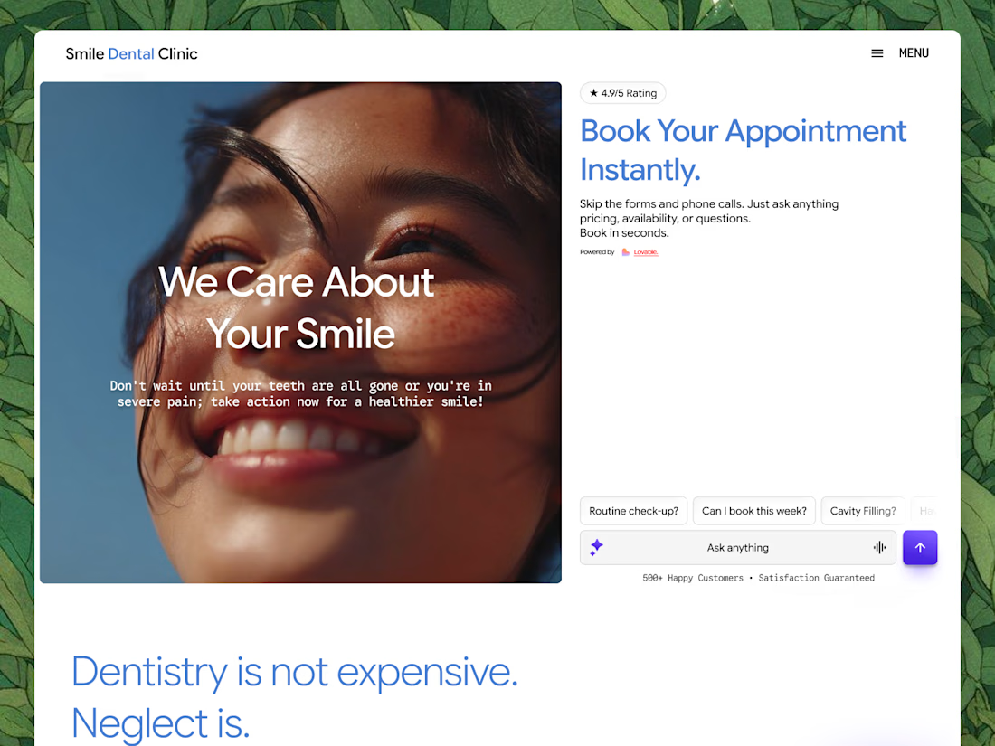
Working on the Lovable challenge and just dropped the initial draft for this dental clinic web app!
Here’s a quick UX decision I made during the wireframing stage: I originally considered a live chatbot, but ended up replacing it with a structured, interactive FAQ-to-booking funnel instead.
Why the pivot?
Conversion Optimization: Patients visiting a dental site usually want instant answers on pricing, insurance, or immediate availability. A streamlined FAQ that leads straight into a clear "Book Now" CTA reduces friction and drives higher conversion rates.
Implementation Speed: Let's be honest, setting up a full conversational chat integration within a tight challenge timeframe isn't practical.
By prioritizing high-intent UI elements like interactive prompt chips ("Routine check-up?", "Can I book this week?"), the user journey stays fast, clear, and focused on booking appointments.
Building this whole design system and prototype using Lovable and Figma. Wish me luck! 🤞



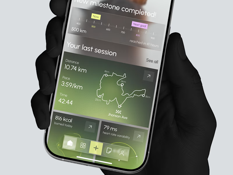
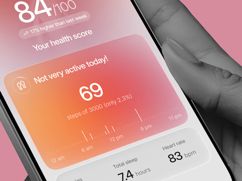
Designed two directions for a health tracking app
Same data, but two very different feelings
One is dark and focused, built for athletes. The other is warm and friendly, built for everyday people
What do you think?
Which one would you open every day, A or B?
34 votes
Ends in 21h

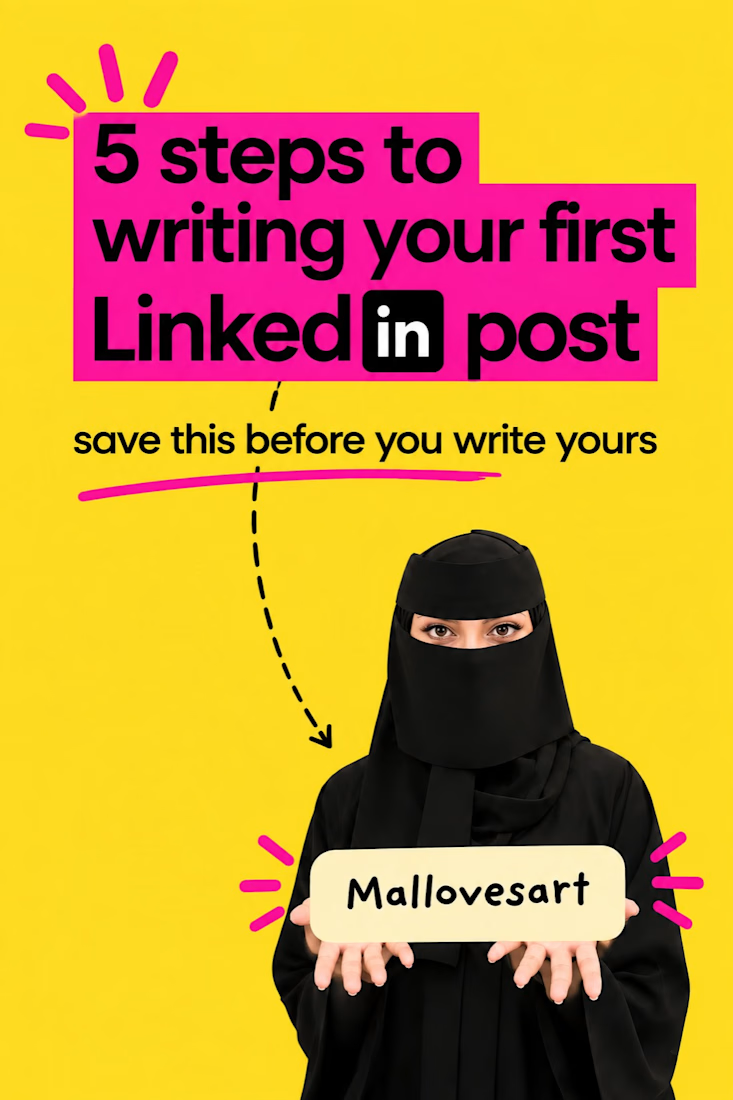
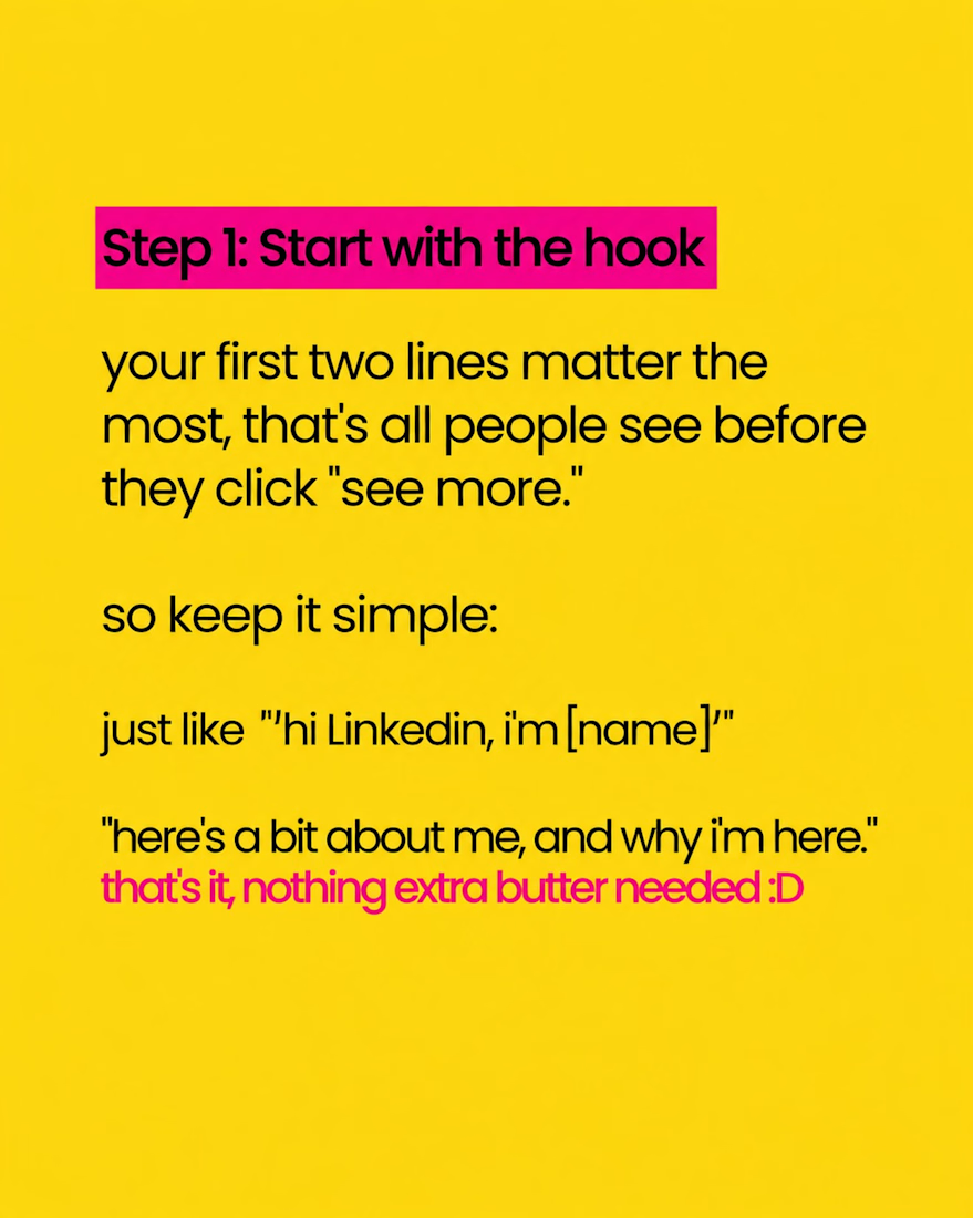
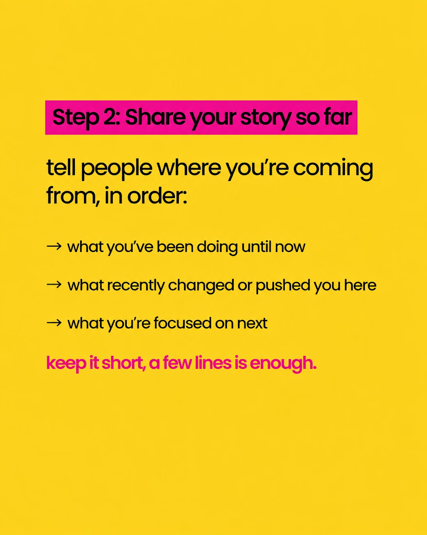
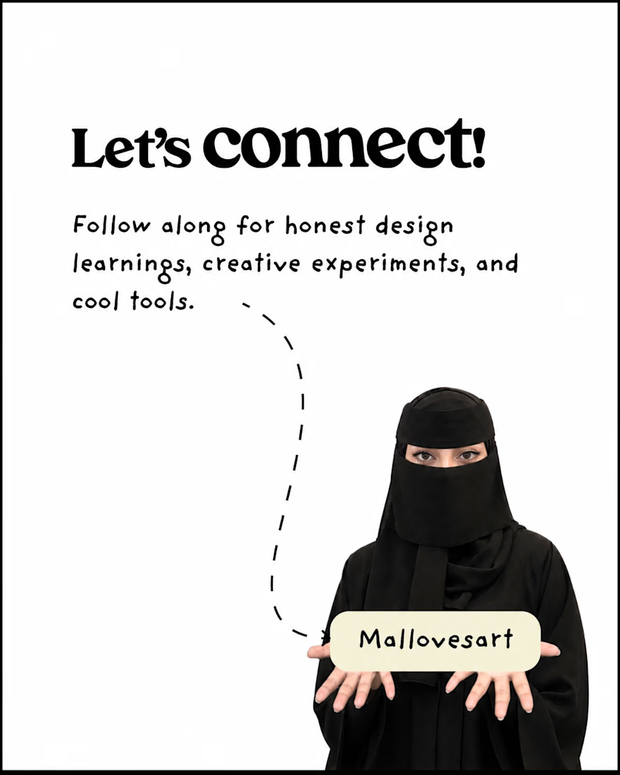
Carousel design breaking down "5 Steps to Writing Your First LinkedIn Post" — bold pink and yellow color-blocking with punchy, easy-to-scan typography. Designed to hook attention in the first slide and guide readers step-by-step through a simple, actionable framework.