The network for creativity
Join 1.25M professional creatives like you
Connect with clients, get discovered, and run your business 100% commission-free
Creatives on Contra have earned over $150M and we are just getting started
Back to feedPost

Most websites don't lose visitors because they look bad. They lose them because they're confusing.
A visitor should never have to think:
“Where do I go next?”
When I build a website, I try to make the journey obvious:
01 — Clear headline
Tell visitors what the business offers within seconds.
02 — Simple navigation
Make important information easy to find.
03 — Strong visual hierarchy
Guide attention toward the things that actually matter.
04 — One clear next step
Whether it's booking, ordering, contacting or buying — make the action obvious.
05 — Less friction
Remove unnecessary steps that make users work harder than they should.
Good UI isn't about adding more.
It's about making the right things easier to understand.
That's one of the principles I keep in mind when designing and developing websites.
What's the first thing that makes you leave a website?
#WebDevelopment #WebDesign #UIUX #UserExperience #WebsiteDesign #FrontendDevelopment #WebDeveloper

The network for creativity
Join 1.25M professional creatives like you
Connect with clients, get discovered, and run your business 100% commission-free
Creatives on Contra have earned over $150M and we are just getting started


Trending
retrofuturism
Share your favorite designs from the past exploring the distant future. Or your own take on the aesthetic 🚀
halftone
Dots. Texture. Grain. Let's see your designs using the halftone technique.

Midjourney
Creatives are showing off what they're making with Midjourney.
colorgrade
Video editors sound off: How do you enhance the mood of your video in color grading?
Related posts

A landing page should work as hard as the product it represents.
SMSVirtual had 850k+ active users, a 4.6 rating, and 39M+ received SMS.
None of it was showing up where it mattered.
The hero wasn't leading with the benefit, social proof was buried, and the sections weren't structured to guide a visitor toward a decision.
The full redesign covered every section: hero, features, use cases, FAQ, and CTA.
Each one designed with a clear purpose. Build trust early, communicate value clearly, remove doubt, and close with a strong call to action.
This is what a full landing page redesign looks like when strategy and design work together.

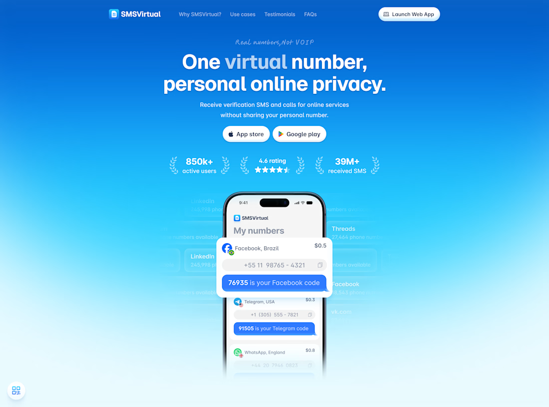
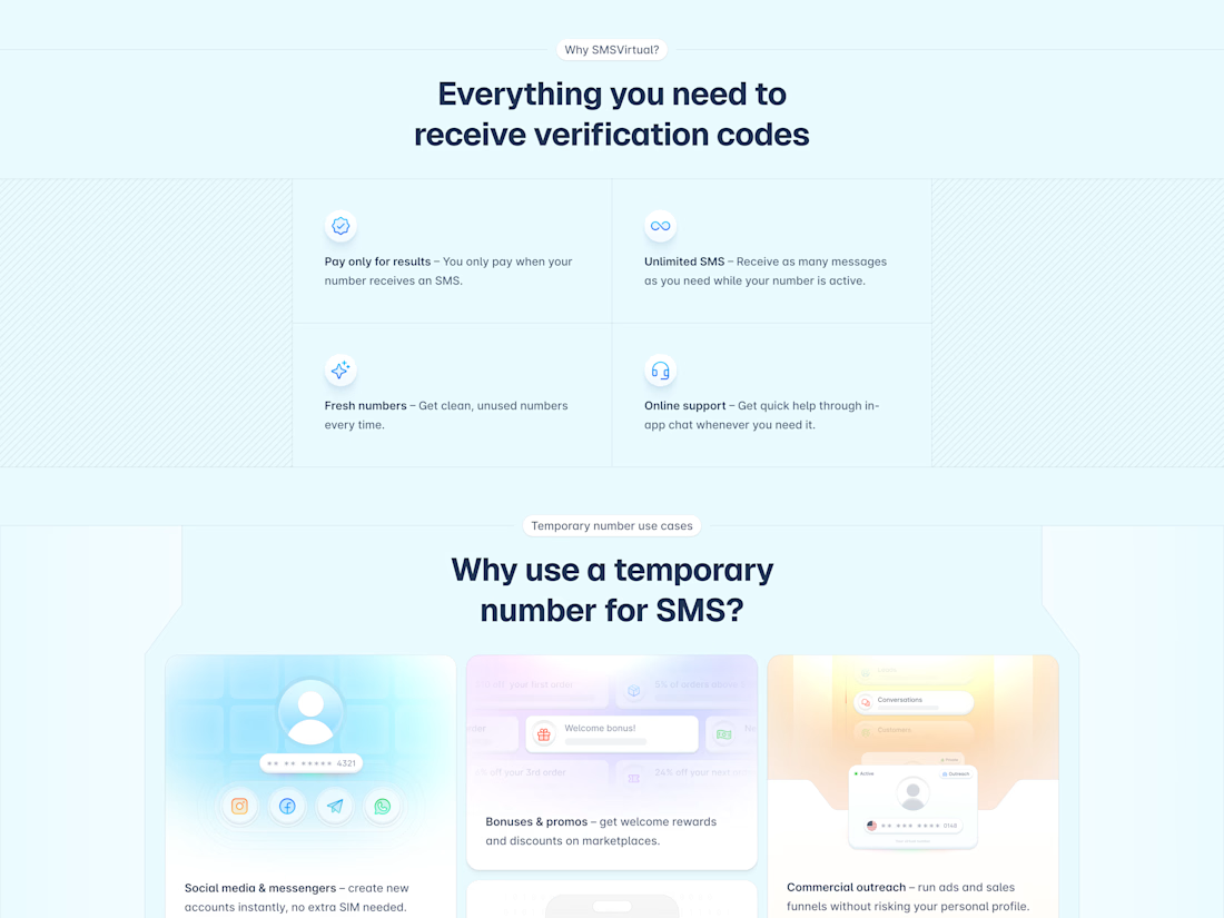
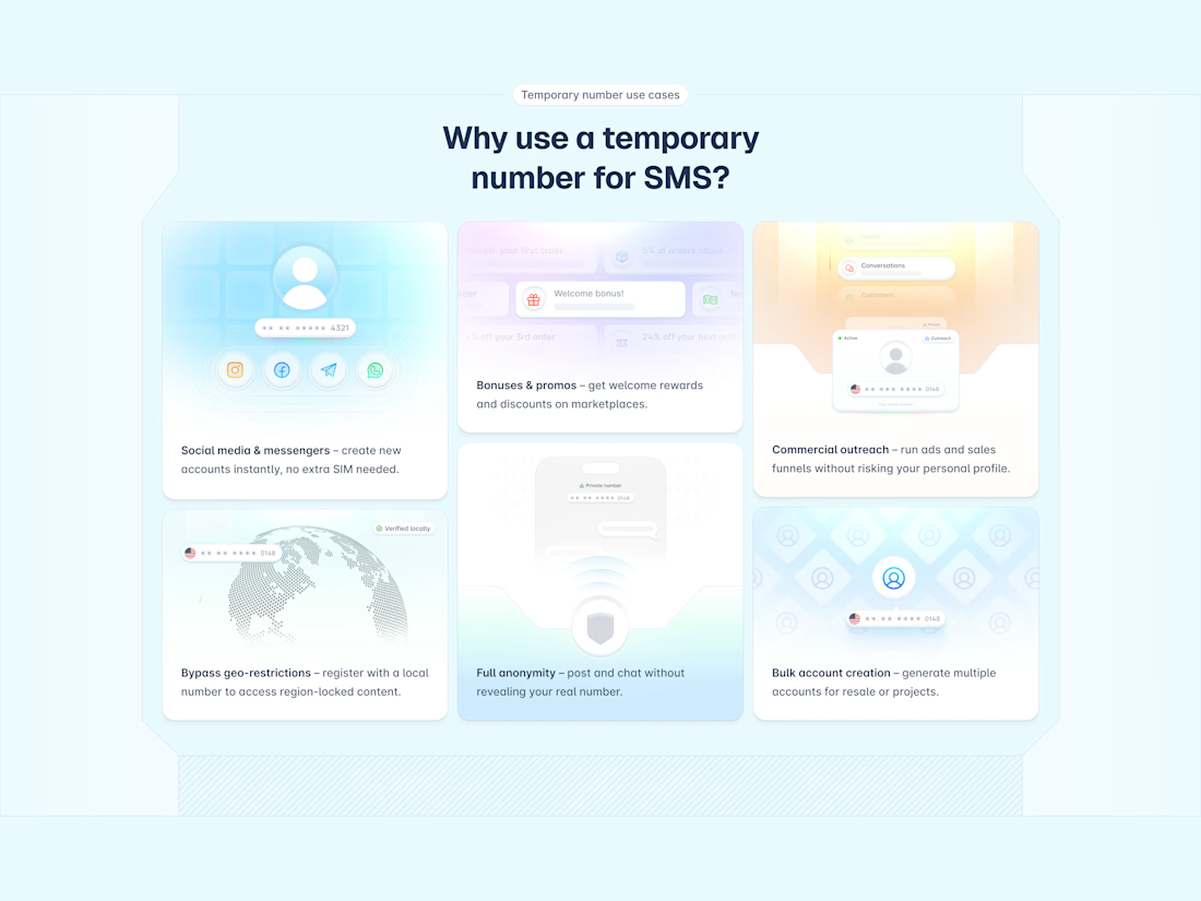
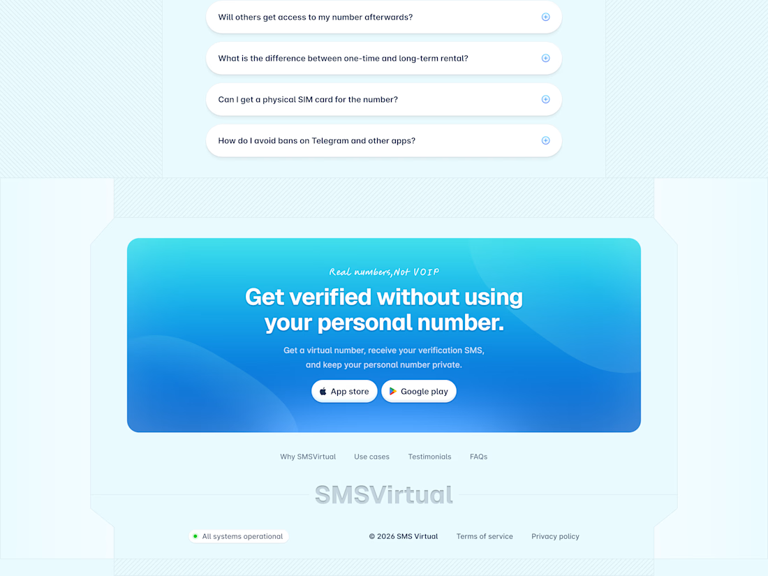

Love what you did with the hero by letting users see metrics of the app , that alone is a conversion tactics even before users scroll down to other sections of the landing page

Your health data exists everywhere. A plan that uses it doesn't.
Energy balance at 78. Heart rate at 72. AI health insights scoring 98. Morning mobility, hydration resets, breathwork, and mindfulness all scheduled, all trackable, all in one warm orange interface that feels less like a medical chart and more like a personal coach.
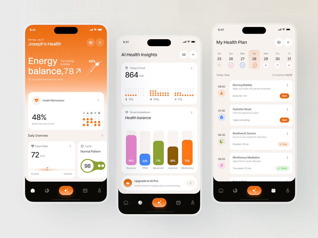

Creative App Designs - We loved it : )

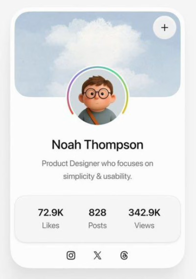
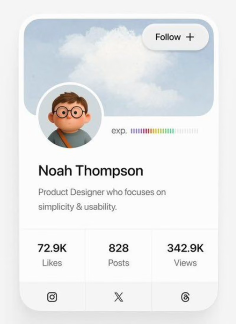


A for me. The follow CTA is clearer and the hierarchy feels more intuitive.