The network for creativity
Join 1.25M professional creatives like you
Connect with clients, get discovered, and run your business 100% commission-free
Creatives on Contra have earned over $150M and we are just getting started

The network for creativity
Join 1.25M professional creatives like you
Connect with clients, get discovered, and run your business 100% commission-free
Creatives on Contra have earned over $150M and we are just getting started

Challenges
View all


Related posts



Concept project for a made-up hair salon. Price list by service, and a booking-by-email button.


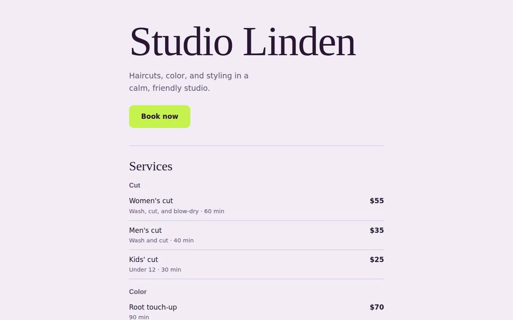
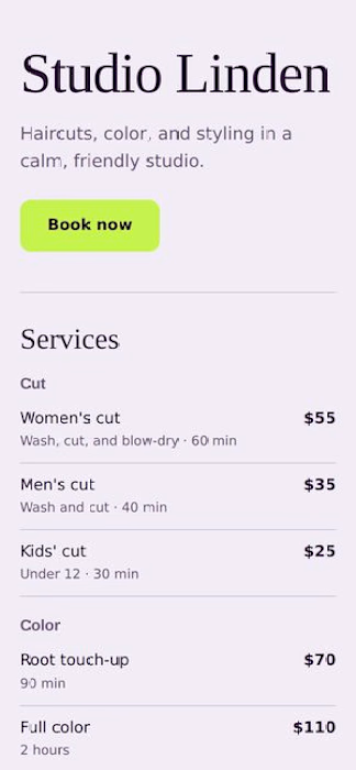


booking by email instead of a whole widget is honestly refreshing for a small salon

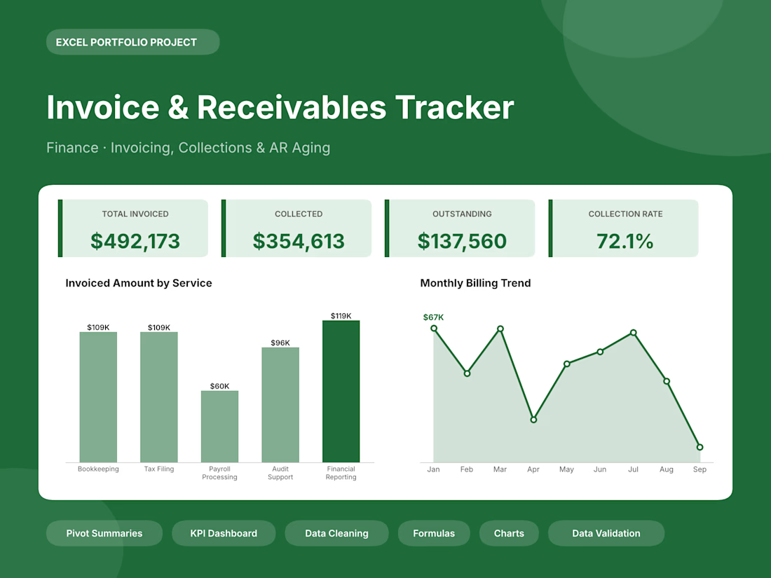
Sample Data - Finance: invoices and receivables, collections and overdue-payment buckets.
Dashboard: a colored title banner, 4 KPI cards, a “Key Highlights” box and 4 charts. The highlights are written by formulas, so they update when the data changes.
Data: 250 records in a filterable table, with drop-down lists, color-coded status cells, bar shading on amounts and calculated columns.
Pivot Summary: 5 summary tables (by category, region, month, status, and so on) with grand totals.
Raw vs Clean: messy sample rows next to a checklist of the cleanup steps. This shows clients the data-entry and cleanup work they’d be paying for.