The network for creativity
Join 1.25M professional creatives like you
Connect with clients, get discovered, and run your business 100% commission-free
Creatives on Contra have earned over $150M and we are just getting started
Back to feedPost

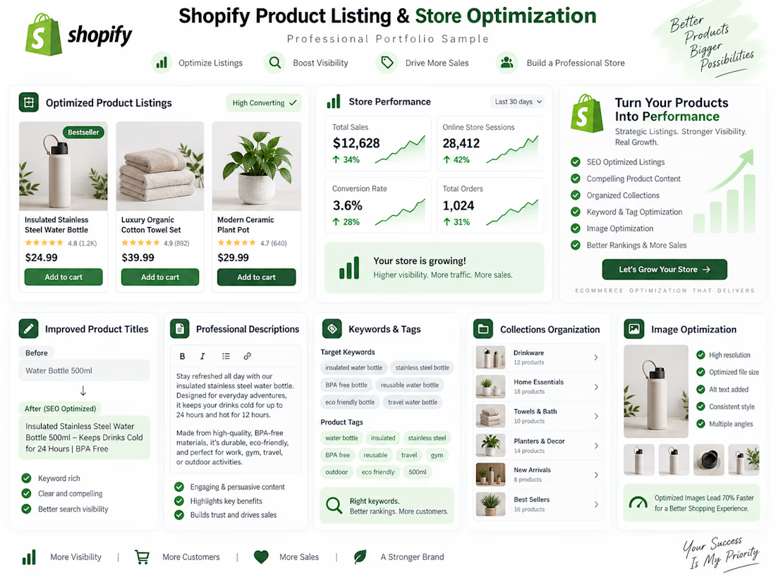
Shopify Product Listing and Store Optimization — Professional Portfolio Sample. A clean e-commerce optimization sample showcasing improved product titles, descriptions, keywords, tags, collections, and product image presentation.

The network for creativity
Join 1.25M professional creatives like you
Connect with clients, get discovered, and run your business 100% commission-free
Creatives on Contra have earned over $150M and we are just getting started




Related posts

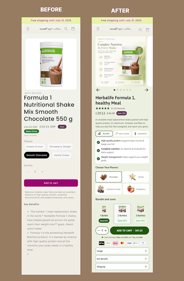
I redesigned this mobile offer section of product page on @Figma to create a clearer, more persuasive buying experience.
The original page presented the essential information, but the benefits, product options and purchase controls were difficult to scan.
For the redesign, I improved:
• Product and offer hierarchy
• Benefit-focused messaging
• Product gallery and visual presentation
• Flavour and bundle selection
• Pricing and savings visibility
• Trust signals near the CTA
• Mobile usability and buying flow
The goal was to help shoppers understand the product, compare their options and move toward purchase with less friction.
This is a concept redesign created to demonstrate my approach to conversion-focused Shopify product page design.


Good hierarchy fix, the before version buries the flavor picker and quantity discount below a wall of bullet points. On the bundle tiers, are the 10/20/30% discounts pulled from a real margin model for a shake product, or placeholder numbers for the concept? That third tier...

Nestora Home Decor - Shopify Drop-shipping Store


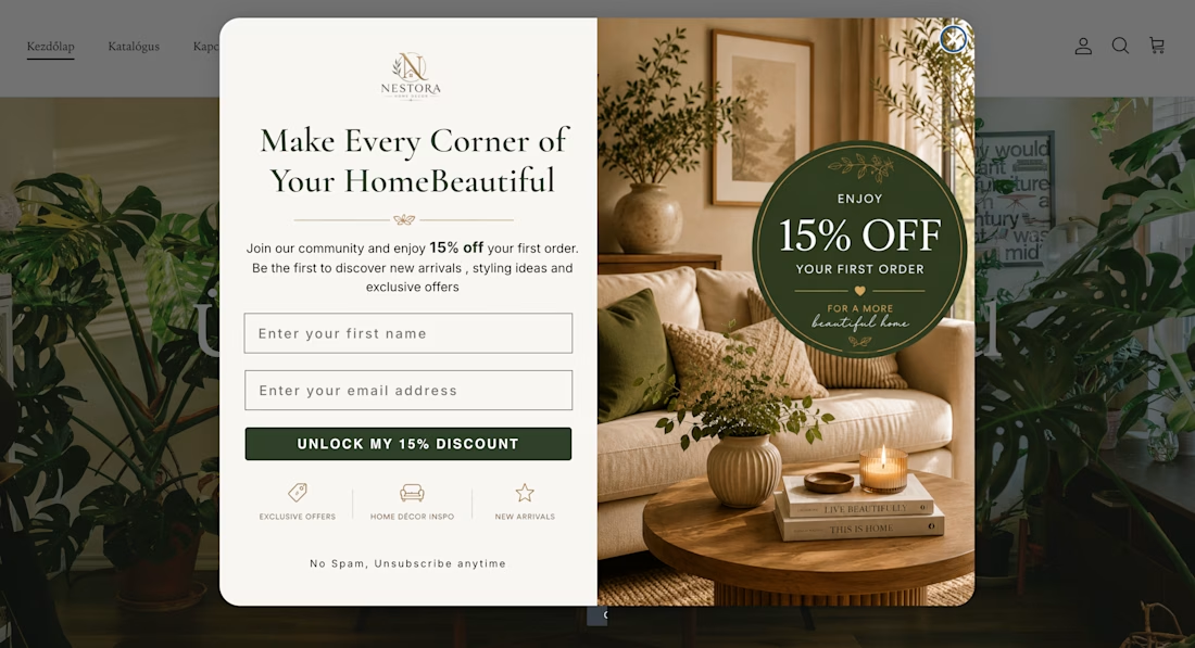
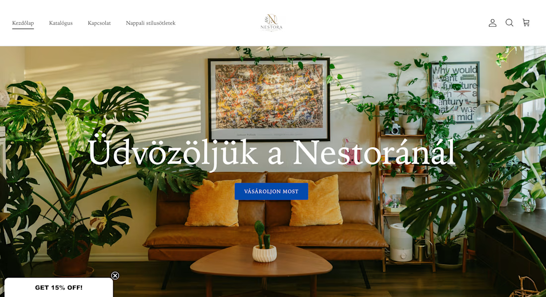
Noticed the homepage nav and hero are in Hungarian but the first-order popup and its discount code are in English, was that a deliberate call since the audience skews bilingual, or is the popup app still on its default locale? A mismatch there right at the entry point is the...

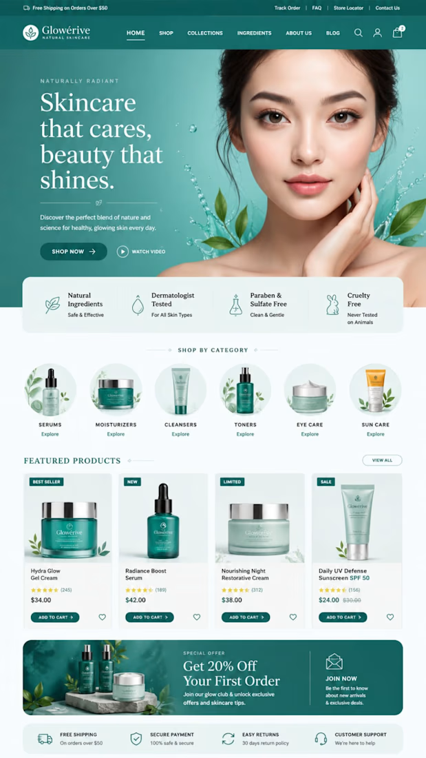
Just completed a modern Shopify store design focused on clean visuals, easy navigation, and a better e-commerce experience.💯