The network for creativity
Join 1.25M professional creatives like you
Connect with clients, get discovered, and run your business 100% commission-free
Creatives on Contra have earned over $150M and we are just getting started
Back to feedPost
Taste Test


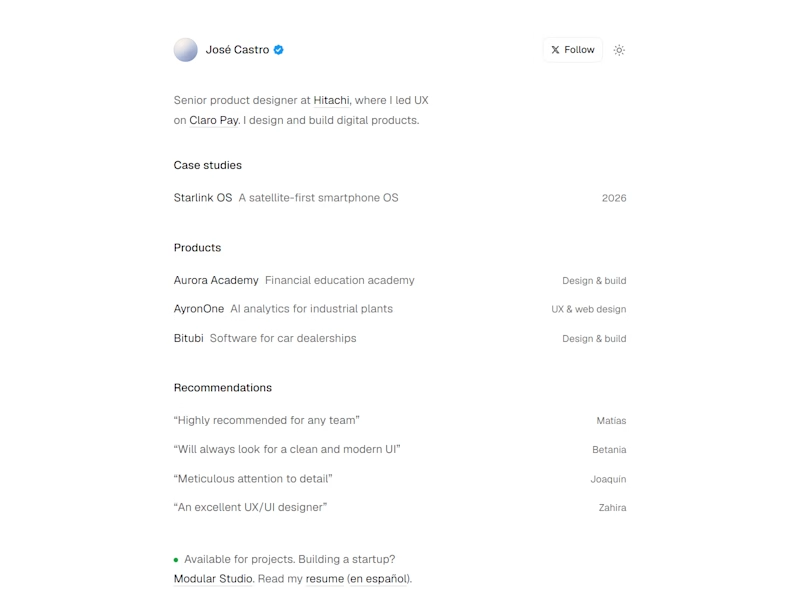
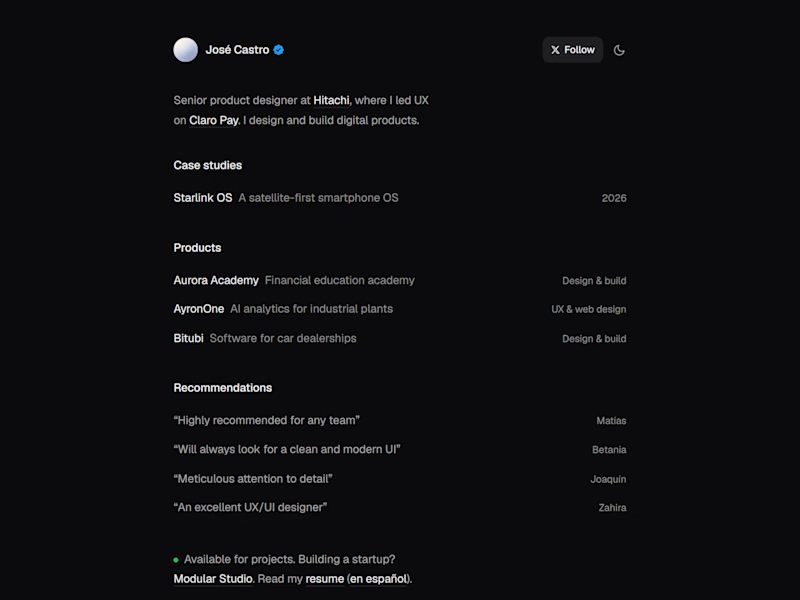
I redesigned my personal site to be as quiet as possible: one column, one page, everything you need at a glance.
Same layout, same type, same spacing. Only the light changes.
Which one would you keep as the default?
3 voted
50%
3 voted
50%
6 votes
Closed


i'd keep the light one as the default and let the grey be an evening mode. with this little on the page the white gives the type more room to breathe
this is nice, thanks!
The network for creativity
Join 1.25M professional creatives like you
Connect with clients, get discovered, and run your business 100% commission-free
Creatives on Contra have earned over $150M and we are just getting started


Related posts

Very close to finish a website project! Help me out!
Blue or orange scheme?
38 voted
47%
43 voted
53%
81 votes
Closed

The orange scheme was stunning 😍

Which one could win here?
A/B testing for a Landing page for B2B search analytics platform.
For startups, converting users is extremely crucial.
Rather than judging on your own, let the numbers tell you which one can help you get more users.
#landingpage #abtesting #b2b #aisearch #businessanalytics
19 voted
44%
24 voted
56%
43 votes
Closed

Light blue. For a B2B analytics tool, showing the actual dashboard in the hero does the selling before anyone reads the copy. “Win in AI search” lands better with the product right beside it. Would be curious to see a second test on the CTA too, “Start Free Analysis” vs something tied to a result.

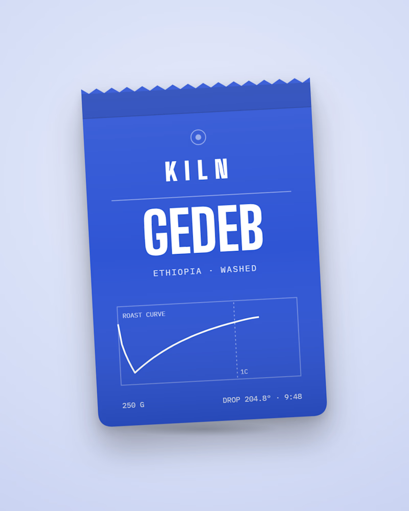
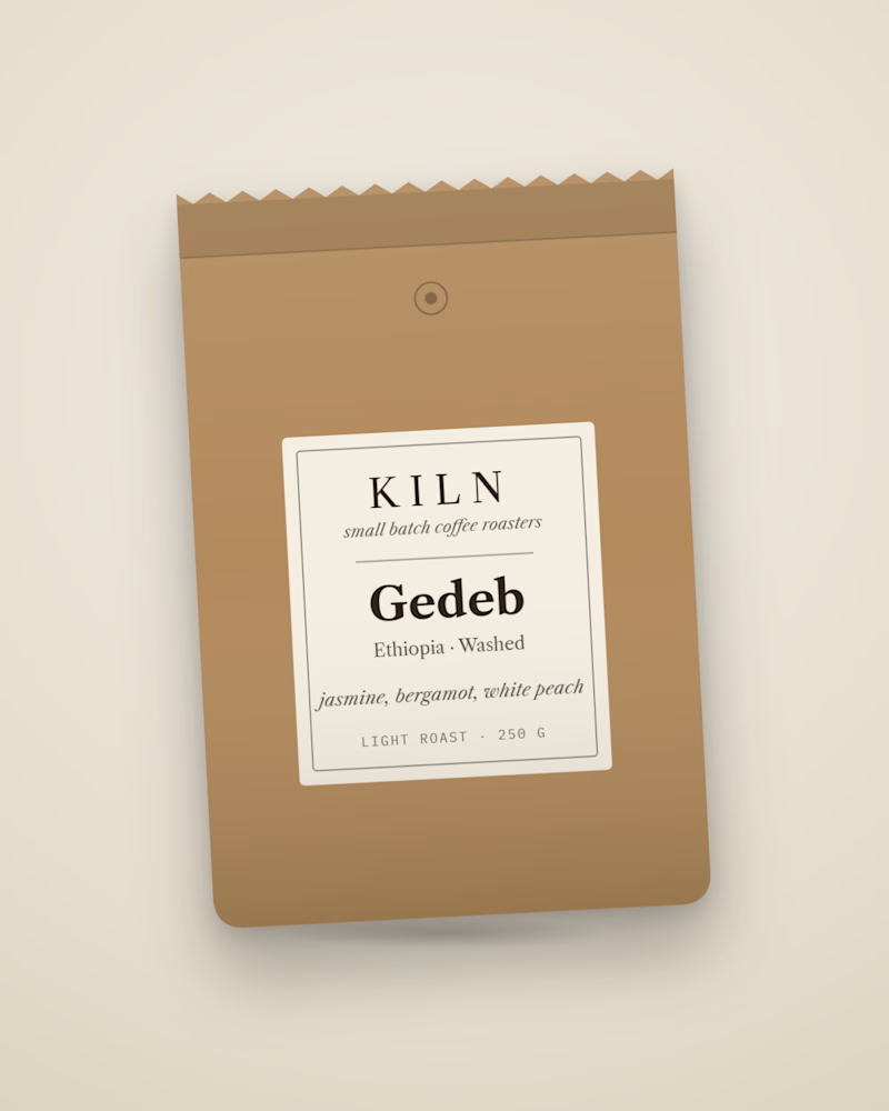
Which bag would make you buy the coffee?
Same coffee, two bags. One prints the real roast curve from its batch: drop temperature, roast time, first crack. The other is the classic kraft label most roasters ship. I built the first into KILN, a Shopify store concept where every bag is generated from its roast data. Which one are you picking up, and why?

8 voted
62%
5 voted
38%
13 votes
Closed

Printing the actual roast curve on the bag is such a good trust move, it turns the data into the packaging. I'd buy that one. Does the curve change with every batch on the print run?