The network for creativity
Join 1.25M professional creatives like you
Connect with clients, get discovered, and run your business 100% commission-free
Creatives on Contra have earned over $150M and we are just getting started
Back to feedPost
Taste Test


I think I'm staring at these for too long 😂
If you had to choose one...
❤️ Image 1
🔥 Image 2
Bonus points if you tell me why.
0 voted
1%

0 voted
1%

0 votes
Closed
The network for creativity
Join 1.25M professional creatives like you
Connect with clients, get discovered, and run your business 100% commission-free
Creatives on Contra have earned over $150M and we are just getting started



Related posts

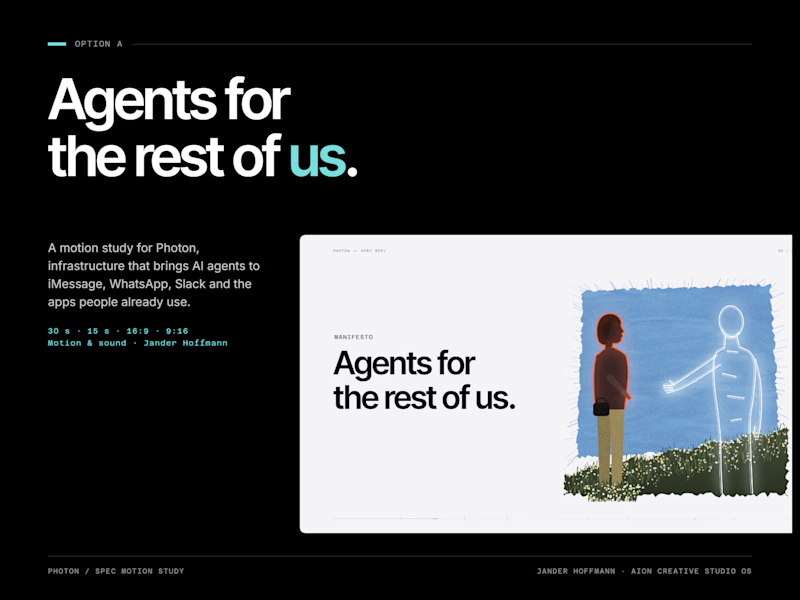
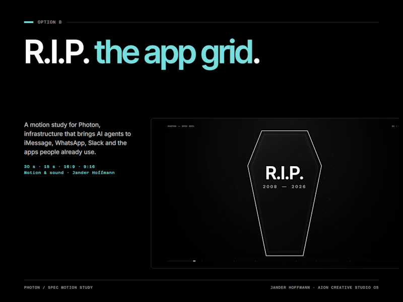
Which cover would make you click: A or B?
4 voted
100%
0 voted
0%
4 votes
Closed


first cover gets my vote

Working on a Contra project - which one is your go to?
90 voted
52%
82 voted
48%
172 votes
Closed

I will go for A - Spiral

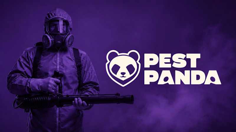
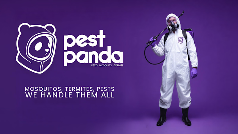
Which logo + Wordmark looks more organic/reliable/premium and why?
5 voted
71%
2 voted
29%
7 votes
Closed

Option 2 for me: the rounded lowercase wordmark and the panda in a hazmat hood feel friendlier and more premium, while the heavy caps next to the gas-mask photo in option 1 read a bit aggressive for a home service. I'd only give the tagline in option 2 more weight, at that size it gets lost on the purple.