The network for creativity
Join 1.25M professional creatives like you
Connect with clients, get discovered, and run your business 100% commission-free
Creatives on Contra have earned over $150M and we are just getting started
Back to feedPost

This project is a complete brand identity design for a real estate company called KEVCITY – Real Estate Property. It showcases how a brand is built visually and applied consistently across different touchpoints.
🔶 Concept & Branding
The core idea behind this project is modern, bold, and premium real estate branding.
The logo symbol (abstract “K” mark) feels dynamic and architectural, hinting at buildings, growth, and movement.
The sharp edges and forward-leaning shape communicate progress, trust, and development—key qualities in real estate.
🎨 Color Strategy
The color palette is very intentional:
Yellow/Gold → Represents prosperity, positivity, and investment value
Red/Orange Gradient → Adds energy, strength, and attention-grabbing appeal
Dark tones (brown/black) → Provide balance and professionalism
This combination makes the brand feel both approachable and premium, which is ideal for property marketing.
🧩 Brand Applications (What’s Included)
This project is not just a logo—it’s a full identity system:
Office Branding (wall logo, interior setup)
Merchandise Design (branded mug)
Stationery (business cards, letterheads)
Outdoor Advertising (billboard design)
Pattern Design (repeating logo for brand texture)
These mockups show how the brand works in real-world scenarios, ensuring consistency across all platforms.
🏙️ Visual Style
Clean typography with strong spacing → gives a corporate and trustworthy feel
Subtle skyline illustrations → reinforce the real estate theme
Minimal clutter → keeps focus on brand identity
💡 Overall Impression
This is a well-rounded branding project that demonstrates:
Strong logo concept
Consistent visual identity
Practical application across marketing materials🔥


The network for creativity
Join 1.25M professional creatives like you
Connect with clients, get discovered, and run your business 100% commission-free
Creatives on Contra have earned over $150M and we are just getting started



Related posts

Brand work for HauntChain
I'm loving building this brand and the results so far
A deFi platform with some gamification


That's cute ❤️

PREMIUM BRAND IDENTITY & MOCKUP COLLECTION
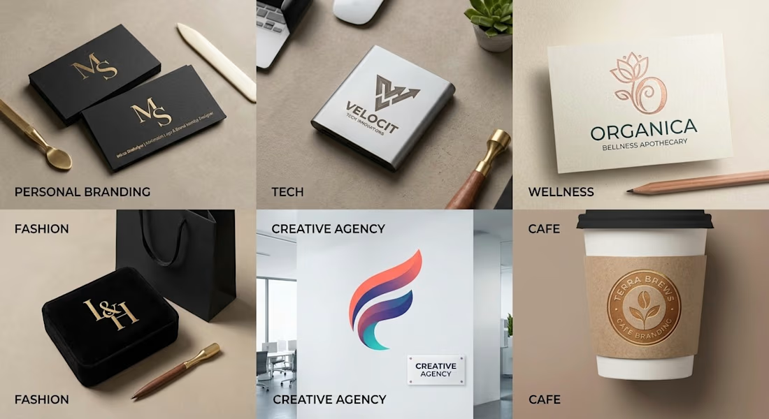

Clear Brand Identity + Clean MockUp = Premium Product

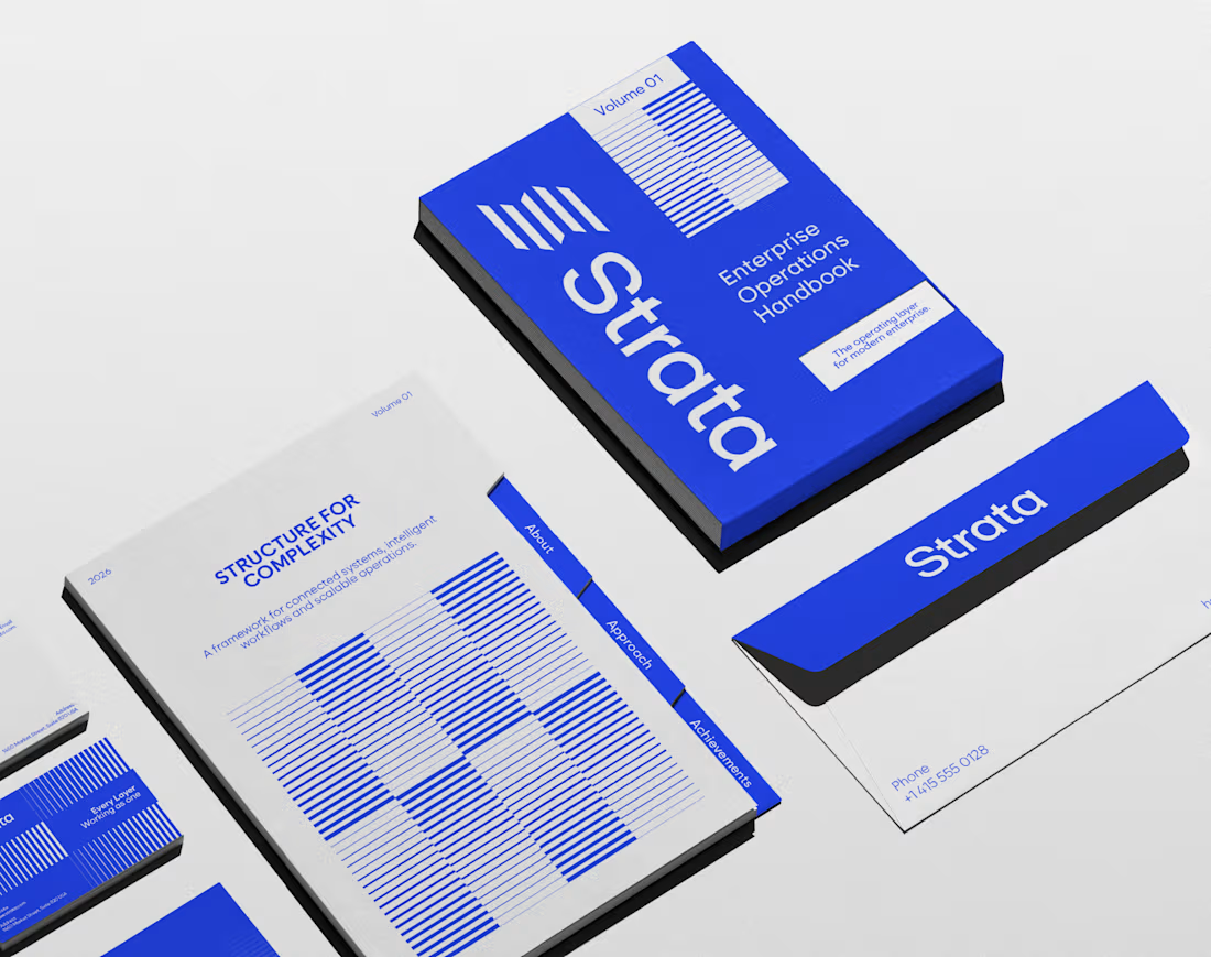
In geology, strata are layers laid down over time, each one holding the rest. That’s exactly what an enterprise platform should feel like.
I designed the brand identity for Strata, a SaaS platform that connects fragmented systems, data, workflows and teams. The name already carried the idea, so the identity makes it visible: “Every layer, working as one.”
Logo: Five stacked layers forming a subtle S, solid like rock and arranged for motion.
Principle: “Complexity, organized into movement” turns a dense product story into something calm.
Palette: Strata Blue #2447F9, near-black #02040C and white. Flat colour only, so every layer stays distinct.
Layout: Modular grids and architectural spacing that build pages the way strata build ground, in order.
Imagery: Portraits washed in Strata Blue, with light streaming through, putting people at the centre of the system.
A good name sets up the brand. The identity has to prove it.
If your SaaS or B2B platform needs a brand as solid as its infrastructure, let’s talk.
#BrandIdentity #SaaSBranding #TechBranding #LogoDesign