The network for creativity
Join 1.25M professional creatives like you
Connect with clients, get discovered, and run your business 100% commission-free
Creatives on Contra have earned over $150M and we are just getting started
Back to feedPost

🛒 Flipkart App — UI/UX Mistakes & Solutions
I explored the Flipkart app from a UI/UX perspective and identified several areas where the user experience could be improved.
From information overload and banner clutter to visual hierarchy, notifications, filters, product cards and checkout flow — small design decisions can have a big impact on how easily users browse and shop.
For each mistake, I explored a practical UX solution focused on clarity, simplicity and a smoother user journey.
4 explored — 3 more coming next. 🚀
Good UI gets attention. Great UX makes things easier.
#UIUX #UIDesign #UXDesign #Flipkart #UXCaseStudy #ProductDesign #UXDesigner #UIUXDesign #DesignProcess #ContraDesigner

The network for creativity
Join 1.25M professional creatives like you
Connect with clients, get discovered, and run your business 100% commission-free
Creatives on Contra have earned over $150M and we are just getting started





Related posts

IPO Coins landing page web design 3D animation website icons


Great Design, R

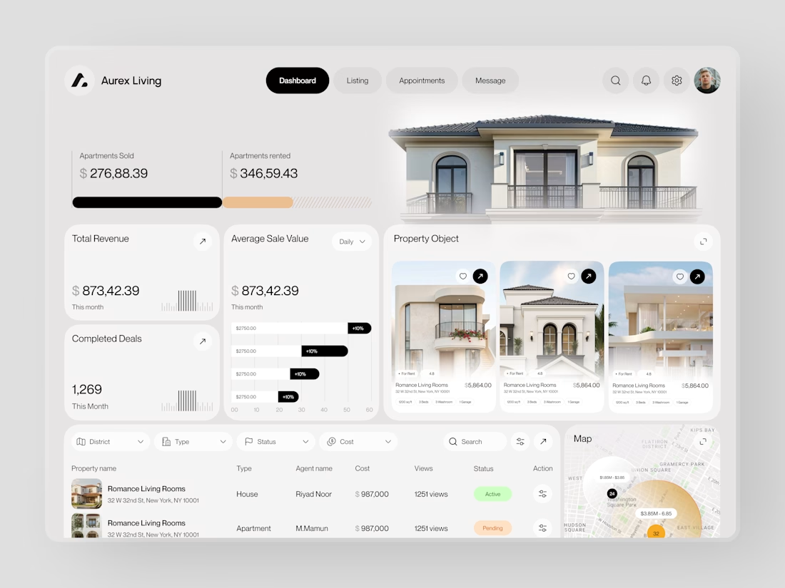
Real estate dashboards are usually built for data entry. Aurex Living was built for decision-making.
$873,42.39 total revenue. 1,269 completed deals this month. $276K sold, $346K rented. Property cards, agent tracking, map view, average sale value trending +10% - every number a real estate operator actually needs, on one clean white canvas.

What if you could explore a basketball arena in 3D before booking your seat?
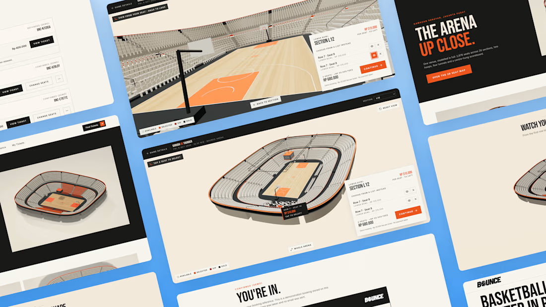
You found the game. But before you pay, how do you know which seat is worth it? A flat seating chart gives you a section and a number, but it can be hard to picture your position relative to the court.
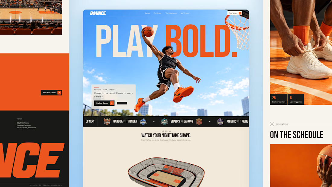
So I built BOUNCE with Lovable, a basketball ticketing concept centered around interactive 3D seat selection.
Rotate the stadium, zoom into the stands, explore different sections, and compare prices before choosing your seats directly inside the 3D arena. The goal is simple: help fans feel more confident about where they’re sitting before they book.
From there, complete checkout and get a ticket you can view, save, or print. My Tickets brings bookings together, with a one-time seat change for the same game and refund requests for eligible bookings.
Bold orange, oversized typography, and scroll driven motion bring the energy of basketball into the experience.
Try the demo: https://bouncebasketball.lovable.app/
Fictional teams. Simulated payments. No real charges.
Less guesswork. More game. BOUNCE. Your game. Your view.


The 3D elements, especially seat pov idea is very interesting🔥