The network for creativity
Join 1.25M professional creatives like you
Connect with clients, get discovered, and run your business 100% commission-free
Creatives on Contra have earned over $150M and we are just getting started
Back to feedPost

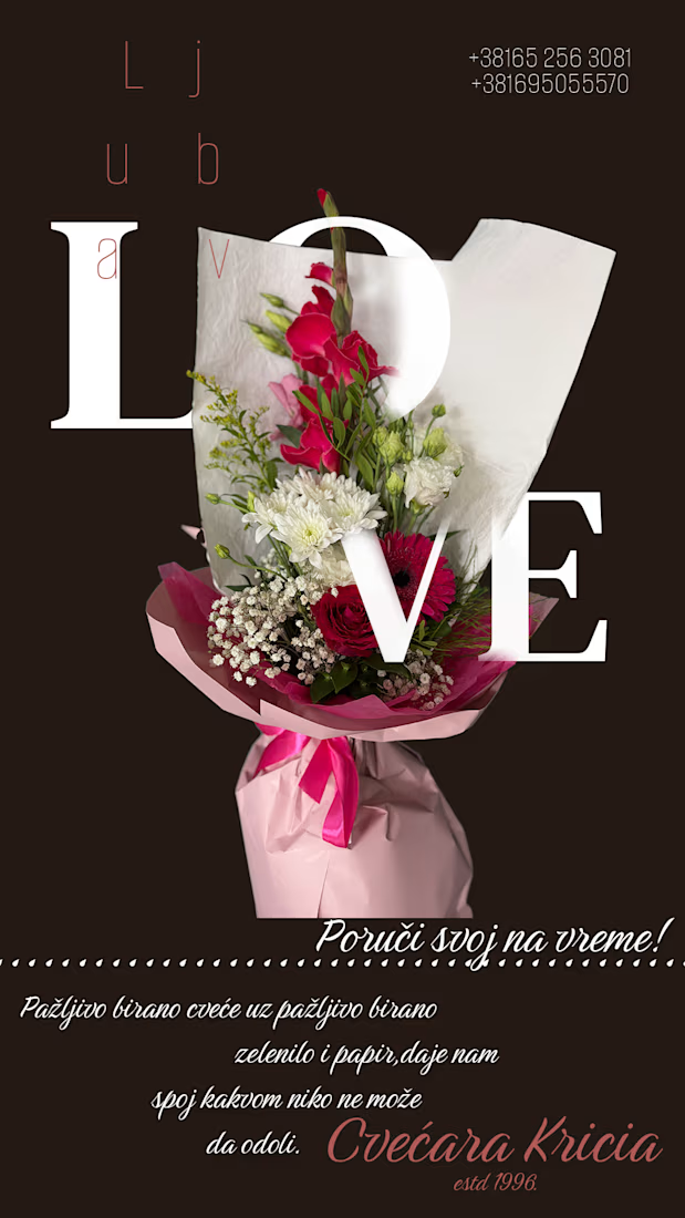

The oversized serif type layered right into the bouquet photo is a nice touch, it feels part of the arrangement instead of slapped on top. Was this a template for a florist client, or a one-off seasonal push?

Thanks! This was designed specifically for Cvećara Kricia — the ‘LOVE’/‘Ljubav’ wordplay was tailored to their brand, but the same oversized-typography technique can easily be adapted for other florists or seasonal campaigns.
The network for creativity
Join 1.25M professional creatives like you
Connect with clients, get discovered, and run your business 100% commission-free
Creatives on Contra have earned over $150M and we are just getting started





Related posts


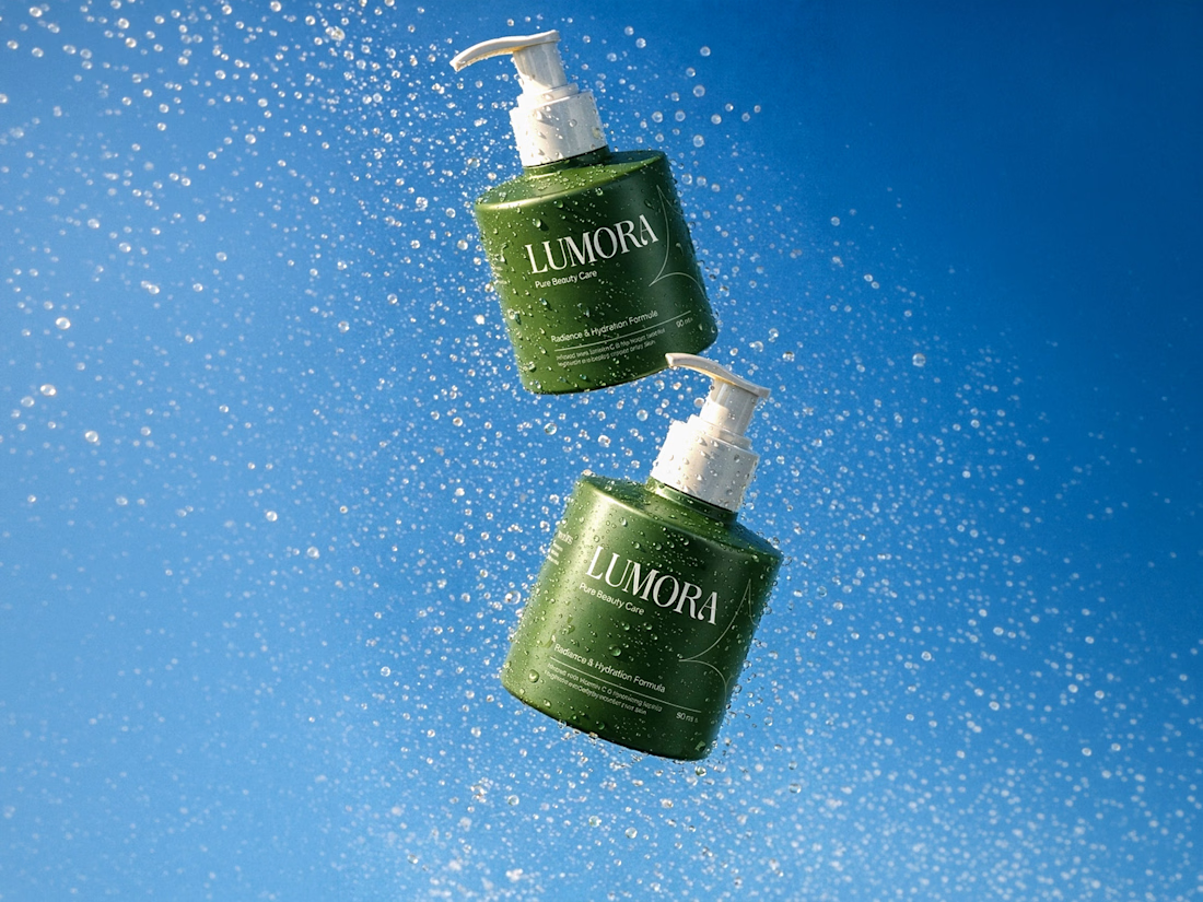

Great work!

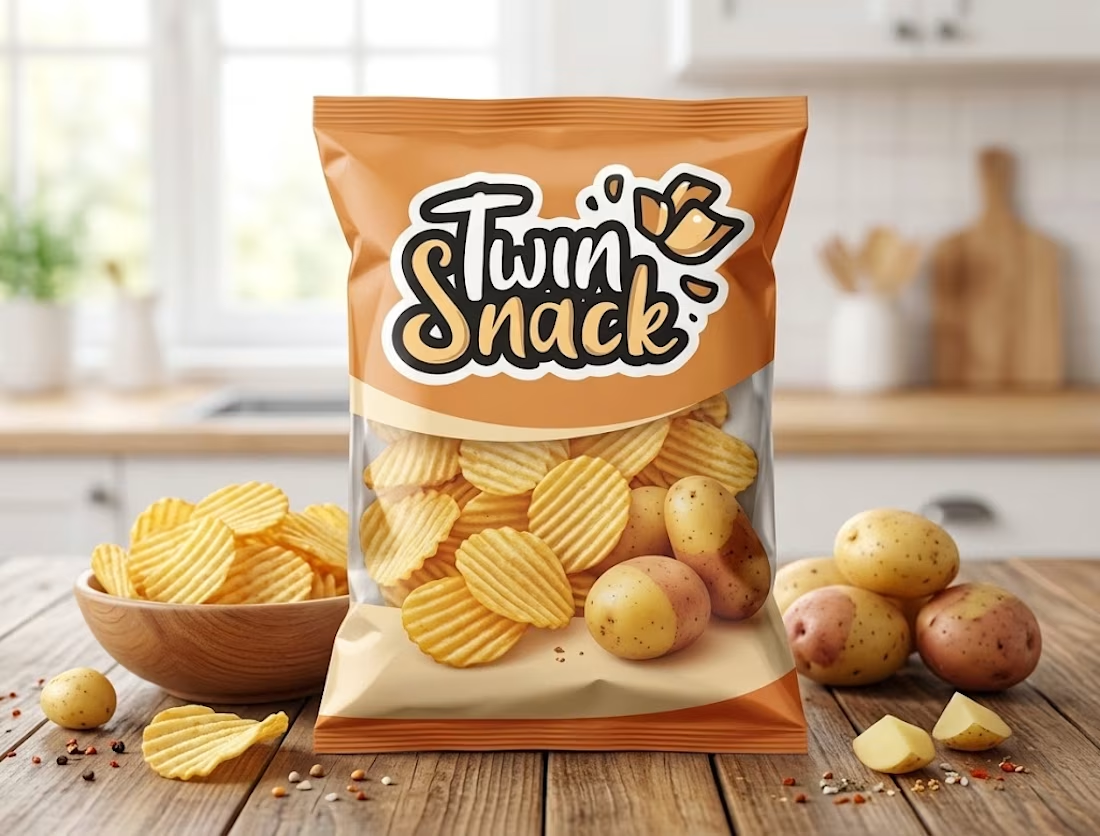
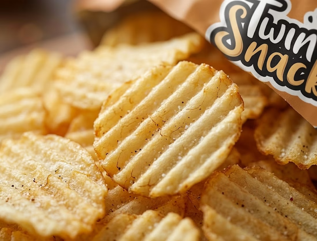
🥔 Twin Snack | FMCG Packaging & Macro Product Visual Design
A vibrant product packaging design and high-detail macro close-up concept created for Twin Snack, a premium crinkle-cut potato chips brand targeting Gen-Z and snack enthusiasts.
Key Design Highlights:
Custom Packaging Design: Dynamic warm orange & cream color scheme paired with bold custom logo typography (Twin Snack), crisp ridges, and fresh ingredient visuals.
Macro Texture Close-Up: Ultra-detailed macro product shot emphasizing the signature crinkle ridges, golden crispy texture, and fine seasoning to highlight product crunch & quality.
Branded Consistency: Seamless brand integration across product packaging and promotional visual assets.
Market-Ready Visuals: Designed specifically for social media ad campaigns, FMCG retail branding, and e-commerce product listings.
Ideal For: FMCG Branding, Product Packaging Showcase, Food & Beverage Marketing, and Portfolio Showcase.
Hashtags:
#GraphicDesign #PackagingDesign #FMCGBranding #TwinSnack #ProductDesign #FoodPackaging #BrandIdentity #VisualDesign #ContraDesigner #FreelanceDesigner #PortfolioShowcase

Saved this for inspiration! Beautiful work.

Motion Design & Animation — From Viewport to Final Render 🎬
Turning ideas into polished motion.
A quick look at some of my recent motion design work — from After Effects timelines and viewport setups to the final rendered animations.
I focus on:
• 2D Animation
• Motion Graphics
• Logo Animation
• Explainer Videos
• Video Editing
• Creative Visual Design
Every frame is built with attention to timing, movement, composition, and clean visual storytelling.
Available for freelance projects & collaborations.
If you're looking for a Motion Designer / 2D Animator for your next project, feel free to reach out.
#MotionDesign #2DAnimation #MotionGraphics #AfterEffects #Animation #Animator #VideoEditing #CreativeDesigner #FreelanceDesigner #MotionDesigner


Showing the timeline beside the final render makes the craft easier to appreciate.