The network for creativity
Join 1.25M professional creatives like you
Connect with clients, get discovered, and run your business 100% commission-free
Creatives on Contra have earned over $150M and we are just getting started
Back to feedPost
Just finished designing and building my newest Framer template, ORYN Audio 🎧
A bold product landing page with detailed product visuals, interactive color selection, and smooth scroll animations. Built to look sharp on every screen and be easy to make your own.
It’ll be available for free. Take a look and let me know what you think 👇

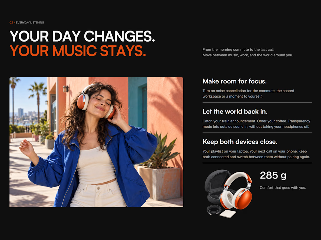
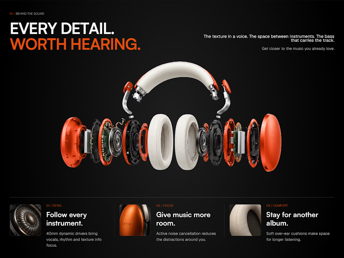
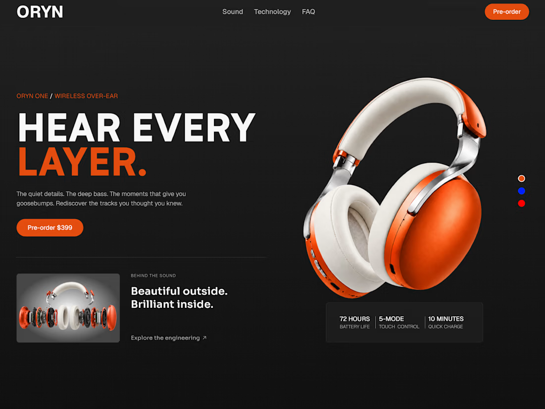
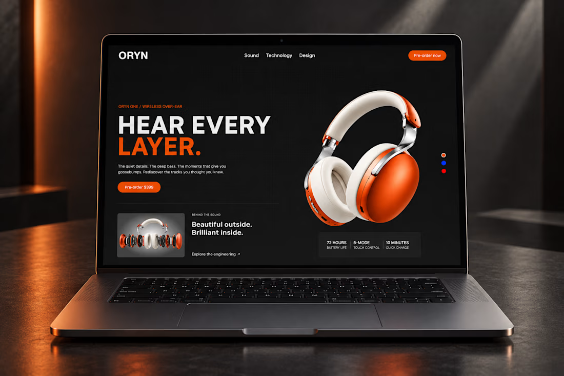


Grab ORYN ONE for free and make it yours: https://framer.link/bd4Unub
The network for creativity
Join 1.25M professional creatives like you
Connect with clients, get discovered, and run your business 100% commission-free
Creatives on Contra have earned over $150M and we are just getting started










Related posts

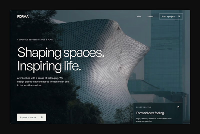
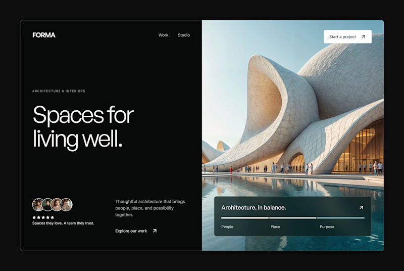
Design Exploration: Hero Section of Architecture Website. Which one do you think much better?

12 voted
43%
16 voted
57%
28 votes
Closed


🍏 Botella - my latest template, now live on the Framer Marketplace 🍇
🍷 Designed for cans, wineries, vineyards, and premium beverage brands. Soooo, Botella combines elegant typography, refined layouts, and immersive visuals to create a sophisticated digital experience 🍾
🌎 Preview it: https://www.framer.com/marketplace/templates/botella/

Amazing

My portfolio, reimagined in Framer
The goal was simple: bring everything together in one place, from client projects and case studies to Framer templates and project videos, while keeping the experience clean and easy to navigate.
The entire portfolio fits within a strict 100vh viewport, so you can explore everything without scrolling.
Would love to hear your thoughts and feedback!
Portfolio link in the comments.