The network for creativity
Join 1.25M professional creatives like you
Connect with clients, get discovered, and run your business 100% commission-free
Creatives on Contra have earned over $150M and we are just getting started
Back to feedPost

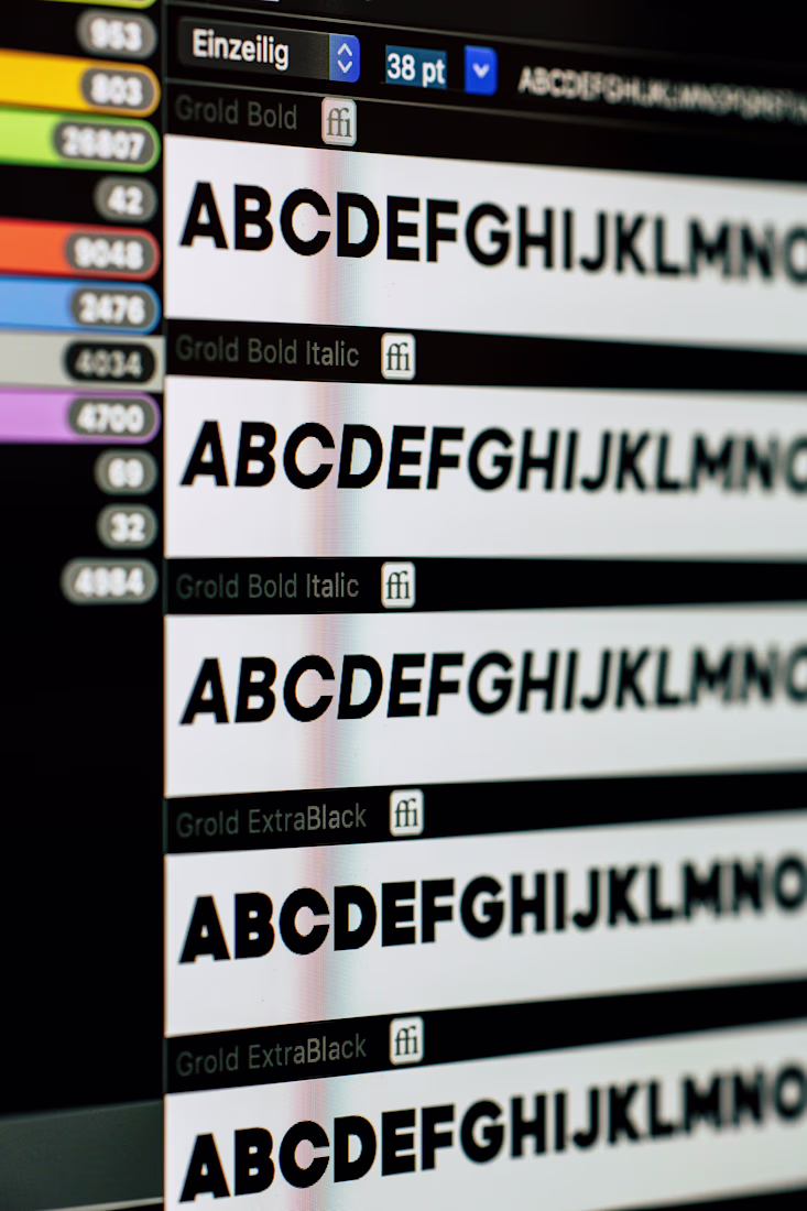
One typography mistake I see everywhere -
Using too many fonts, weights, and styles at once.
It usually comes from trying to make everything stand out.
But hierarchy doesn’t come from variety - it comes from contrast and restraint. A limited type system creates consistency and makes important content more noticeable.
Typography works best when it’s calm and intentional.
Follow for more such daily content! 💫
The network for creativity
Join 1.25M professional creatives like you
Connect with clients, get discovered, and run your business 100% commission-free
Creatives on Contra have earned over $150M and we are just getting started
Related posts


I tested color, style, and typography for both the ocean and hair designs. Feedback guided refinements, ensuring the final designs are visually appealing and aligned with their themes.
1 vote
Ends in 7h


Nice work


Trending
maxearnings
The next frontier of payments is live on Contra. How are you maximizing revenue?
freelancerlife
Freelancer life is wins, pivots, and everything in between. What’s yours right now?
aidesignflow
AI tools are redefining how designer work. What does your workflow look like?
micrographics
Micrographics started as utility - barcodes, packaging, instruction labels. How would you use them?
aivideo
AI video tools are moving at warp speed. What tools are you using?