The network for creativity
Join 1.25M professional creatives like you
Connect with clients, get discovered, and run your business 100% commission-free
Creatives on Contra have earned over $150M and we are just getting started
Back to feedPost
Taste Test

I can’t stop obsessing over details
Some might call these designs boring.
Fair enough.
They’re not gimmicky.
...and I’m not adding things just to make the page look busier.
I care more about whether people understand your offer and have a reason to choose you.
After 7+ years in design
We’ve systemised how we
write
design
build
websites for conversion.
More enquiries.
Not just a better-looking website.
Is your website getting traffic, but not enough enquiries?


5 voted
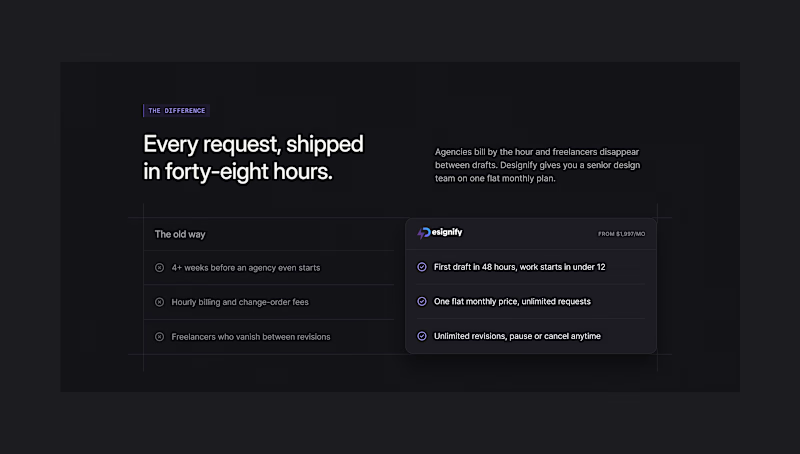
45%
6 voted
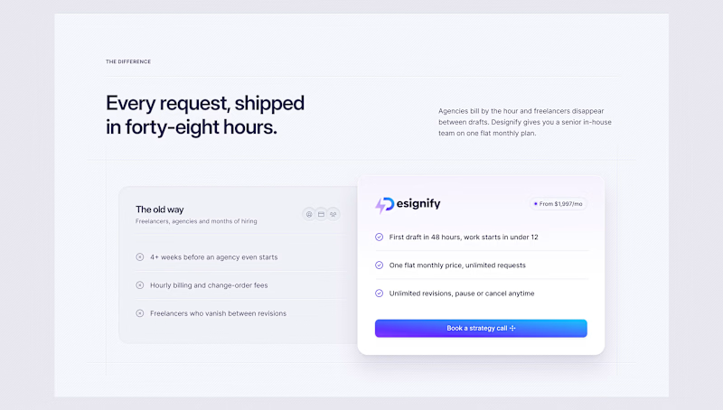
55%
11 votes
Closed


dark

Light for conversions. The elevated card makes the offer clear and simple. Have you split-tested both to see which one drives more client enquiries?

yeah, if i have to scroll around just to figure out what a business does, the design already lost me. a clear offer and an easy next step go a long way
The network for creativity
Join 1.25M professional creatives like you
Connect with clients, get discovered, and run your business 100% commission-free
Creatives on Contra have earned over $150M and we are just getting started











Related posts

Built this in Framer as a concept project. Goal was to make it feel run by ex-journalists. Choices: editorial serif (Libre Baskerville), a dark photo with one color accent, and copy that positions against blast-style PR.
Where I’m unsure: text legibility over the photo and whether the two CTAs compete. What would you change?
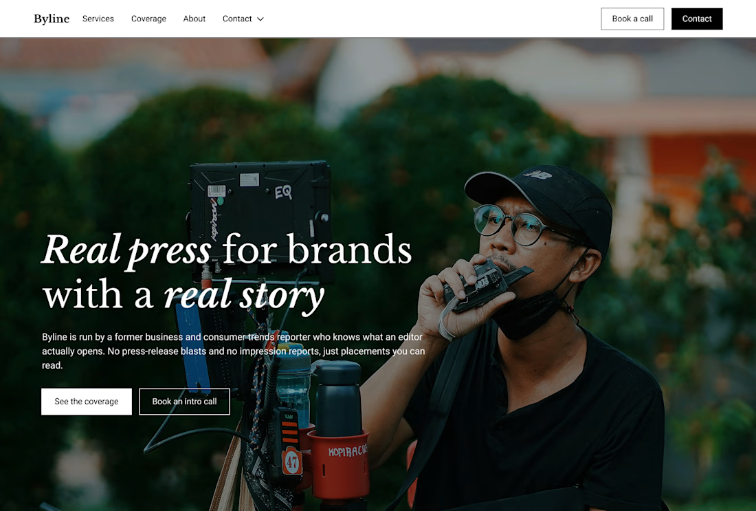

That's great design it feels professional I like how the background mixed with interface ❤️❤️
Great job Cheree🎉🎉

The only glow on the Kestra page is the reflective strip on the jacket. It comes from the image itself, so the Framer layers on top stay flat: grey, white and mono text, no glow effects on buttons or headings. That keeps the page easy to edit, because nothing in the UI depends on one lighting setup. If you swap the photo, the glow goes with it. Would you add a glow effect in Framer or keep it in the image?

wow, nothing but top notch

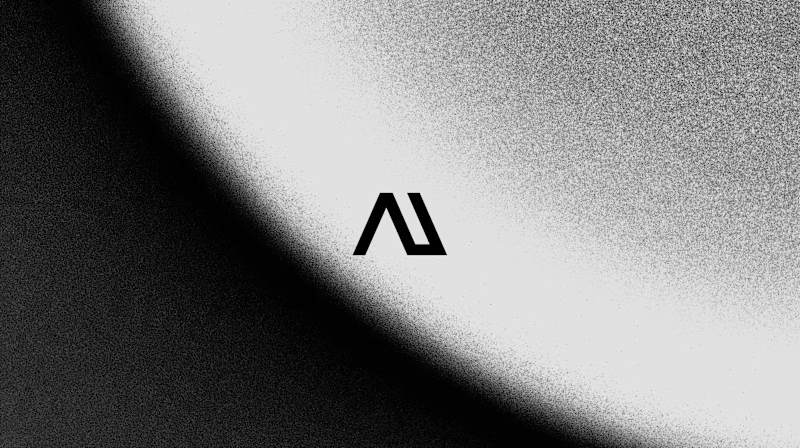
WIP - Brand Identity
Which one?
9 voted
47%
10 voted
53%

19 votes
Closed
B is more suitable for these textures ❤️❤️
Great job Gaber🎉🎉🔥🔥