The network for creativity
Join 1.25M professional creatives like you
Connect with clients, get discovered, and run your business 100% commission-free
Creatives on Contra have earned over $150M and we are just getting started
Back to feedPost


🚛 𝗥𝗶𝗱𝗲 𝗠𝗮𝗻𝗮𝗴𝗲𝗺𝗲𝗻𝘁 𝗣𝗹𝗮𝘁𝗳𝗼𝗿𝗺
I designed a web-based ride management platform focused on helping transportation teams manage riders, monitor ride activity, and access important operational data from one centralized dashboard.
The goal of the project was to create a clean, scalable, and easy-to-use interface for internal teams who need to work with a large amount of rider and trip-related information every day. The platform was designed to support fast decision-making, reduce visual overload, and make the ride management process more organized.
🧑🏼💼 𝗔𝗯𝗼𝘂𝘁 𝘁𝗵𝗲 𝗖𝗹𝗶𝗲𝗻𝘁
The client needed a professional dashboard solution for a ride management product. Their team required a system where admins or managers could easily view rider information, track ride activity, check statuses, and manage operational data without switching between multiple tools.
The main priority was to turn complex transportation data into a simple and intuitive interface that could be used efficiently by non-technical team members.
🟡 𝗧𝗵𝗲 𝗖𝗵𝗮𝗹𝗹𝗲𝗻𝗴𝗲
Ride management platforms usually include a lot of information: riders, trips, statuses, activity history, filters, and performance data. The challenge was to organize all of this in a way that felt clear and manageable.
The interface needed to be:
- Easy to scan
- Clean and professional
- Suitable for daily operational use
- Scalable for future features
- Clear enough for quick decision-making
The biggest UX challenge was balancing detailed data with a simple and lightweight user experience.
🤖 𝗞𝗲𝘆 𝗙𝗲𝗮𝘁𝘂𝗿𝗲𝘀:
- Riders dashboard
- Rider profile overview
- Ride activity tracking
- Data tables
- Search and filters
- Status indicators
- Key operational metrics
- Clean admin navigation
- Scalable dashboard layout
💡 𝗧𝗵𝗲 𝗦𝗼𝗹𝘂𝘁𝗶𝗼𝗻
The final design brings all key ride and rider data into one organized workspace. Instead of overwhelming users with too much information at once, the dashboard uses a clear structure that helps managers quickly understand what is happening and where action is needed.
The interface is designed to support both daily operations and future product growth. It gives the client a strong visual foundation for a professional SaaS-style ride management platform.
✅ 𝗧𝗵𝗲 𝗥𝗲𝘀𝘂𝗹𝘁
The final platform design is clean, functional, and easy to use. It helps transportation teams manage riders and ride activity more efficiently by giving them fast access to the information they need.
The result is a polished dashboard experience that improves clarity, supports faster decisions, and creates a more professional product presentation for the client.


The network for creativity
Join 1.25M professional creatives like you
Connect with clients, get discovered, and run your business 100% commission-free
Creatives on Contra have earned over $150M and we are just getting started



Related posts

What should a creative agency website actually feel like?
For Orvika, we didn't want another agency site built around the same safe layouts and predictable sections.
We pushed the visual direction further with oversized typography, editorial layouts, bold imagery, and stronger contrast, while keeping the experience structured enough to communicate the agency's work and capabilities clearly.
The goal wasn't just to make it look different.
It was to make the agency feel different.
Designed in Figma and built in Framer.
We're sharing more of the websites and digital experiences we've been working on here over the next few weeks.



Very neat man

💳 Making Financial Products Feel Simple
I designed this finance website for Sendit, with one goal in mind: make everyday payments feel simple, trustworthy, and effortless.
The design focuses on:
Clear messaging and strong visual hierarchy
Trust-focused finance UI
Simple payment interactions
Clean, modern layouts
Conversion-focused sections
A responsive experience designed around the user
For fintech products, good design isn’t just about looking modern. It’s about making people feel confident when money is involved.
If you’re building a fintech, SaaS, payment platform, or financial product and need a website that communicates trust and clarity, I’d love to work with you.


Solid execution on a hard brief.

Everyone thinks a data dashboard should look complicated.
I think that is exactly why most of them fail.
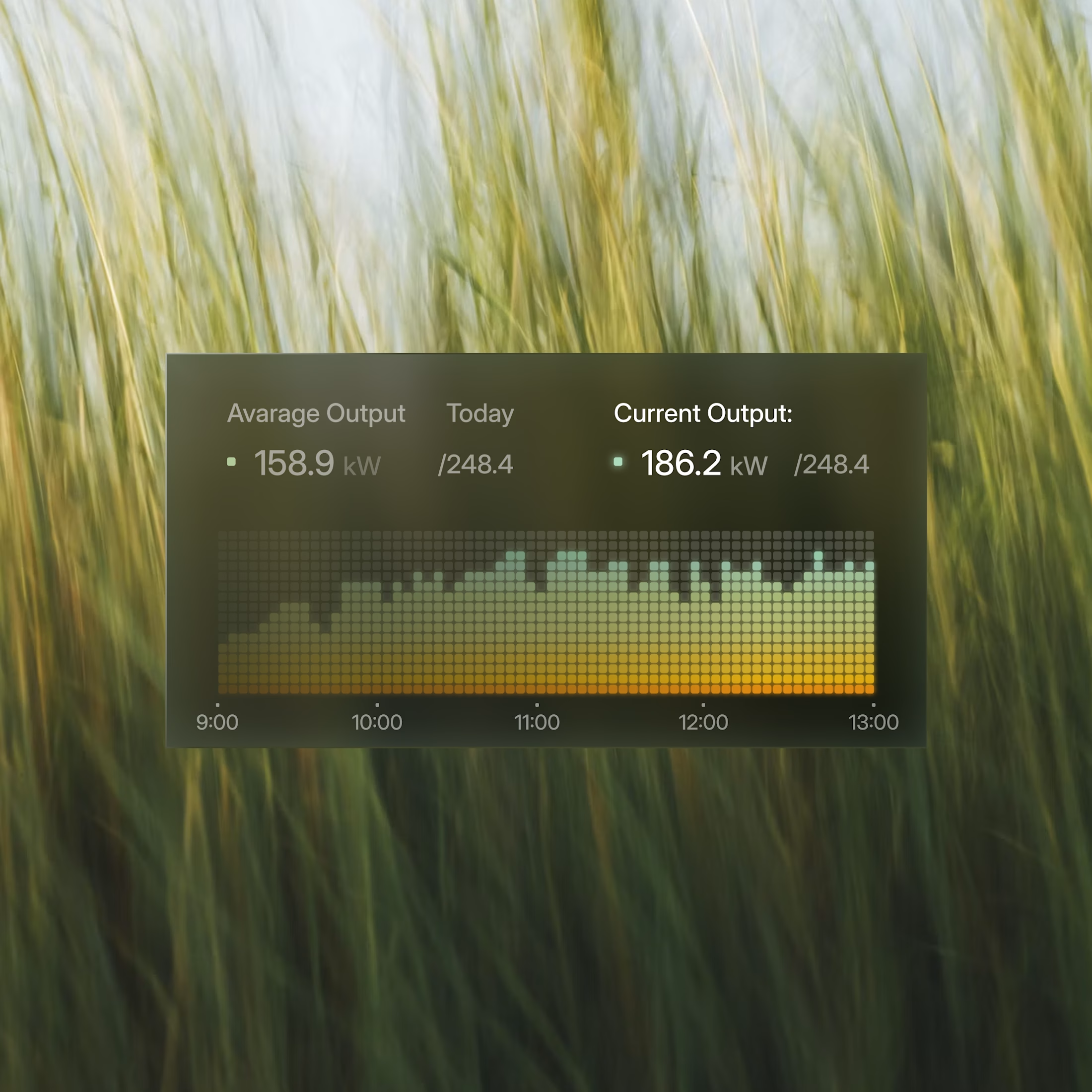
I just finished Helios, a tool that tracks solar energy assets in real time. Dozens of sites, live output, verification records, a wall of numbers. The kind of screen people drown in.
Most designers would make it feel technical. More lines, more glow, more charts. I did the opposite. Every number had to answer one question in half a second, is this good or is this a problem. If it could not, it lost its place.
Because design is not decoration, it is closer to math. It is deciding what to remove until only the truth is left.
Complexity was never the enemy. Confusion is.
Get that right, and people trust you before you have said a word.
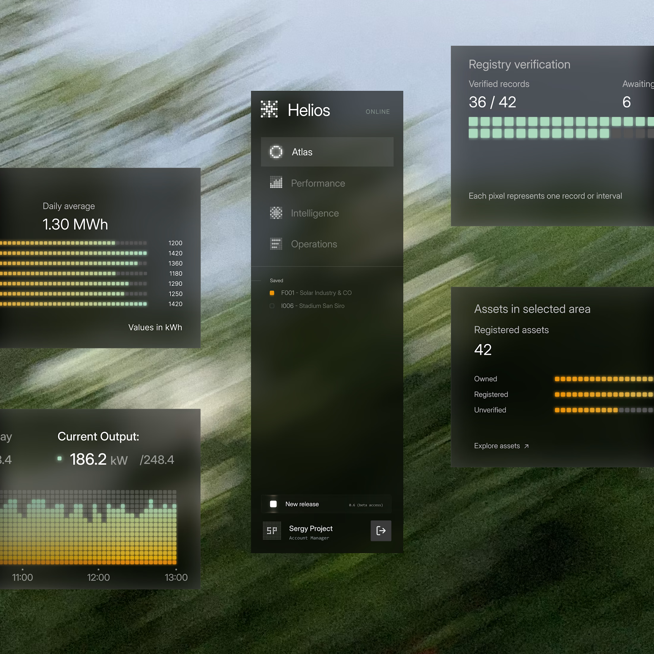
These components are perfectly executed, and the background is perfect for them.