The network for creativity
Join 1.25M professional creatives like you
Connect with clients, get discovered, and run your business 100% commission-free
Creatives on Contra have earned over $150M and we are just getting started
Back to feedPost

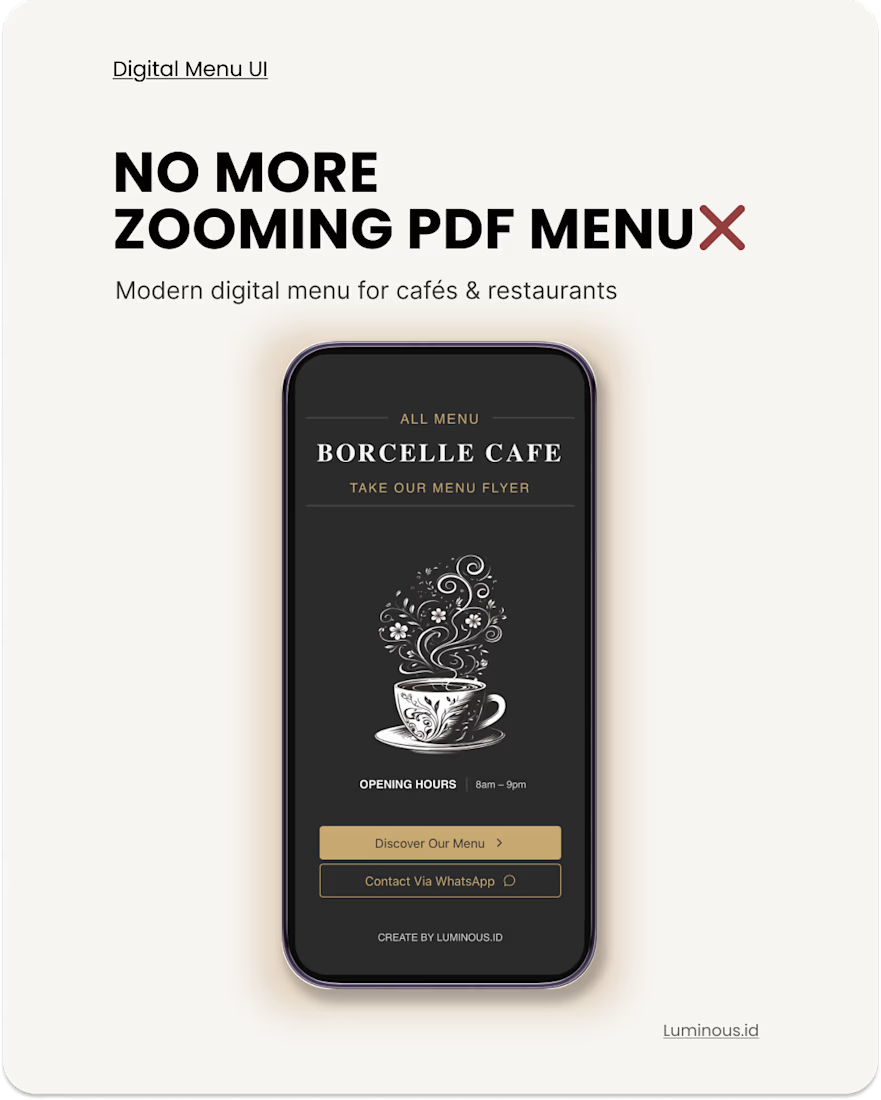
No more zooming PDF menus 🔍❌
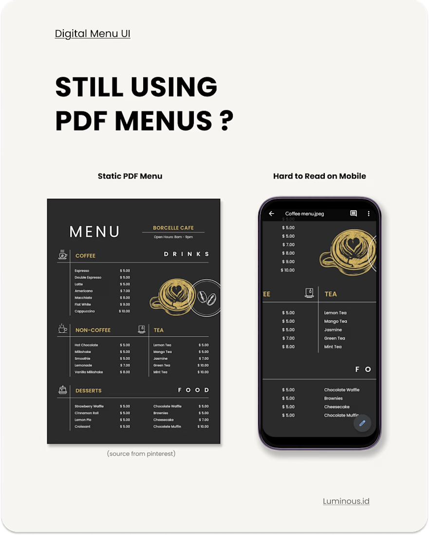
Most customers open menus from their phones, but many cafés & restaurants still use static PDF menus that are difficult to read on mobile.
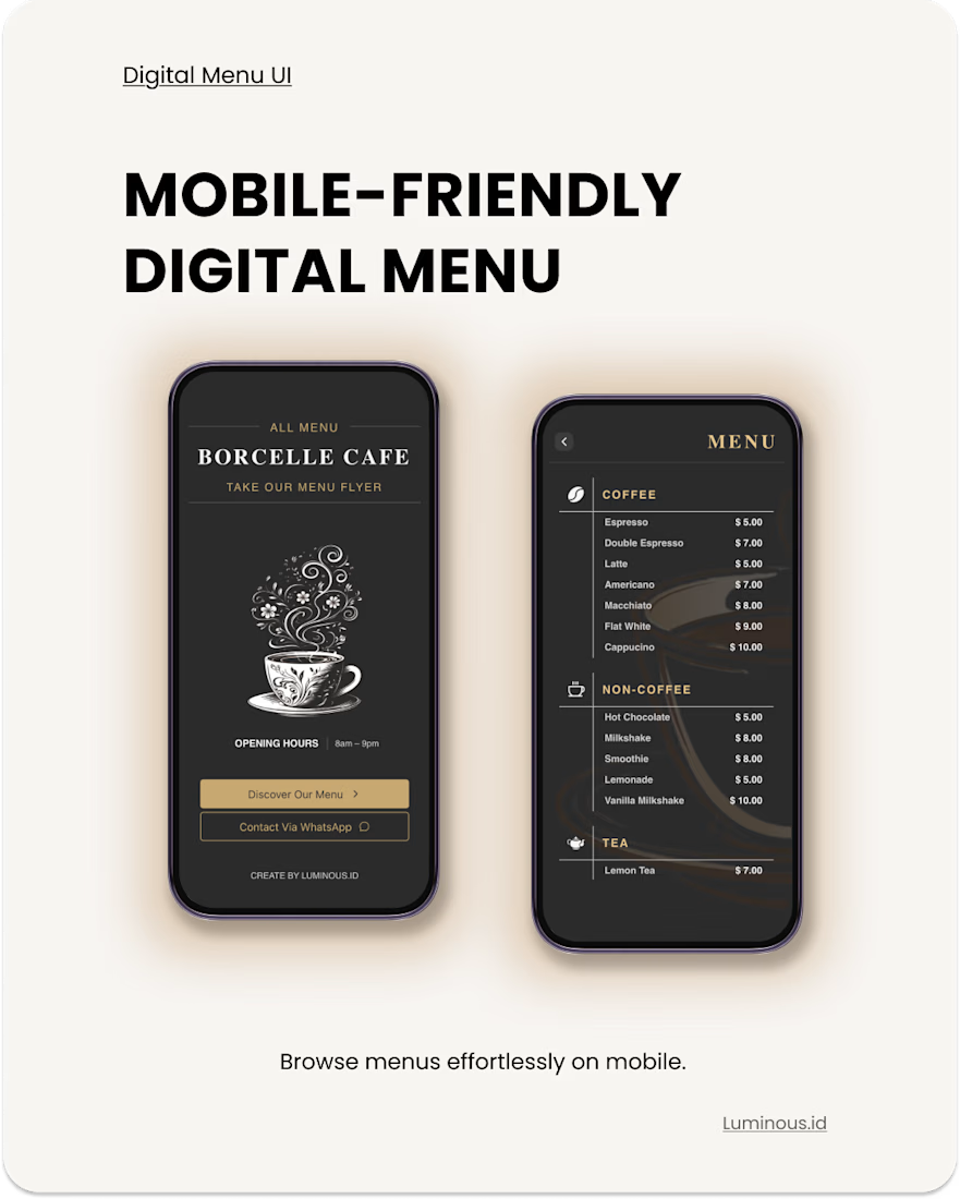
So I redesigned the experience into a mobile-friendly digital menu that feels cleaner, easier to browse, and more modern ✨
Why digital menus work better:
• Easy to browse on mobile
• No app installation needed
• Accessible instantly via QR code
• Cleaner customer experience
• Modern & premium appearance
• Easier to update anytime
Designed for cafés, restaurants, and coffee shops that want a better digital experience ☕
Live preview available 👀
Available for freelance projects on Contra ✨
#webdesign #uidesign #frontenddeveloper #digitalmenu #reactjs #freelance


The network for creativity
Join 1.25M professional creatives like you
Connect with clients, get discovered, and run your business 100% commission-free
Creatives on Contra have earned over $150M and we are just getting started





Related posts

Hi Contra Community! I'm new here, what do you think about this design? I'll love to have your feedback.

Welcome to the Contra Community Juan!


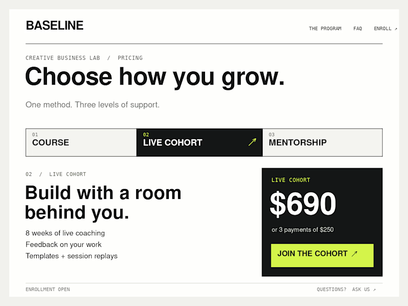
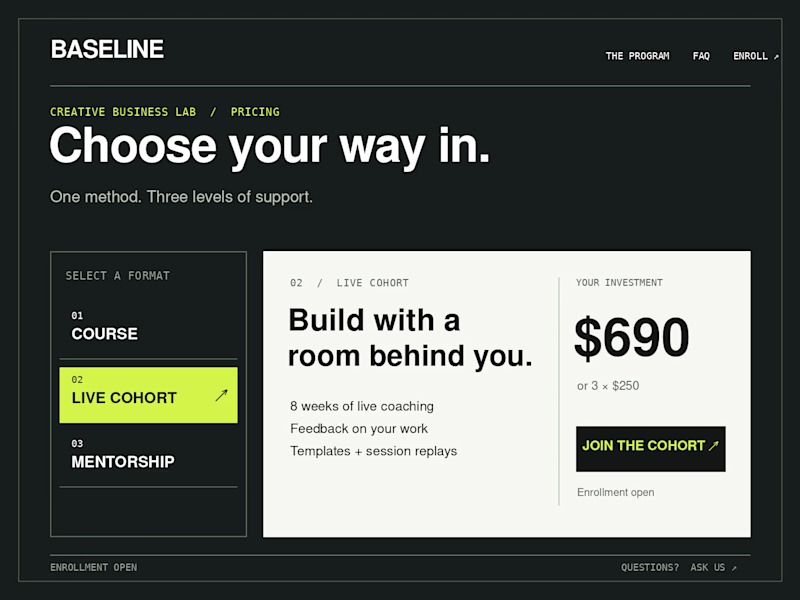
Which Kajabi pricing section would you ship?
Creative Business Lab has three paths: Course, Live Cohort, and Mentorship. Both designs show the same $690 Live Cohort with the same benefits. Only the presentation changes.
Vote Horizontal tabs or Side tabs, then tell me the one thing you’d improve before launch. Have a stronger third approach? Show it in the replies.

21 voted
50%
21 voted
50%
42 votes
Closed

Horizontal. side tabs read as nav, people skip them. though the stronger third option is no tabs at all, three cards side by side. both of these hide two prices behind a click and comparison is the one job a pricing section has.

Meet Mnemonist, a new Framer portfolio template for independent designers, creative studios, and art directors.
It’s built around an editorial layout with CMS-powered projects, large imagery, and a set of custom code components including a Step Grid Slider, Rolling Character interaction, Pull / Liquid Effect, and Infinite Wrap Gallery.
Preview: https://mnemonist.framer.website
Get : https://www.framer.com/marketplace/templates/mnemonist/
Would love to hear what you think.


