The network for creativity
Join 1.25M professional creatives like you
Connect with clients, get discovered, and run your business 100% commission-free
Creatives on Contra have earned over $150M and we are just getting started
Back to feedPost
Taste Test
Exploring two directions for this landing page:
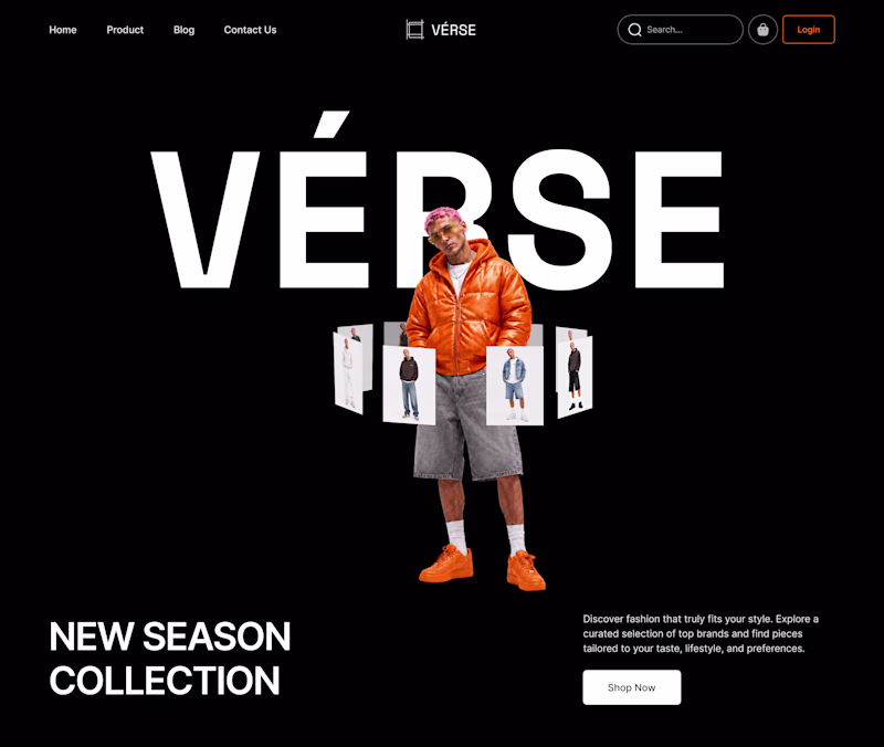
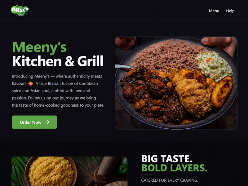
A — Dark Mode
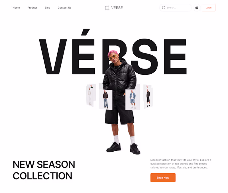
B — Light Mode
Need your opinion....
Which version would you prefer for the home page?
11 votes
Ends in 8h
This A-dark mode really stands out. The effort and thought behind it are obvious, and it shows in the final result. Keep pushing like this, you're building something remarkable.
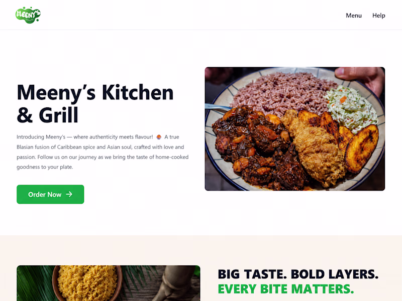
Light mode
Dark mood
dark mode always win
Dark Mode
A for me.
The orange jacket becomes a much stronger focal point against the dark background, and the overall composition feels more premium and fashion-forward. The contrast also helps the hero section stand out immediately.
B feels cleaner and more accessible, but A has the...
Always a fan of dark mode
The network for creativity
Join 1.25M professional creatives like you
Connect with clients, get discovered, and run your business 100% commission-free
Creatives on Contra have earned over $150M and we are just getting started
Related posts
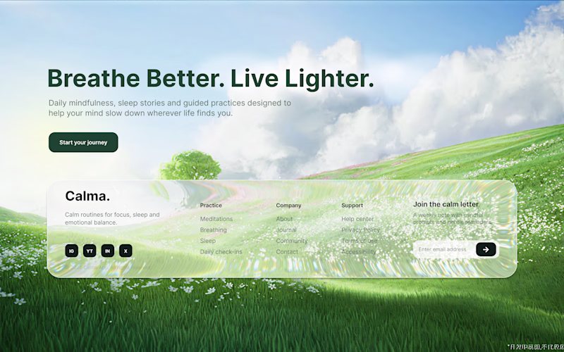
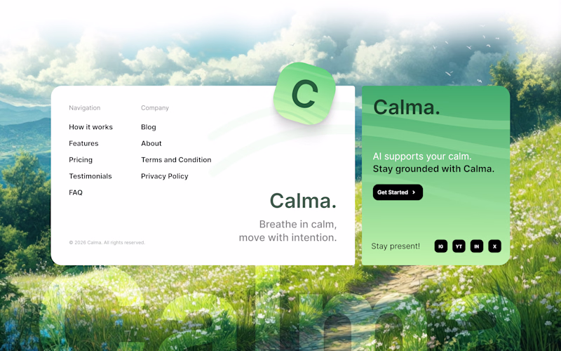
Which one would you choose? Mindful Landing Page Footer Design ✨
41 voted
49%
43 voted
51%
84 votes
Closed
The 2 is nice. I will go for 1
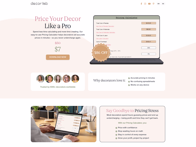
Trying out different styles for a restaurant landing page that I'm working. Witch do you think is better?
4 voted
13%
28 voted
87%
32 votes
Closed
Dark all day!
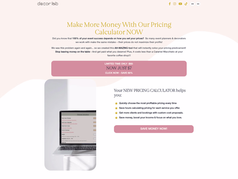
Refined looks great 😌
Challenges
View allTrending
Claude
Claude has entered the design space. How are you using Claude Design?
Contra University
Learn from expert creatives how to earn more using next-gen AI tools.
MagicPath
The canvas is infinite, and exploration is becoming the workflow. How are you using MagicPath?
creativeaiflow
Creative AI workflows are evolving. What tools do you use, and what are their strengths and weaknesses?
freelancerlife
Freelancer life is wins, pivots, and everything in between. What’s yours right now?