The network for creativity
Join 1.25M professional creatives like you
Connect with clients, get discovered, and run your business 100% commission-free
Creatives on Contra have earned over $150M and we are just getting started
Back to feedPost

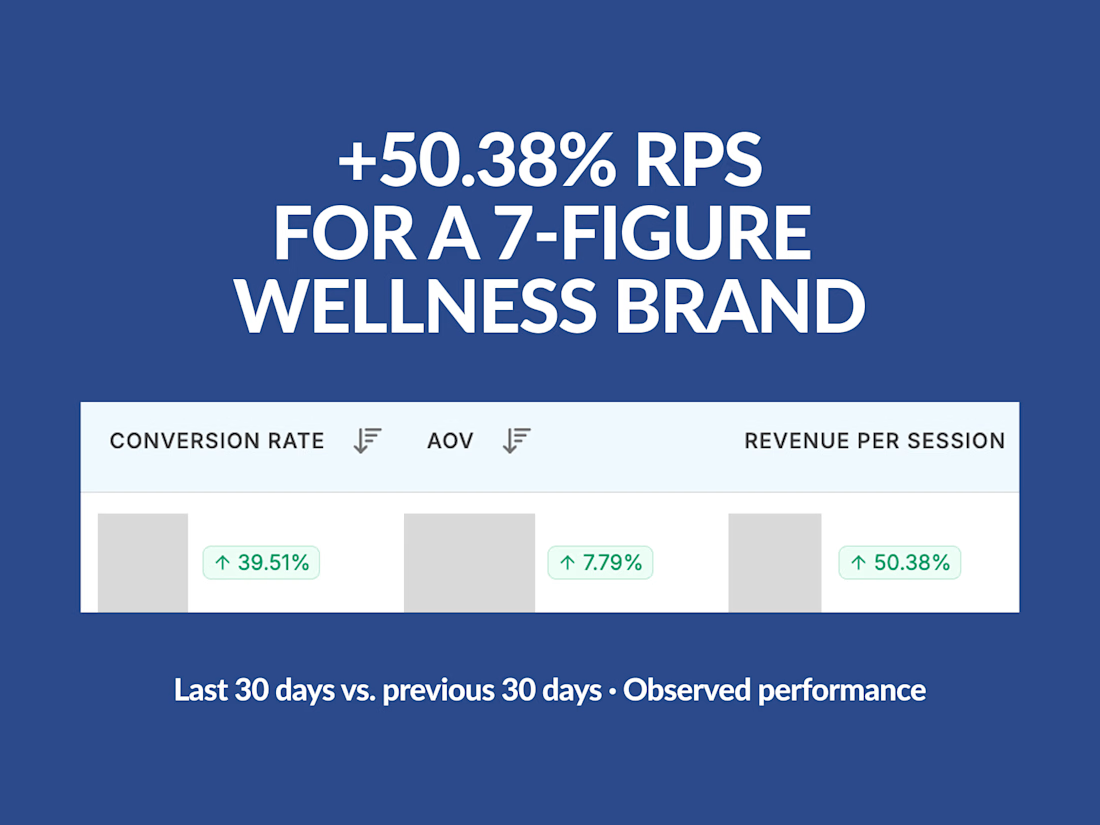
Redesigned and rebuilt two Shopify PDPs for KYOR, a 7-figure wellness brand, using Replo.
The goal was to improve the buying experience through clearer offers, stronger product education, social proof, and a more intuitive subscription flow.
My role covered CRO strategy, PDP design, and hands-on Replo development.
OUTGLOW results (last 30 days vs. previous 30 days):
• +50.38% revenue per session
• +39.51% conversion rate
• +7.79% average order value
• +24.63% total revenue, despite 17.12% fewer sessions
These are observed before-and-after results, not the outcome of a controlled A/B test.
Both PDPs were developed to create a clearer, more conversion-focused shopping experience for paid traffic.


The network for creativity
Join 1.25M professional creatives like you
Connect with clients, get discovered, and run your business 100% commission-free
Creatives on Contra have earned over $150M and we are just getting started
Related posts

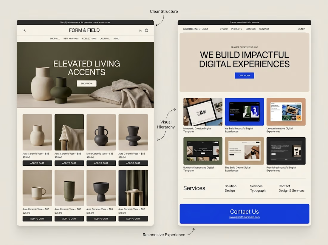
A website can look beautiful and still be difficult to use.
That's something I keep in mind when exploring both Shopify store design and Framer website design.
Although the platforms serve different purposes, some design principles apply to both:
→ Clear navigation helps visitors find their way.
→ Strong visual hierarchy makes important information stand out.
→ Thoughtful page structure creates a natural flow.
→ Responsive layouts help the experience work across screen sizes.
→ Clear calls to action help visitors understand what to do next.
The goal isn't simply to make a website look impressive.
It's to make the experience clear, useful, and easy to navigate.
I'm continuing to explore how these principles can be applied across different types of websites and projects.
What matters most to you when visiting a website, its visual design, its usability, or a combination of both?


Well said. Usability first, then visuals. Clear navigation wins me every time. 🙌


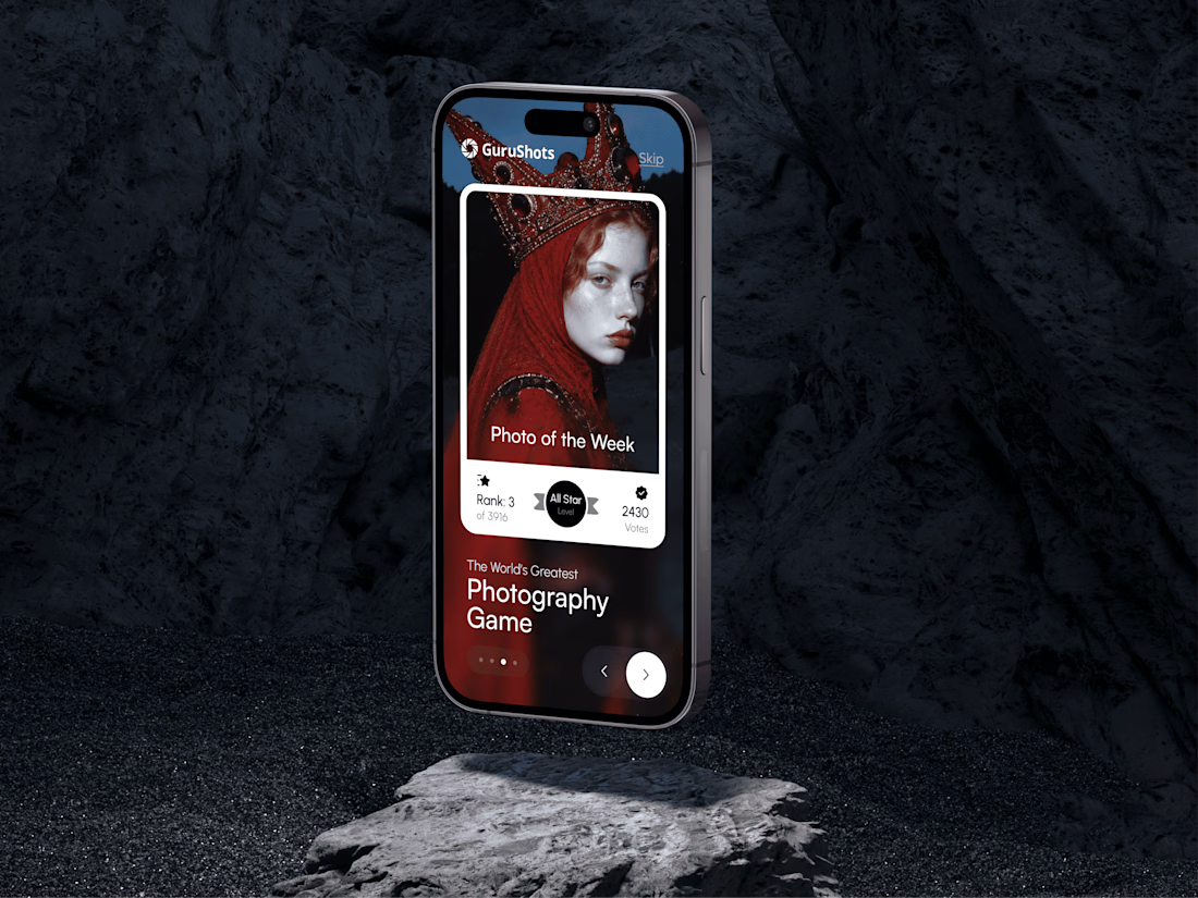
A new day, a new design to share! 📸
This time it is a photography challenge app that brings creativity and competition together through contests, voting, and gamification. What do you think of this one? ✨



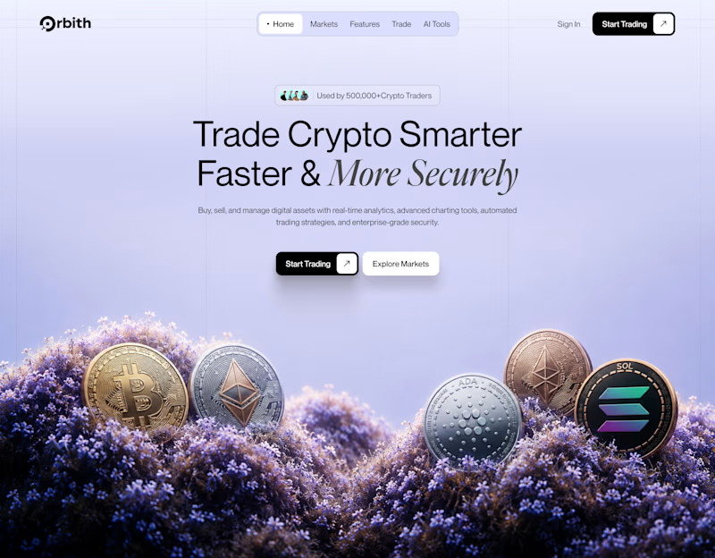
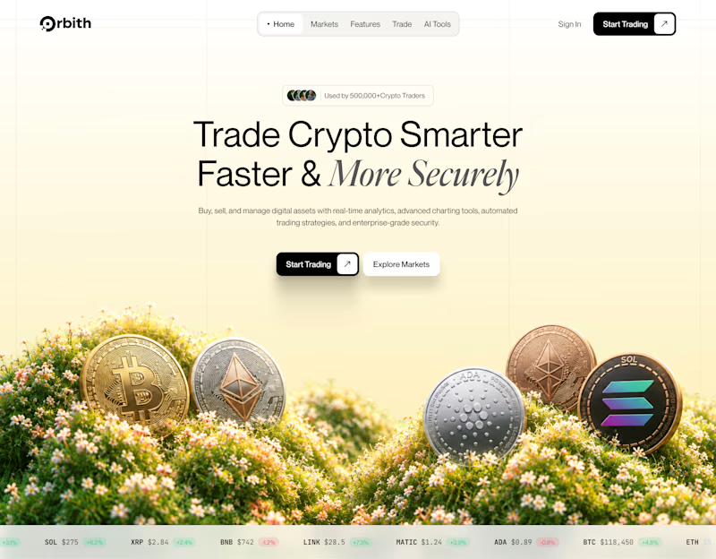
Your crypto landing page has 3 seconds to earn trust. Which direction gets it right?
One crypto homepage feels built for serious traders. The other makes crypto feel effortless.
Which one would make you click “Start Trading” without hesitation: #1 or #2?


10 voted
37%
17 voted
63%
27 votes
Closed
