The network for creativity
Join 1.25M professional creatives like you
Connect with clients, get discovered, and run your business 100% commission-free
Creatives on Contra have earned over $150M and we are just getting started
Back to feedPost

Telling a story through carousel designs requires brainstorming and deep research, here is my 3-step process:
1. Extract & Visualize: Pull keywords from your copy and jot down visuals that anchor the message.
2. Align & Connect: Sync with the brand’s identity and design slides that flow into each other automatically.
3. Refine & Simplify: Edit ruthlessly and strip away clutter to keep the focus sharp.
A seamless transition between slides ensures your audience stays connected to the message without getting lost in the swipe.

The network for creativity
Join 1.25M professional creatives like you
Connect with clients, get discovered, and run your business 100% commission-free
Creatives on Contra have earned over $150M and we are just getting started



Related posts

creating a consistent visual language that makes a brand recognizable, communicates its personality, and builds a stronger connection with its audience.


Very nice

Story or process?
A: the ad. 30 seconds of pure story. Rosita, a grandma's hot sauce, goes from one chat to a full brand, product shoot, original track, landing page and Shopify store.
B: the breakdown. How it was made, from the brief and the prompts to directing every shot, sound and final frame.
Same brand, built and launched with AI. Which one makes you want to hire the person behind it?

7 votes
Ends in 1d

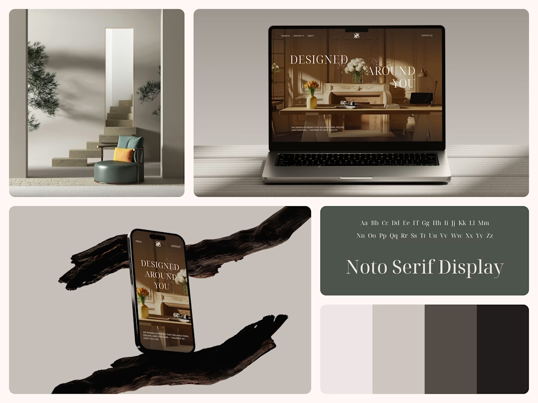
Interior Design Website
The white flowers on the mantel overlap the headline.
Thin Noto Serif Display capitals step down across one warm photo of a paneled room, so the space stays in view between the words. On the phone, the three words stack in a centered column, with Menu and Contact on either side of the monogram.
The palette runs from soft white to near black, which leaves the color to the photo: orange tulips and warm light on the walls.
The headline reads "Designed Around You", and the hero takes it literally, with the wall behind the type and the flowers in front of it.
Designed by the Hue & Machine team.
#InteriorDesign #InteriorStudio #WebsiteDesign #HomepageDesign #WebDesign #ResponsiveDesign #Typography #EditorialDesign #UIDesign #FigmaDesign


Nice!