The network for creativity
Join 1.25M professional creatives like you
Connect with clients, get discovered, and run your business 100% commission-free
Creatives on Contra have earned over $150M and we are just getting started
Back to feedPost
I built a Style Gallery of 24 responsive web directions to make early design conversations concrete.
They are not 24 client projects. Each is a self-initiated study I planned, designed, and implemented across desktop, tablet, and mobile—covering B2B, editorial, product, booking, commerce, dashboards, and campaign layouts.
When I respond to a brief, I choose only the 3 patterns closest to the customer's problem and use them as visual evidence—not as invented client results.
Browse the gallery: https://gallery.forblune.com
If you need a landing page, responsive repair, or a small website with a clear scope and QA handoff, feel free to message me.


Three representative directions are attached: editorial hospitality, evidence-led B2B, and product/service UI. These are self-initiated responsive studies, not client commissions. For a real brief, I would select only the 3 patterns closest to the problem, define scope and...
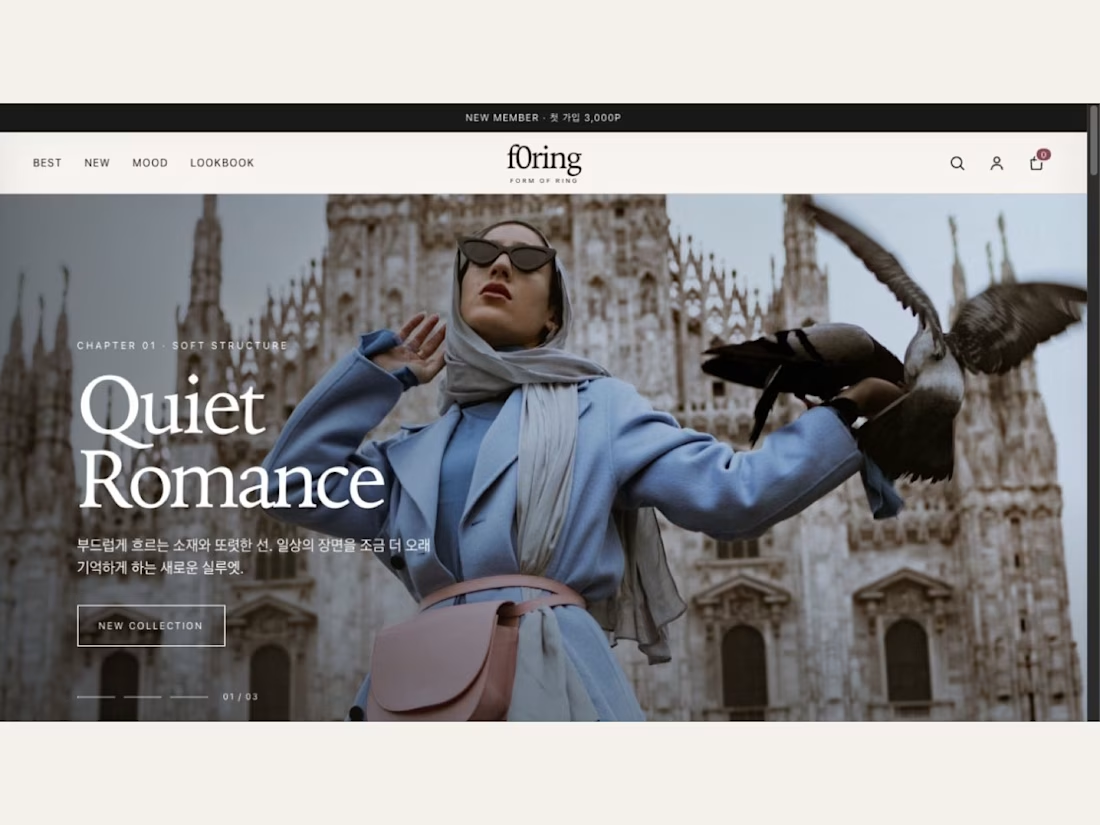
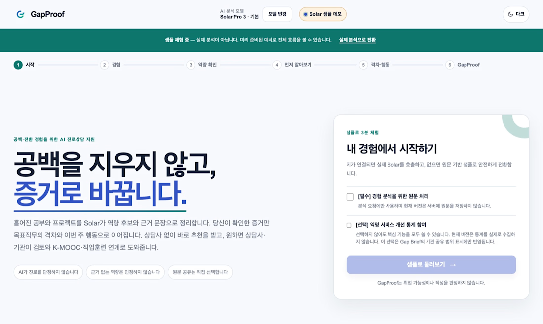
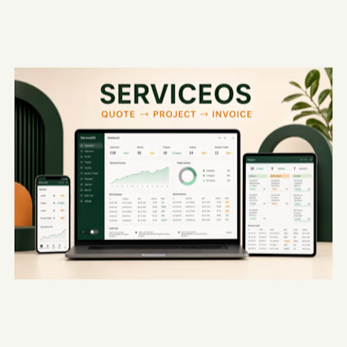
Thanks, Nugraha — exactly. The three directions are useful only when they help lock the audience, content priority, and responsive acceptance criteria before implementation. I also treat desktop, tablet, and mobile as separate checks rather than scaled versions of one layout....
The network for creativity
Join 1.25M professional creatives like you
Connect with clients, get discovered, and run your business 100% commission-free
Creatives on Contra have earned over $150M and we are just getting started






Related posts

Designed the website for Dovora — an agency that builds businesses for creators, not brand deals. "We don't represent brands, we don't split focus" is basically the whole pitch, and I wanted the site to feel just as uncompromising.
So no polished stock creator-economy visuals. The hero is a wall of real streamer/podcast footage arranged in overlapping diamonds and rounded frames — actual creators, mid-stream, mid-laugh — with a glowing gradient orb behind bold "WE BUILD CREATOR BUSINESSES" type. It reads more like a highlight reel than a landing page, which felt right for an audience that lives on camera.
The second section flips the energy completely — dark, minimal, almost aggressive typography ("BUILT EXCLUSIVELY FOR CREATORS. FULL STOP.") paired with huge chrome-and-neon 3D letterforms spelling out CREATORS. It's loud in a completely different way than the hero, and that contrast is intentional — this isn't a buttoned-up agency deck, it's built for people who make content for a living.
Genuinely fun brief to lean all the way into.


Imagine sending someone a link and saying, “This is my business.”
I made this 30-second film for Launch in Seven’s new Business Idea to First Launch service. It shows an illustrative plant-care idea becoming a clear offer, a mobile-friendly page, an inquiry path and outreach drafts.
The $1,500 fixed package includes one offer brief, one responsive landing page, one connected inquiry form, three outreach drafts and one consolidated revision. Domain and hosting costs are separate. Scope, inputs and delivery date are agreed before we start.
Explore the package or message me with your idea and who it helps:
https://contra.com/s/beq6QLOb-business-idea-to-first-launch-landing-page-and-inquiry-form
Original illustrative example, not a client commission or sales result. Custom motion, generated imagery, narration and original music.


Wonderful !

The Last Banner: "Characters" section
Japanese cinematic gaming site concept

The character posters read like a film credit sequence, especially Lord Daichi and Hayato Mori side by side. That red frame keeps the Webflow page feeling cinematic instead of like a generic section.