The network for creativity
Join 1.25M professional creatives like you
Connect with clients, get discovered, and run your business 100% commission-free
Creatives on Contra have earned over $150M and we are just getting started
Back to feedPost

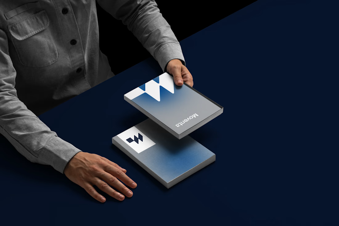
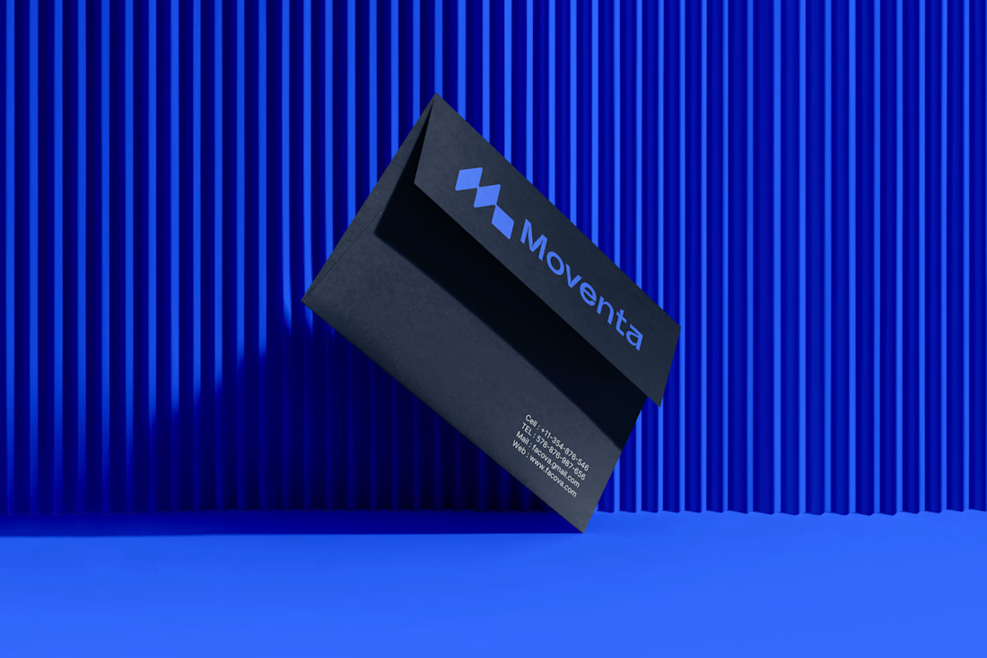
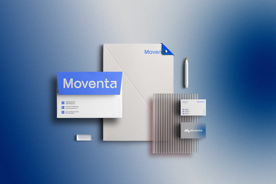
Pulling in modern energy but making it last for years and years to come is a trick that brand designers need to be able to pull off.
I put in a few other little mind tricks in this logo design so it subconsciously spoke to my client's audience, creating that emotion connection that flips the switch from "scroll past" to "hooked".
See if you can find them.


Nice One..
The network for creativity
Join 1.25M professional creatives like you
Connect with clients, get discovered, and run your business 100% commission-free
Creatives on Contra have earned over $150M and we are just getting started








Related posts


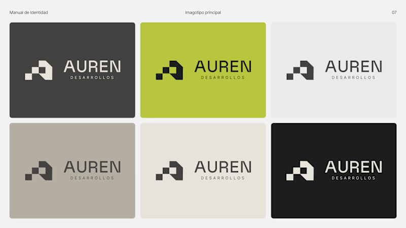
Same brand. Same palette. Two completely different proposals for a real estate developer.
A: An isotype built from blocks. Geometric, precise, the language of construction. It says we build.
B: Custom lettering with movement. Warmer, more editorial. It says we build places you’d want to live in.
36 voted
51%
35 voted
49%

71 votes
Closed

My vote is B, Milagros. Custom lettering with movement has real editorial warmth, which suits a developer selling places people actually want to live in.



I like the Clarity and neatness in your work

New logo & brand identity under 1 week for Get Stuff Digital ✨
