The network for creativity
Join 1.25M professional creatives like you
Connect with clients, get discovered, and run your business 100% commission-free
Creatives on Contra have earned over $150M and we are just getting started
Back to feedPost

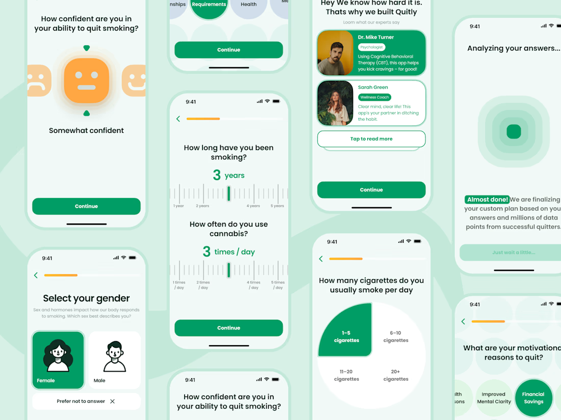
Design for Health & Supplement startup
RECOMMENDED
“Valentyn built ou website from scratch and delivered exactly what we needed. The site feels clean, intentional, and well-considered. He takes ownership without needing constant hand-holding. Would hire again without hesitation.”


David Berghaeuser
Fourth Mountain Pte. Ltd. The network for creativity
Join 1.25M professional creatives like you
Connect with clients, get discovered, and run your business 100% commission-free
Creatives on Contra have earned over $150M and we are just getting started
Related posts

Clinora — Rethinking the Healthcare Dashboard Experience
How can complex health information feel simpler, clearer, and more engaging?
Introducing Clinora, a healthcare dashboard UI concept focused on presenting health metrics through a clean, organized, and visually engaging interface.
Design highlights
• Health monitoring dashboard with organized metric cards
• Heart rate, blood pressure, and blood sugar indicators
• Prescription reminders and consultation scheduling
• 3D anatomical visuals to create a more engaging experience
• Soft blue tones, clear information hierarchy, and consistent UI component.
My goal with this concept was to explore how thoughtful UI/UX design can make health information easier to navigate while maintaining a modern, approachable visual language.
What would you improve first in this dashboard: information hierarchy, data visualization, or navigation?
#Ui design #Ux design #Healthcare design #Dashboard design #Product design #Figma


Health is probably one of my favorite areas to design for.
Over the years, I’ve worked on projects across mental health, elderly care, accessibility, VR-based treatment, wellness, and other health-focused products.
What I value most about these projects is the purpose behind them. They’re designed to help people navigate difficult moments, feel supported, and make everyday life a little easier.
Sharing a glimpse of one of these projects today 💚
Would love to hear what you think about the design!

Such a clean design, Ella! Amazing work 👏

