The network for creativity
Join 1.25M professional creatives like you
Connect with clients, get discovered, and run your business 100% commission-free
Creatives on Contra have earned over $150M and we are just getting started
Back to feedPost

Hostel owners and Framer designers, quick question for both of you.
What should a traveller see before they scroll?
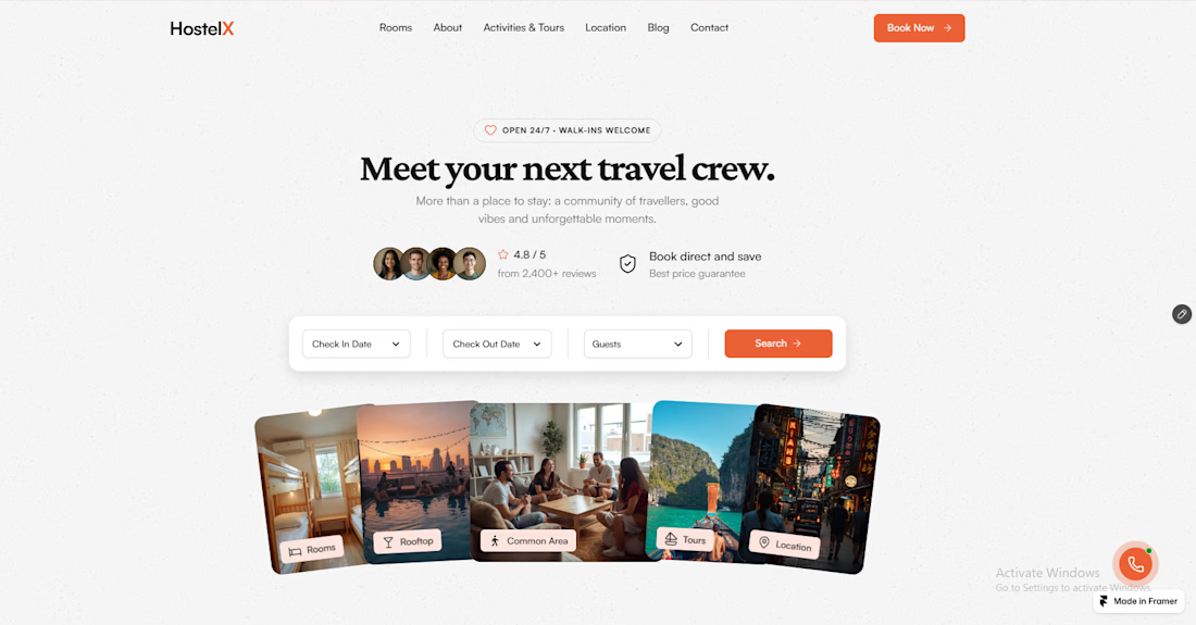
Here’s how I answered it in the HostelX hero:
1. The vibe
“Meet your next travel crew.” A headline about people, not beds. Photo cards for rooms, rooftop, common area, tours and location give a feel for the stay in one glance.
2. Trust
Rating and review count with guest faces, plus a book-direct promise right under the headline. Travellers look for proof before they look for dates.
3. Booking
Check-in, check-out, guests and search, all in the first screen. The booking bar is ready to connect to whatever booking engine the hostel already uses.
For hostel owners: does your homepage show all three before the scroll? Most I see show a big photo and a “Book Now” button, and leave the trust part for later.
For Framer designers: I used tilted photo cards instead of a slider, so every part of the stay is visible at once without waiting for an animation. Would you keep it, or go with one full-bleed photo?
https://framer.link/7sync-hostelxR
Tell me what you’d change.
The network for creativity
Join 1.25M professional creatives like you
Connect with clients, get discovered, and run your business 100% commission-free
Creatives on Contra have earned over $150M and we are just getting started










Related posts

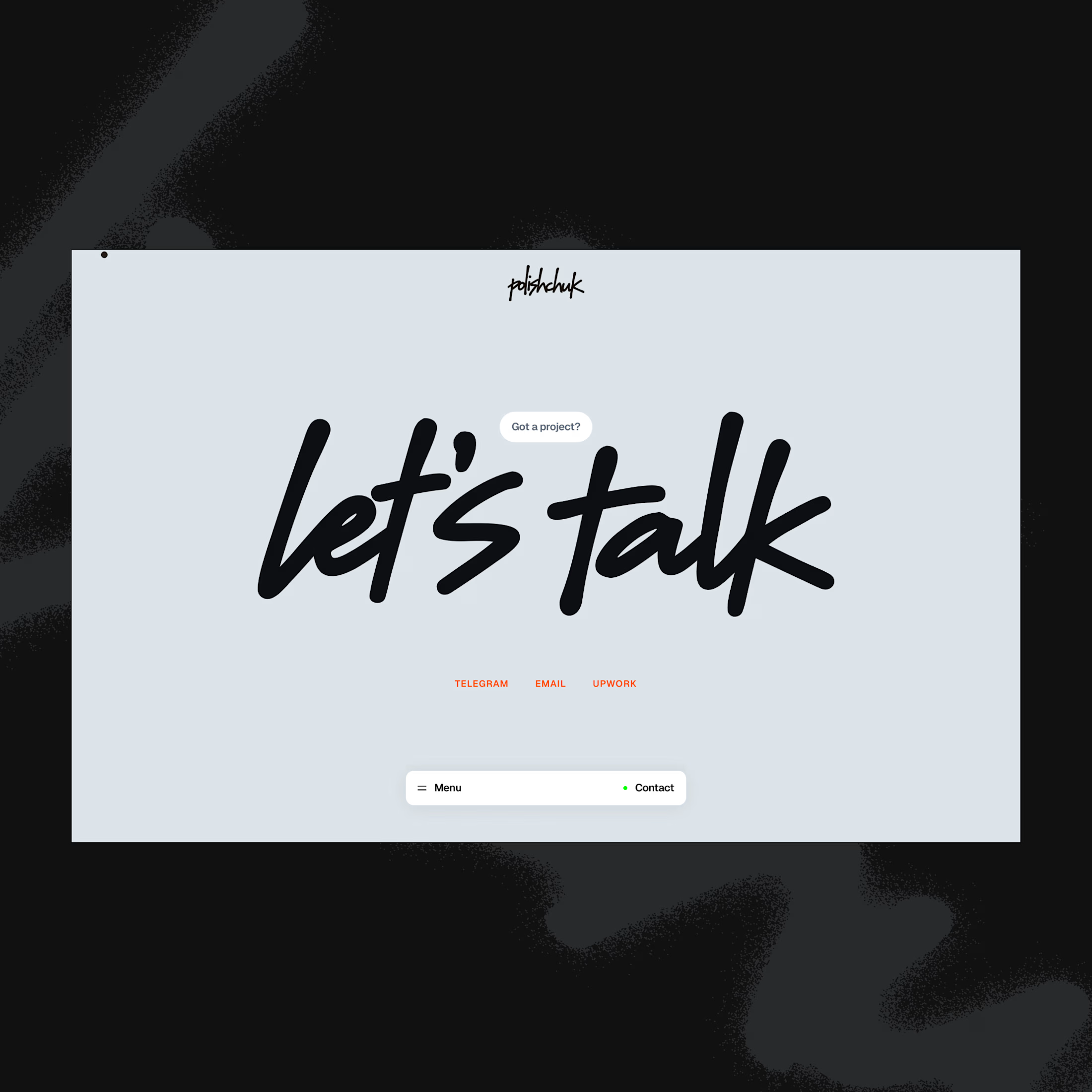
Contact page done with claude from my phone
What a time to be a designer


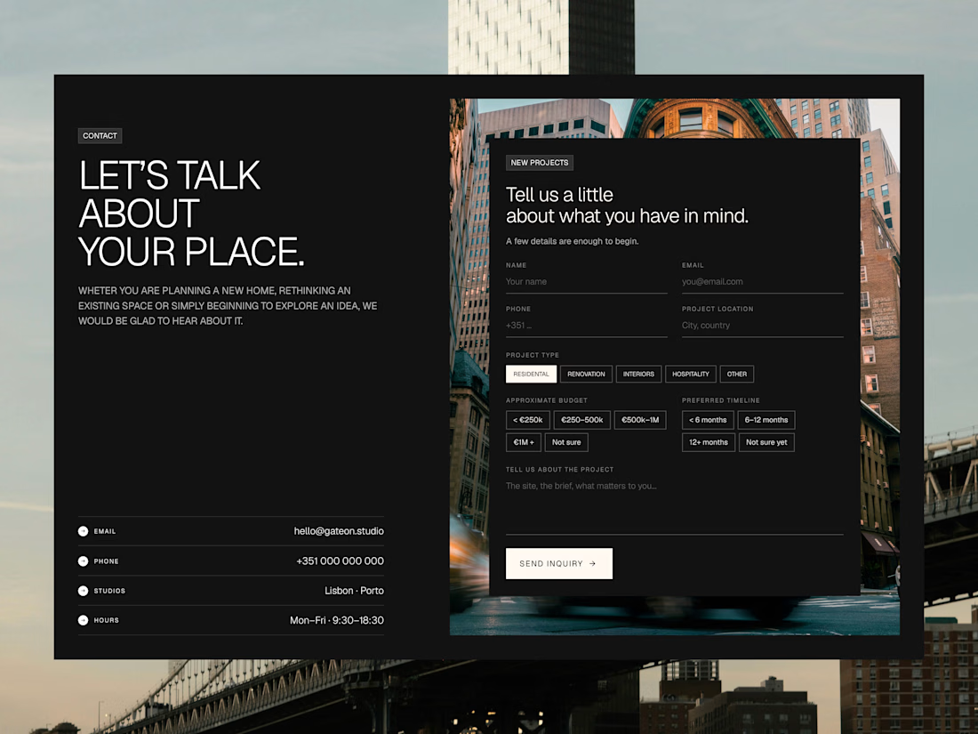

That is amazing and the contact page design looks great.

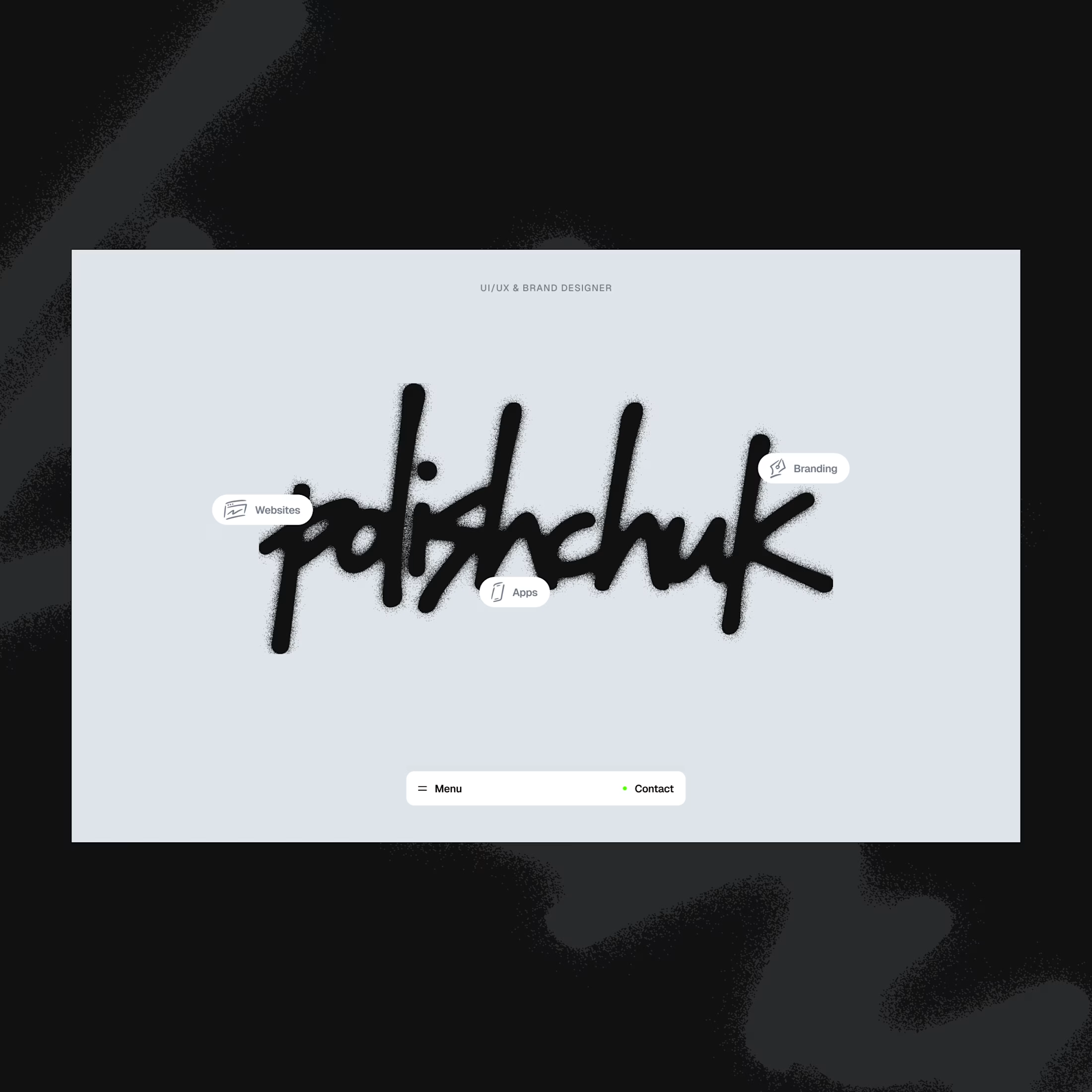
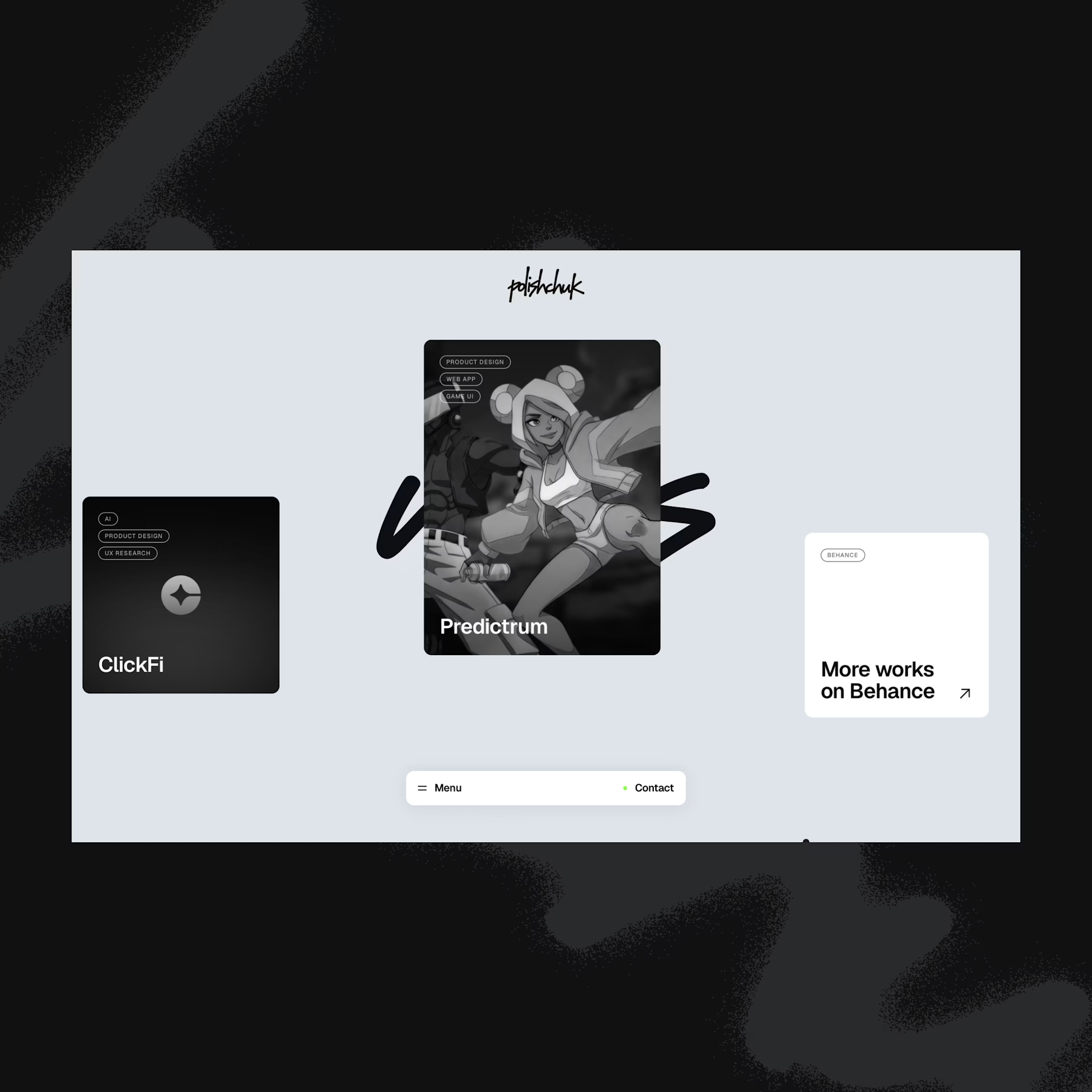
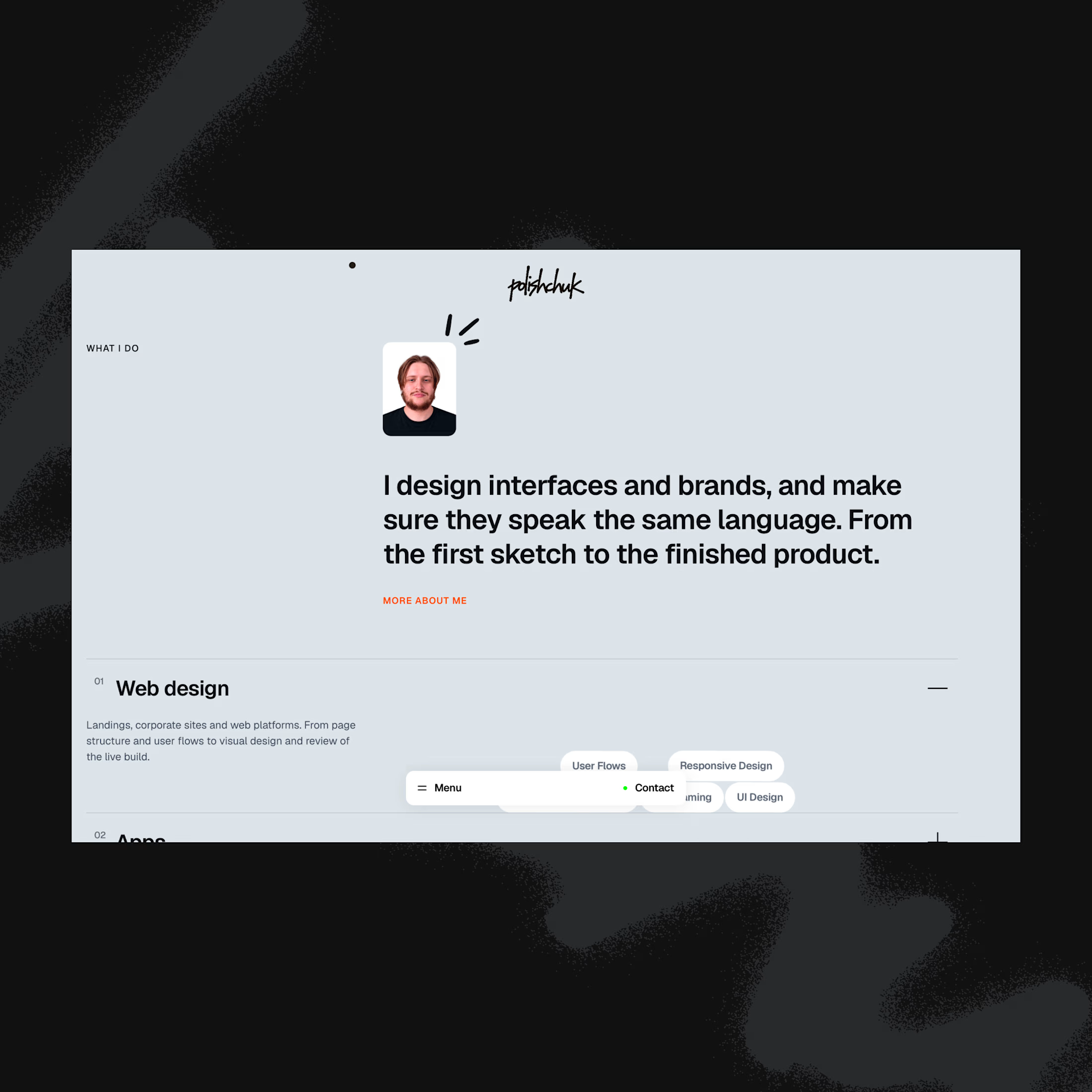
Published my portfolio in the @framer Gallery a few days ago — and today I spotted it in Trending 🧡
Built with Framer + AI: I led the design and direction, AI helped me move faster on the build.
https://www.framer.com/community/gallery/polishchuk-design/


Amazing design – absolutely love it!!